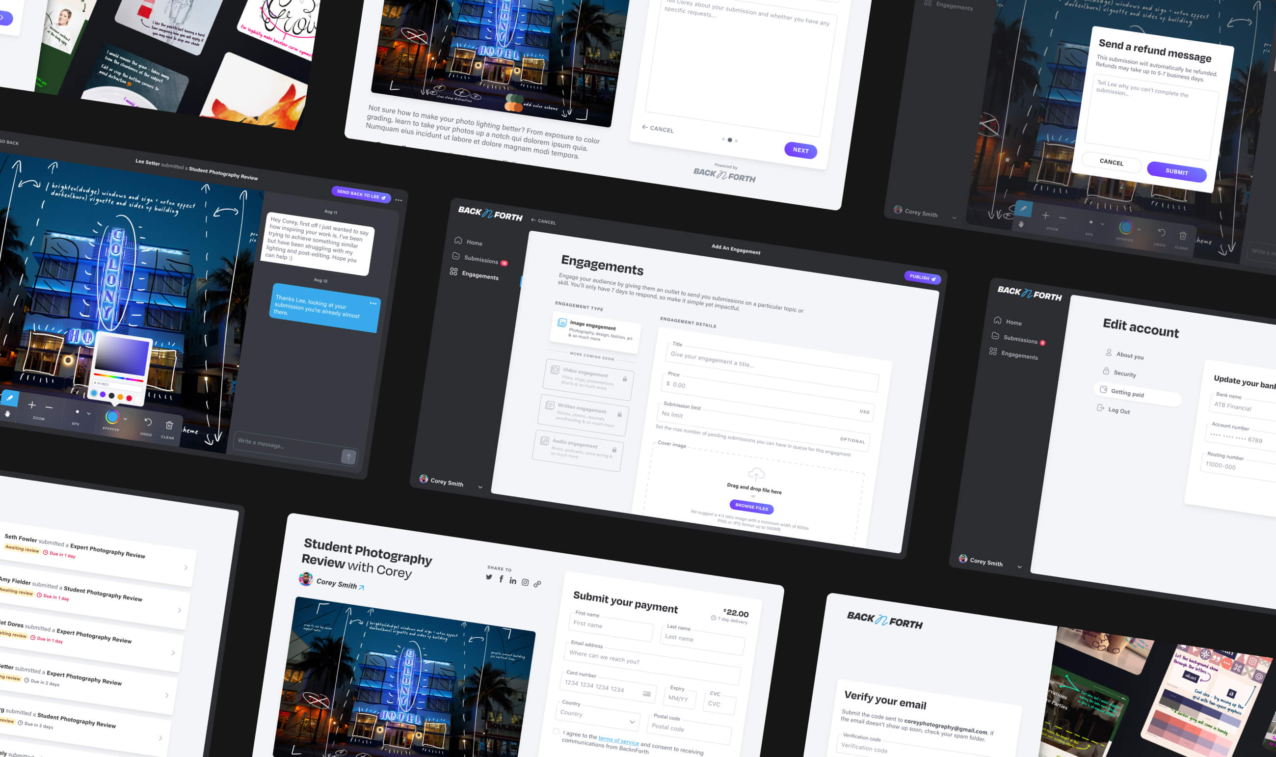
Ideation & Planning
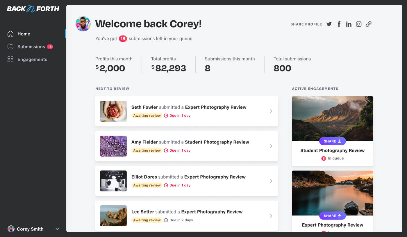
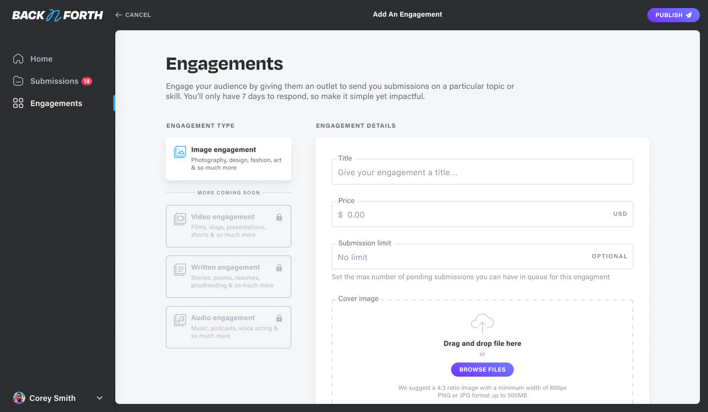
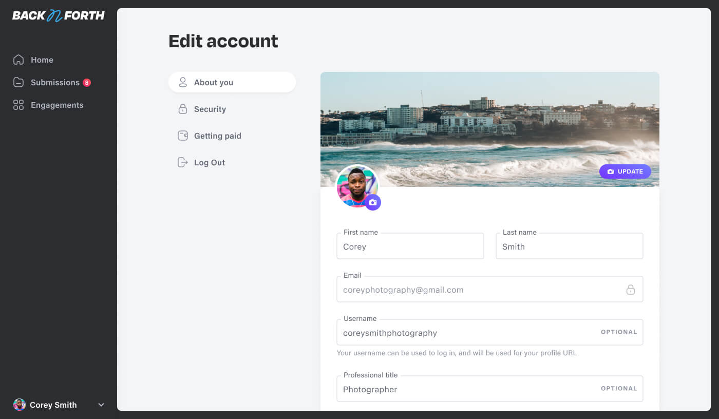
From the inception of Back n Forth, the lead software engineer and I guided a small team from the ideation phase to the successful launch of a minimum viable product. Together, we spearheaded the efforts in understanding what challenges the platform needed to solve, and crafted a strategic plan to execute it within scope.
Submissions
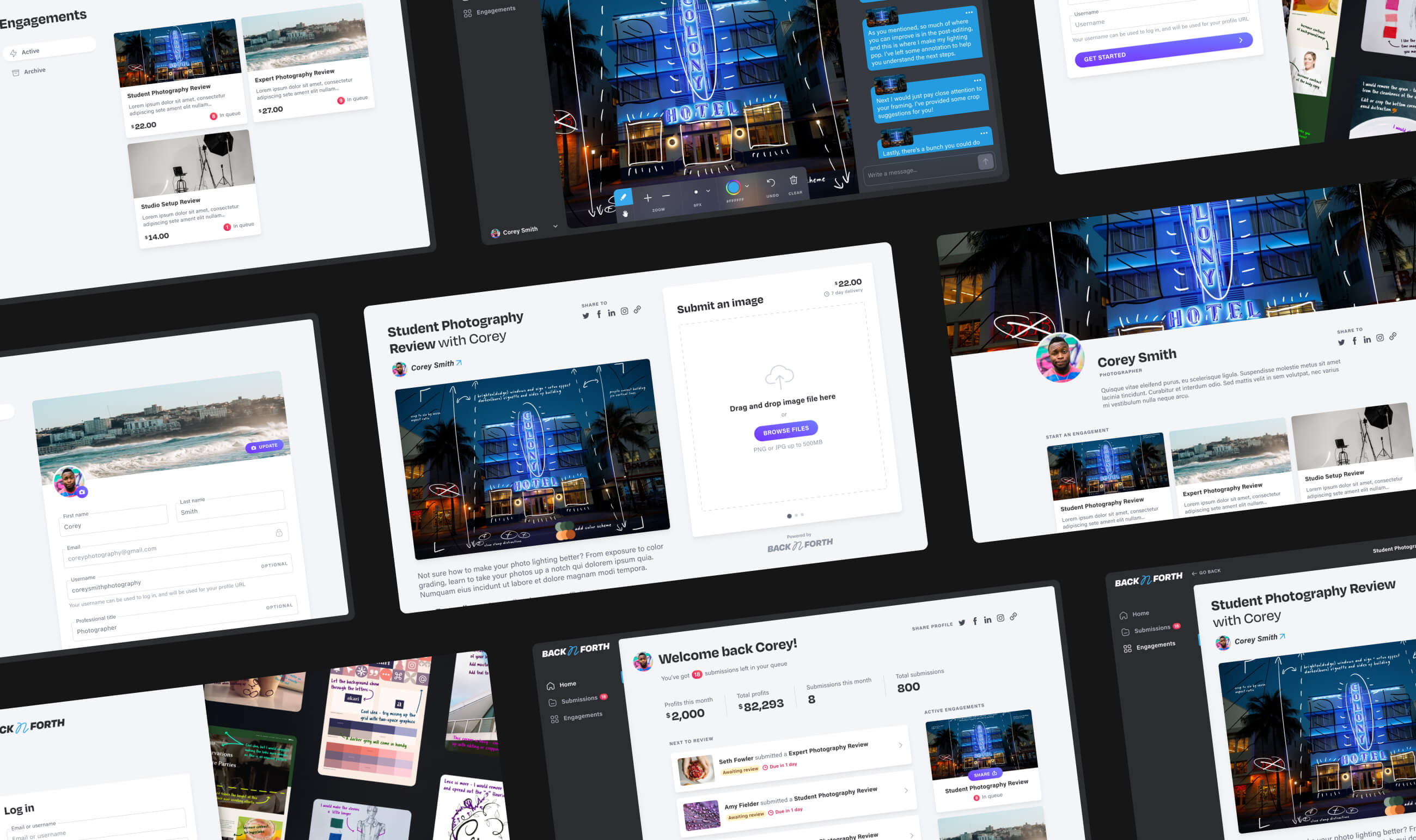
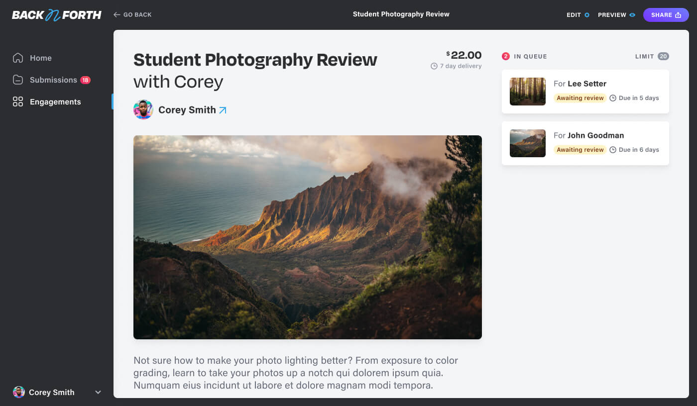
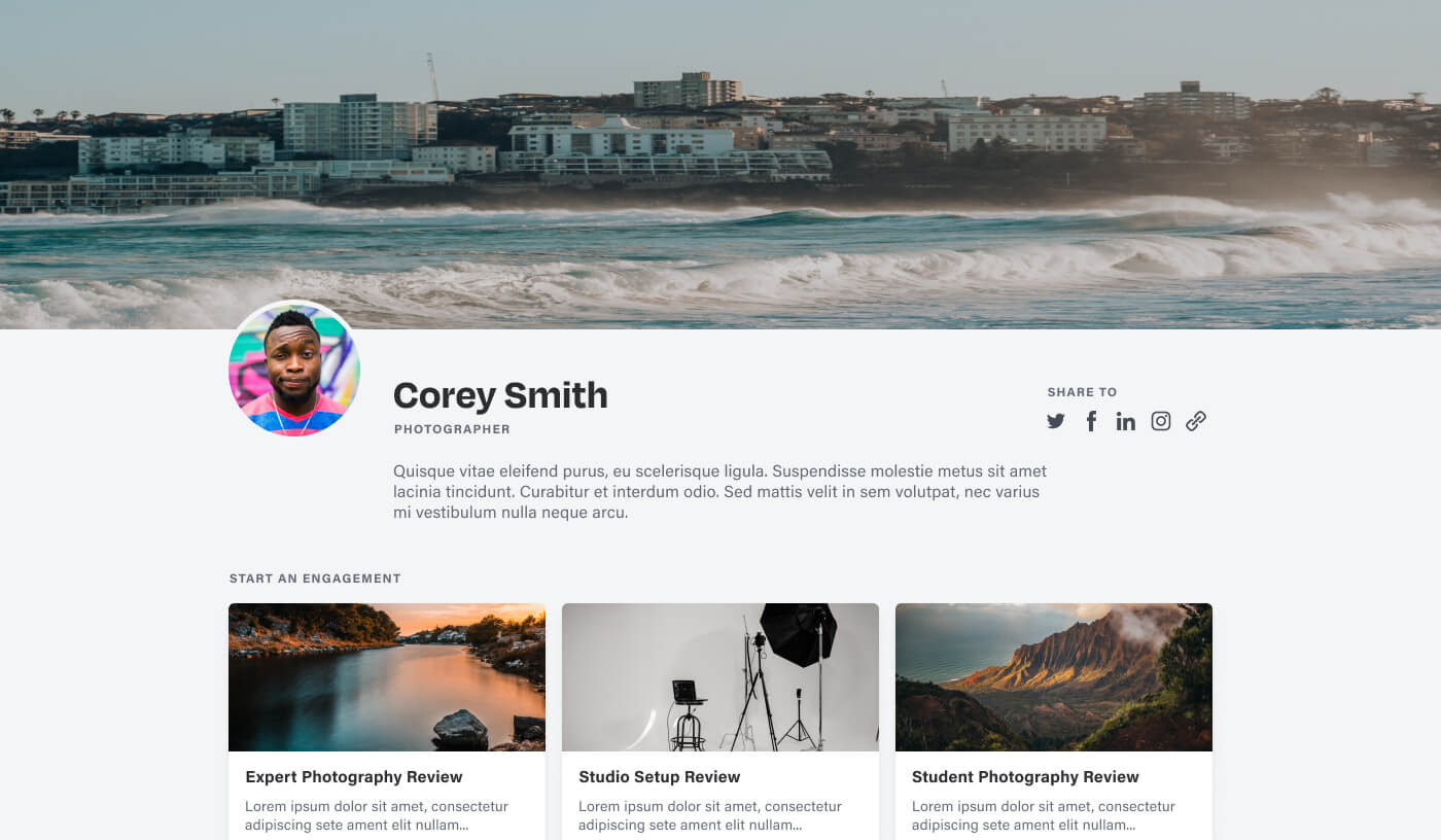
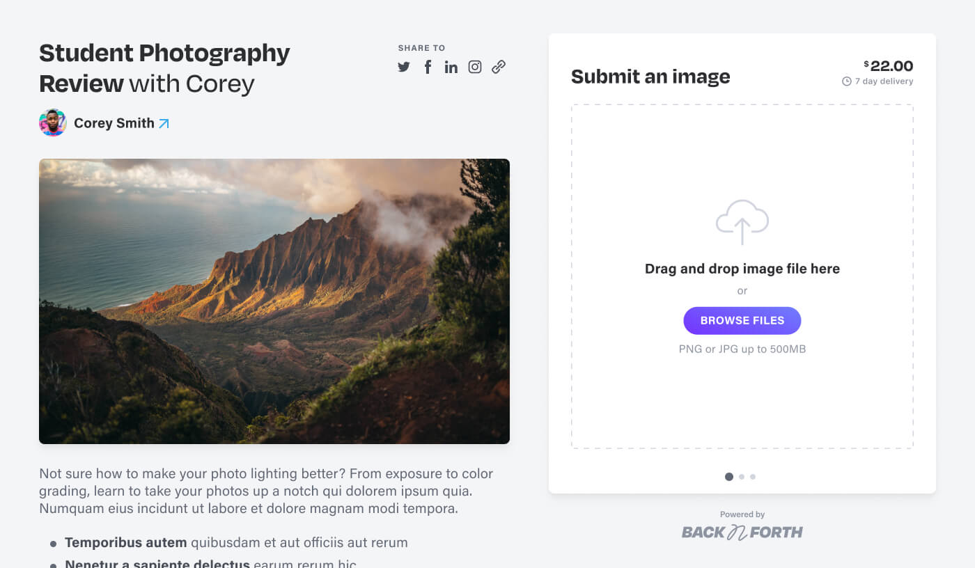
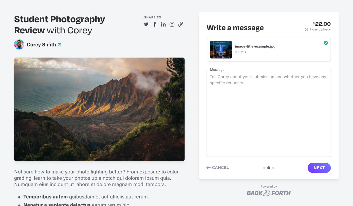
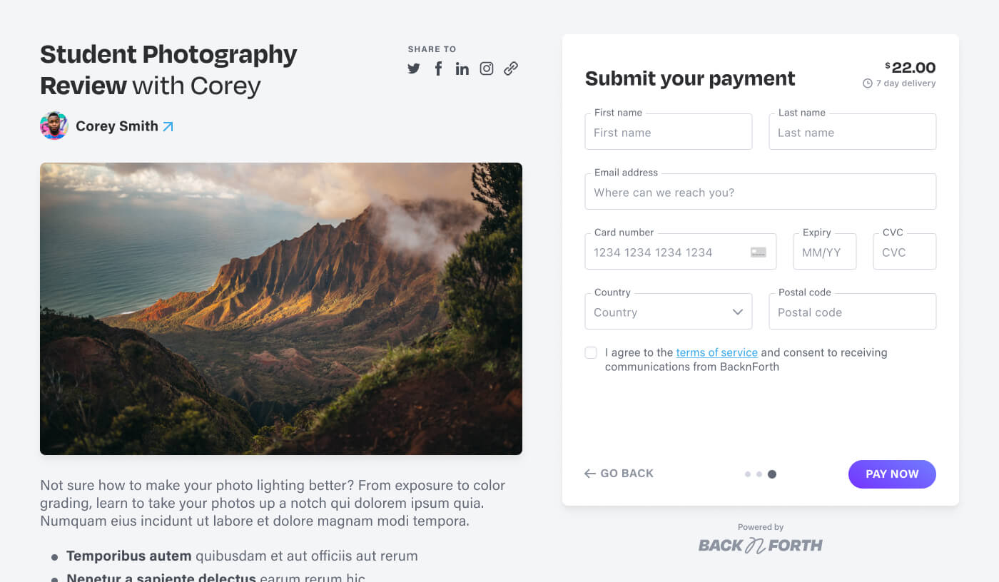
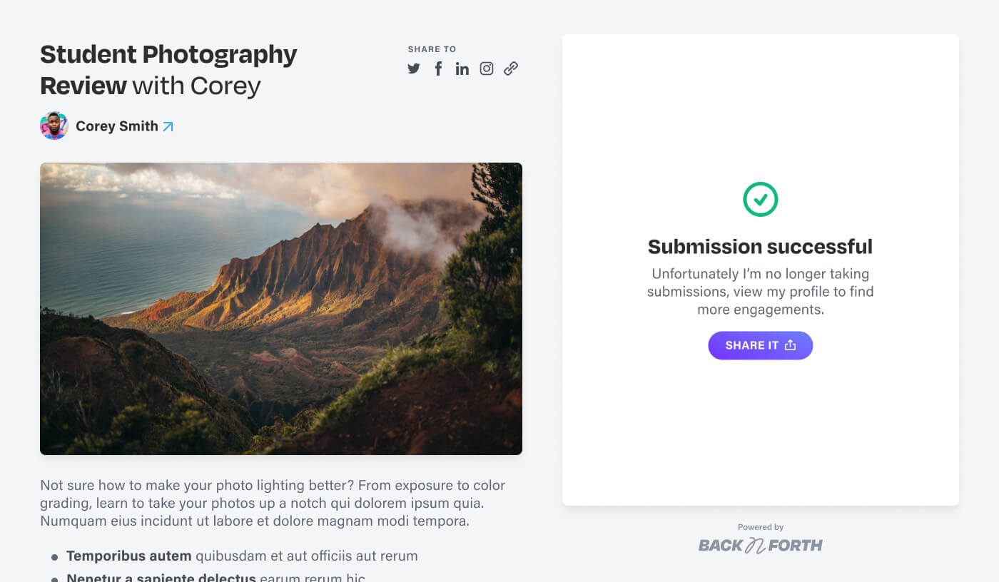
A pivotal feature of the app was the empower creators to host and share dedicated landing pages with their audience. These landing pages not only showcasing their offerings, but also streamlining the process of receiving submissions. To prevent overwhelming users with submission requirements, we implemented a multi-step form, breaking up the process into manageable portions. This approach also ensured a balanced hierarchy between presenting the creator's offering and providing a clear starting point for submissions.
Responses
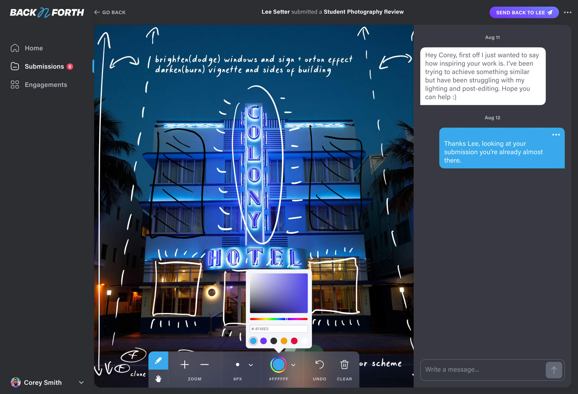
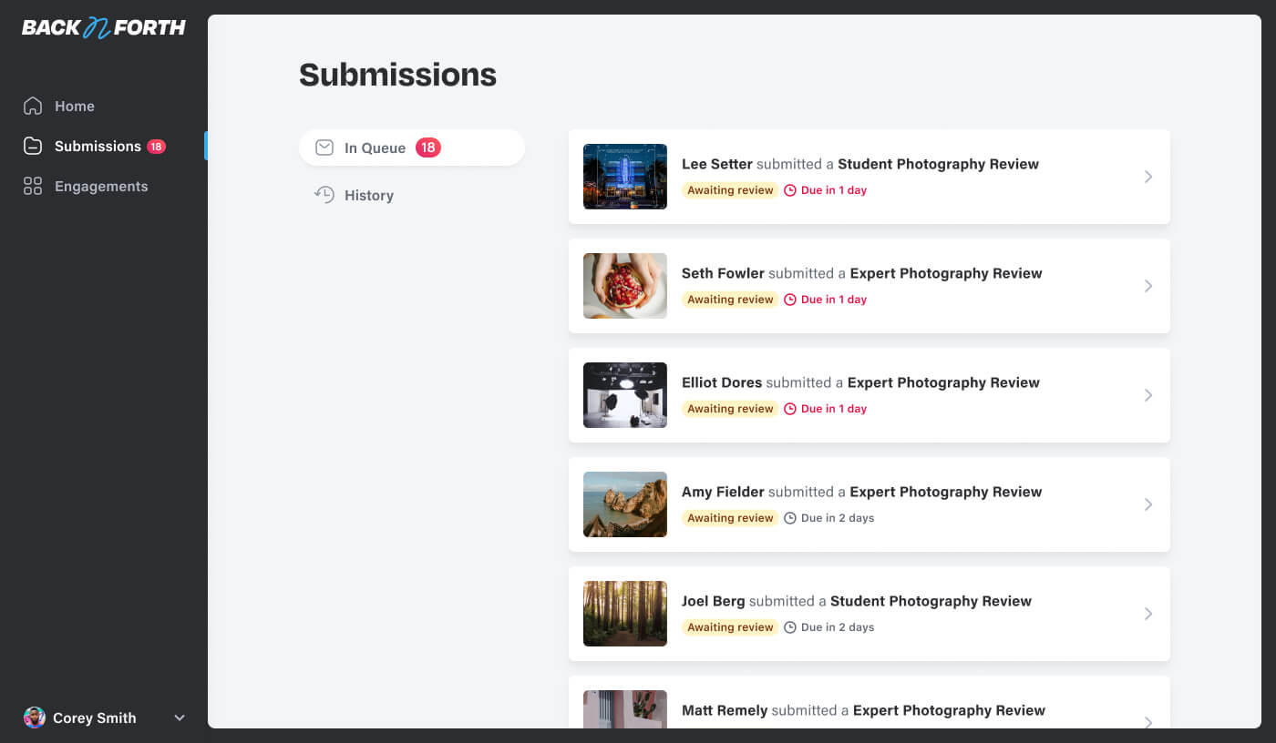
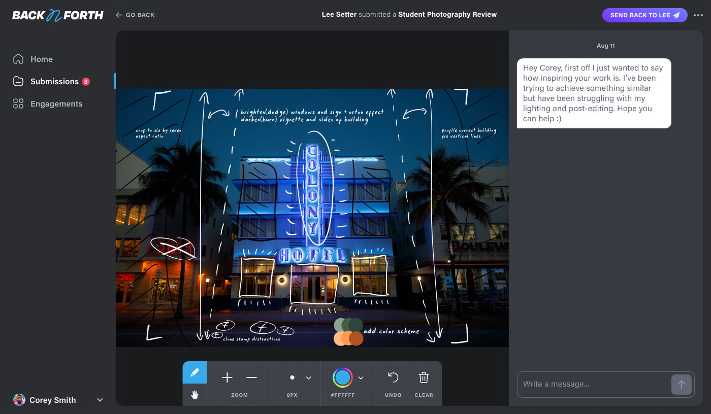
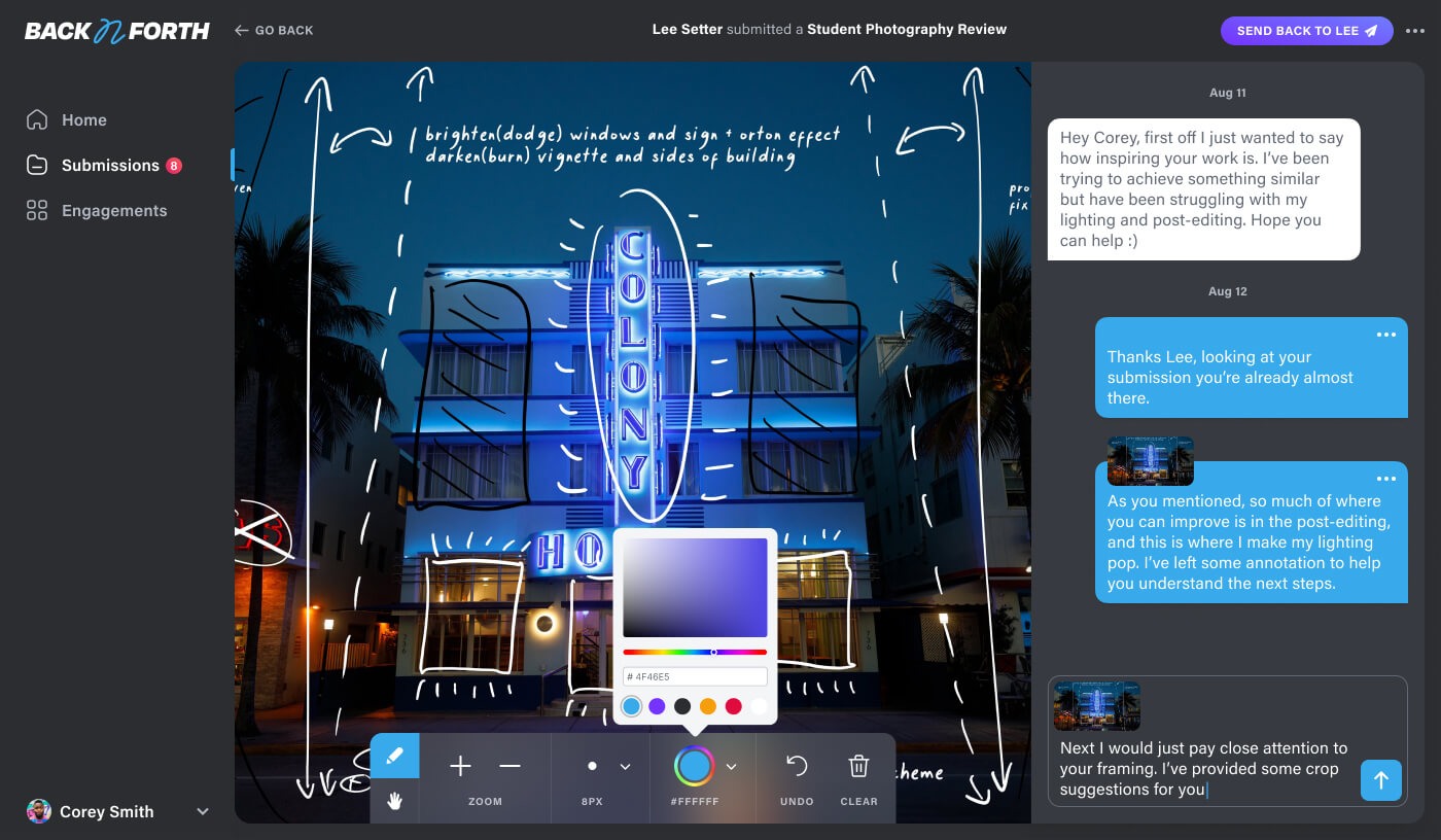
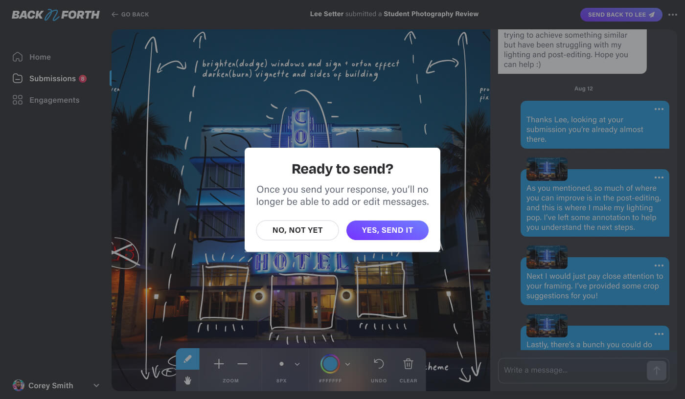
As submissions flow in, we developed an intuitive interface for creators to manage and structure their responses. Considering the specific industries of our personas, we recognized that annotating feedback directly over an image was the most effective means of conveying key points. With this in mind, we designed this feature with the versatility of providing feedback by either typing or using familiar annotation tools.
Launch
Upon launching in beta, we conducted a thorough examination of user behavior, employing both analytics and user-testing sessions. Combining these insights with direct user feedback, we formulated a strategic roadmap for enhancements and new features to focus on once product-market fit is solidified.
