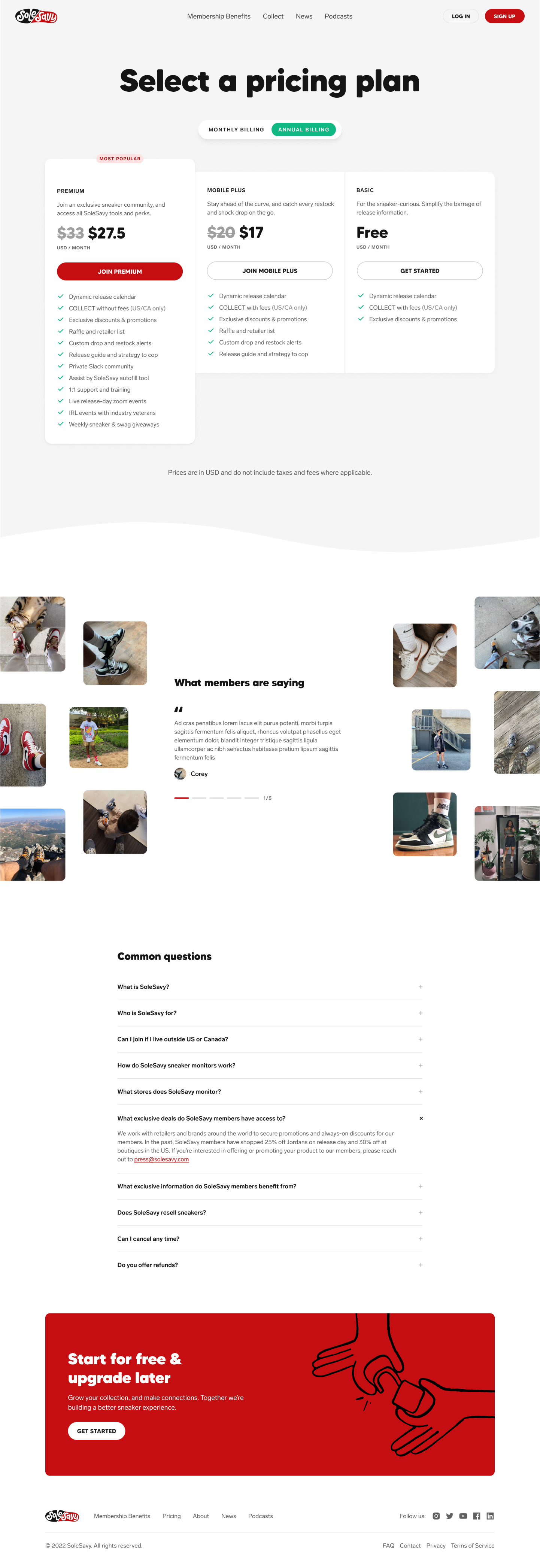
The Platform
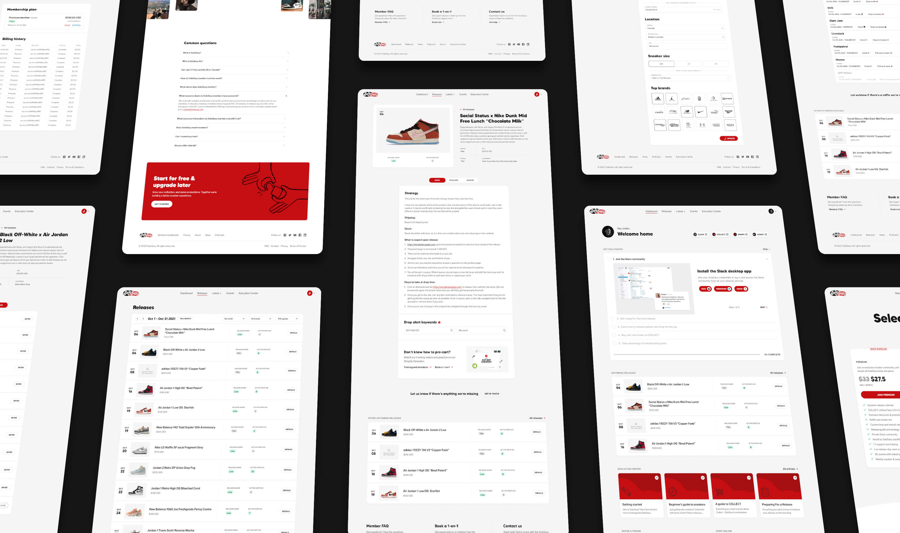
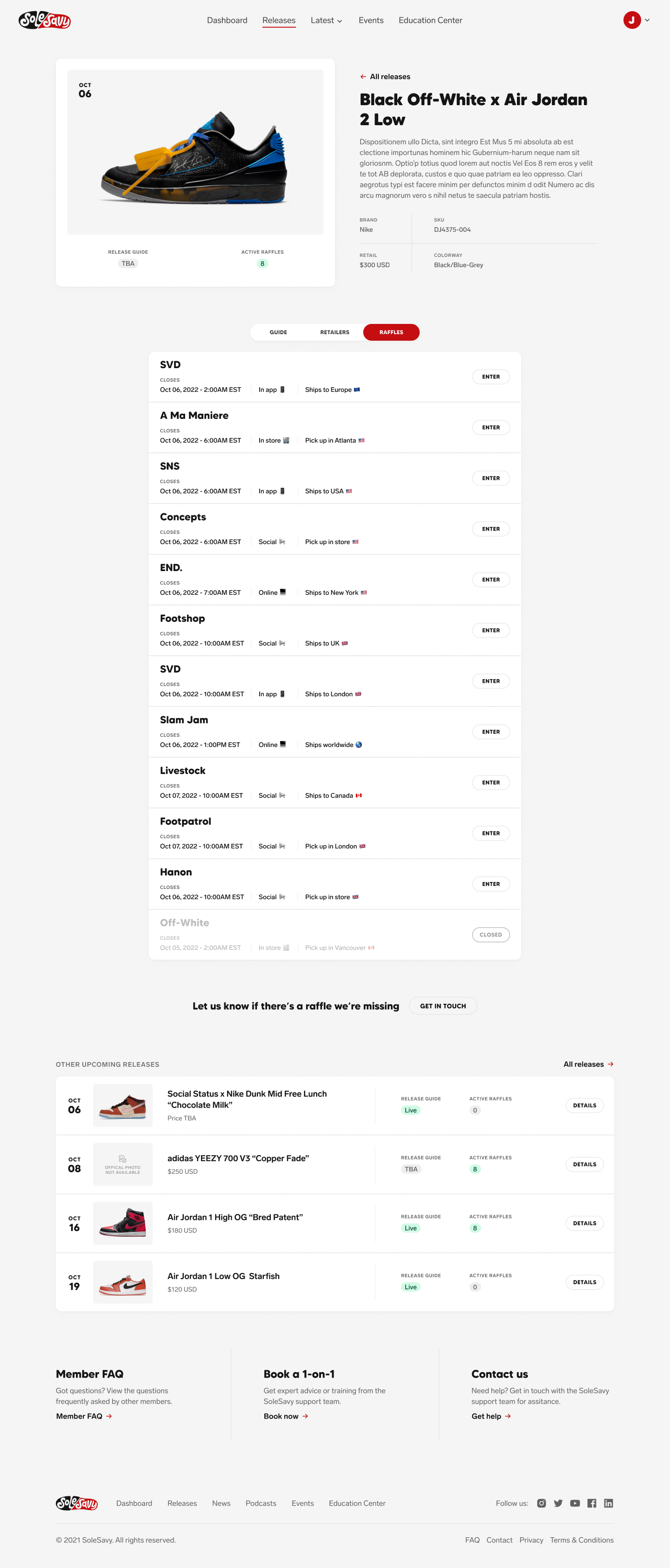
When SoleSavy brought on their internal product team, we discovered that their current membership platform had been stitched together in Wordpress by an external agency. This worked for them initially, but as we needed to expand SoleSavy’s offerings through a tailored user experience, it became clear that we needed to move away from the limitations of Wordpress. This sparked a multi-phased effort of transitioning to a custom solution that could integrate with flexible third-party platforms.

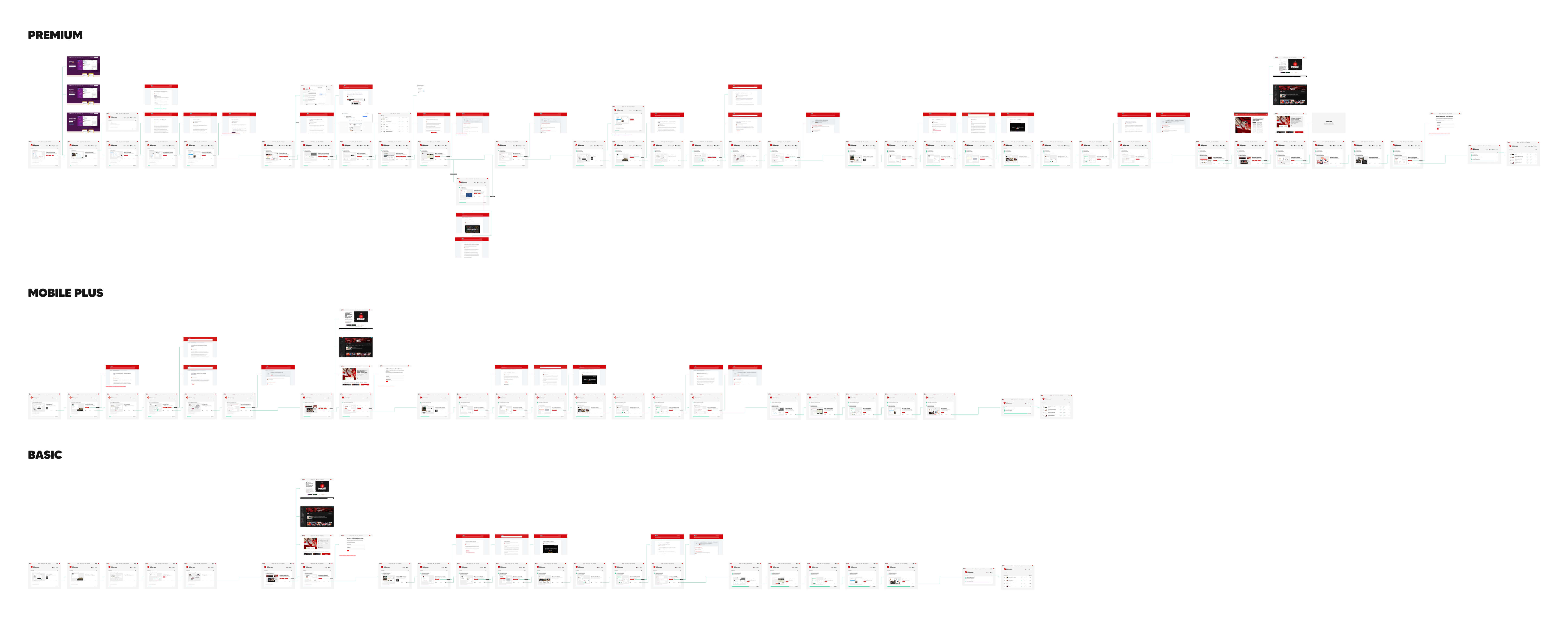
User Journey
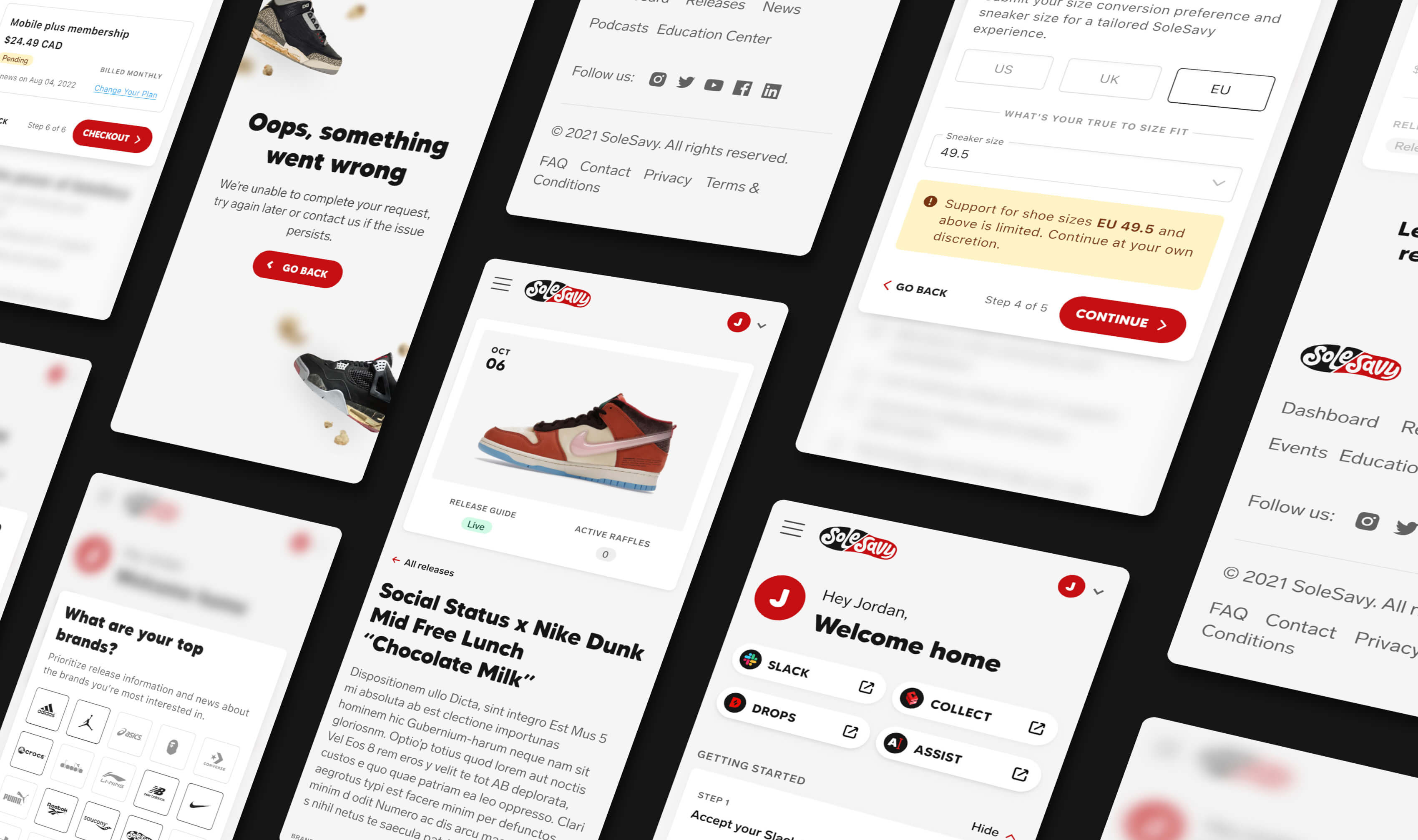
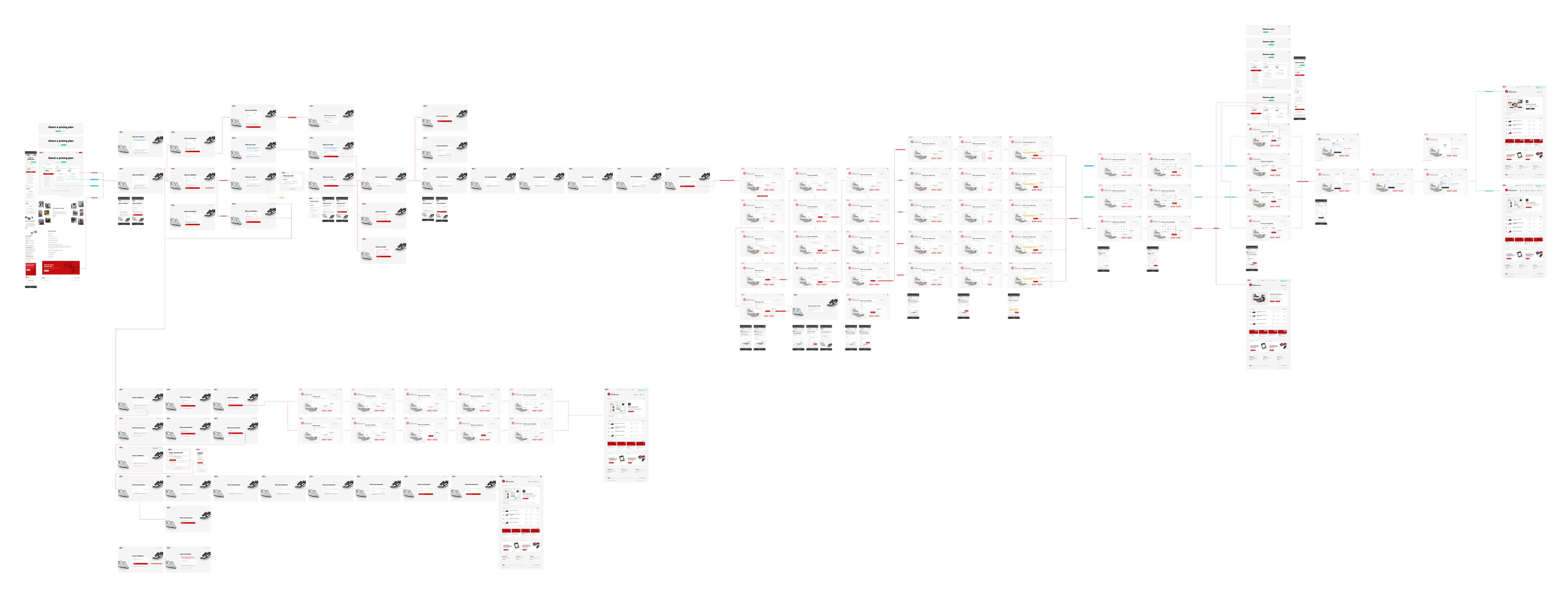
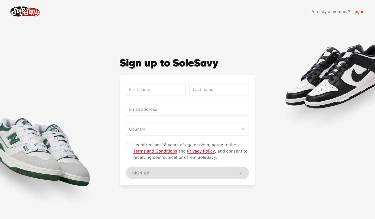
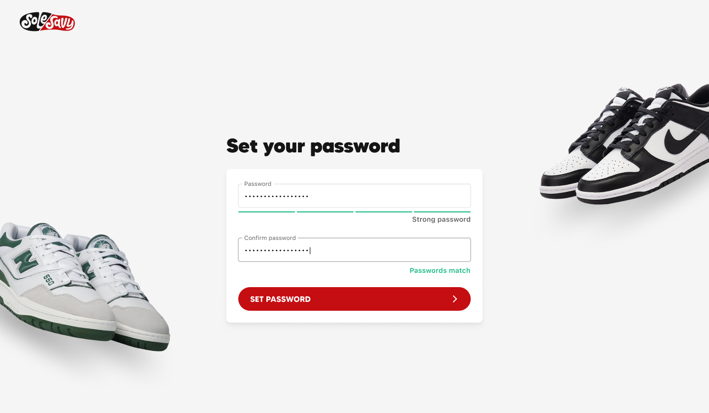
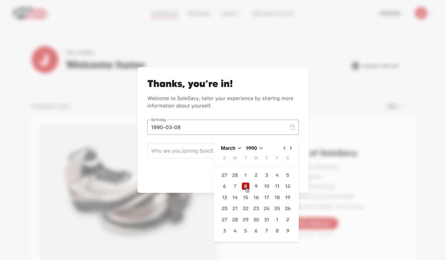
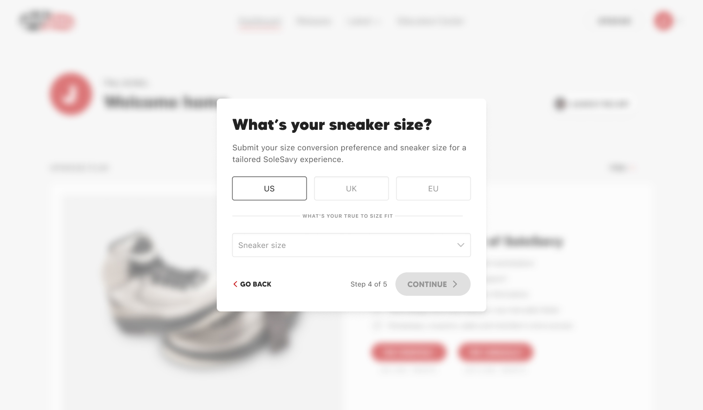
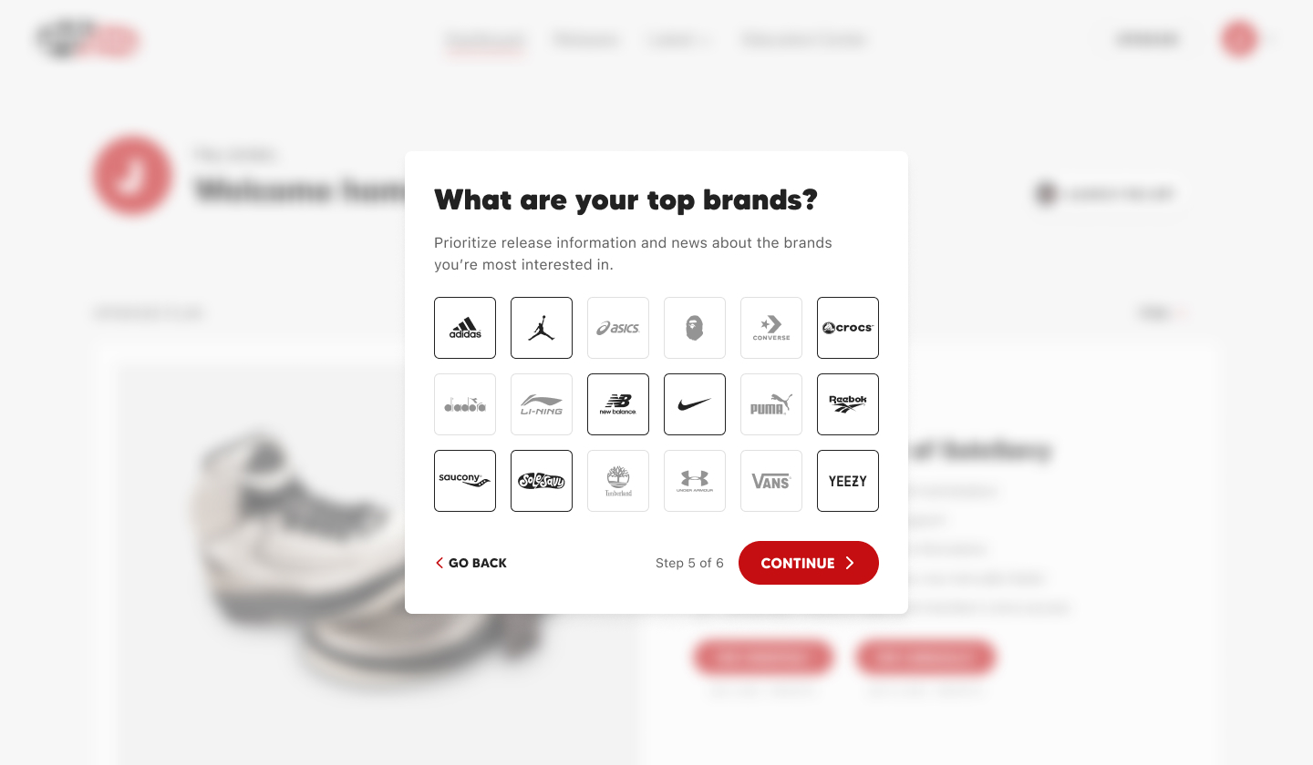
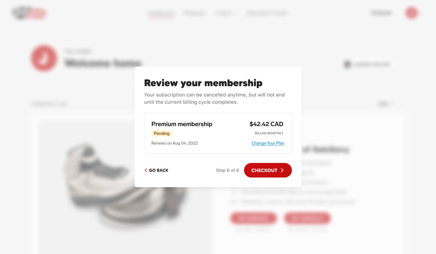
Forming a foundation for the new member portal, we began re-thinking our entire user journey. Encompassing everything from discovery and sign-up, to retention and cancellation processes. After finalizing our strategy and selecting Chargebee as the subscription management software, my focus shifted to developing the sign-up flow. The key goals were to present users with information in digestible portions, and to streamline the process by only collecting what we needed to personalize their SoleSavy experience.
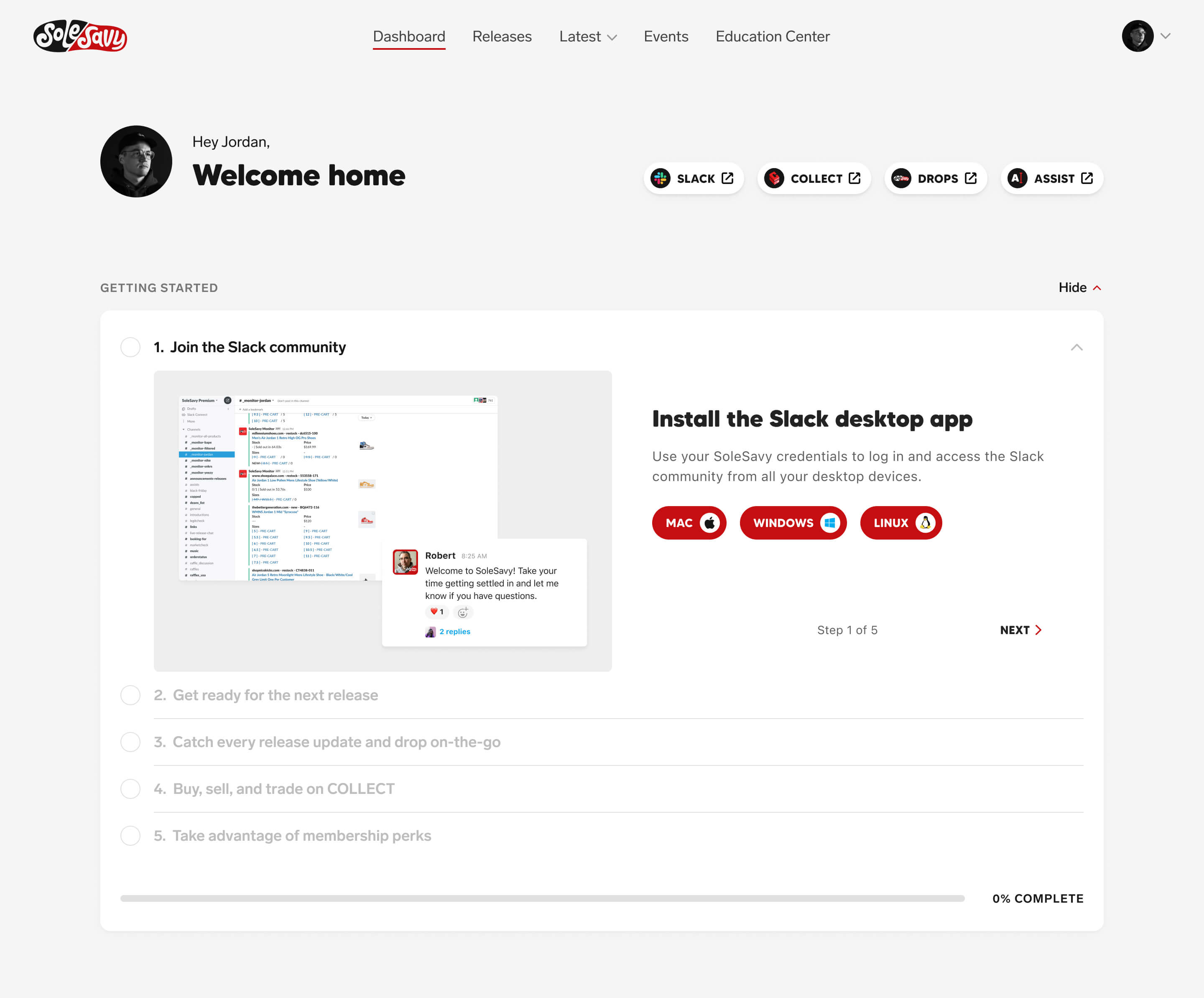
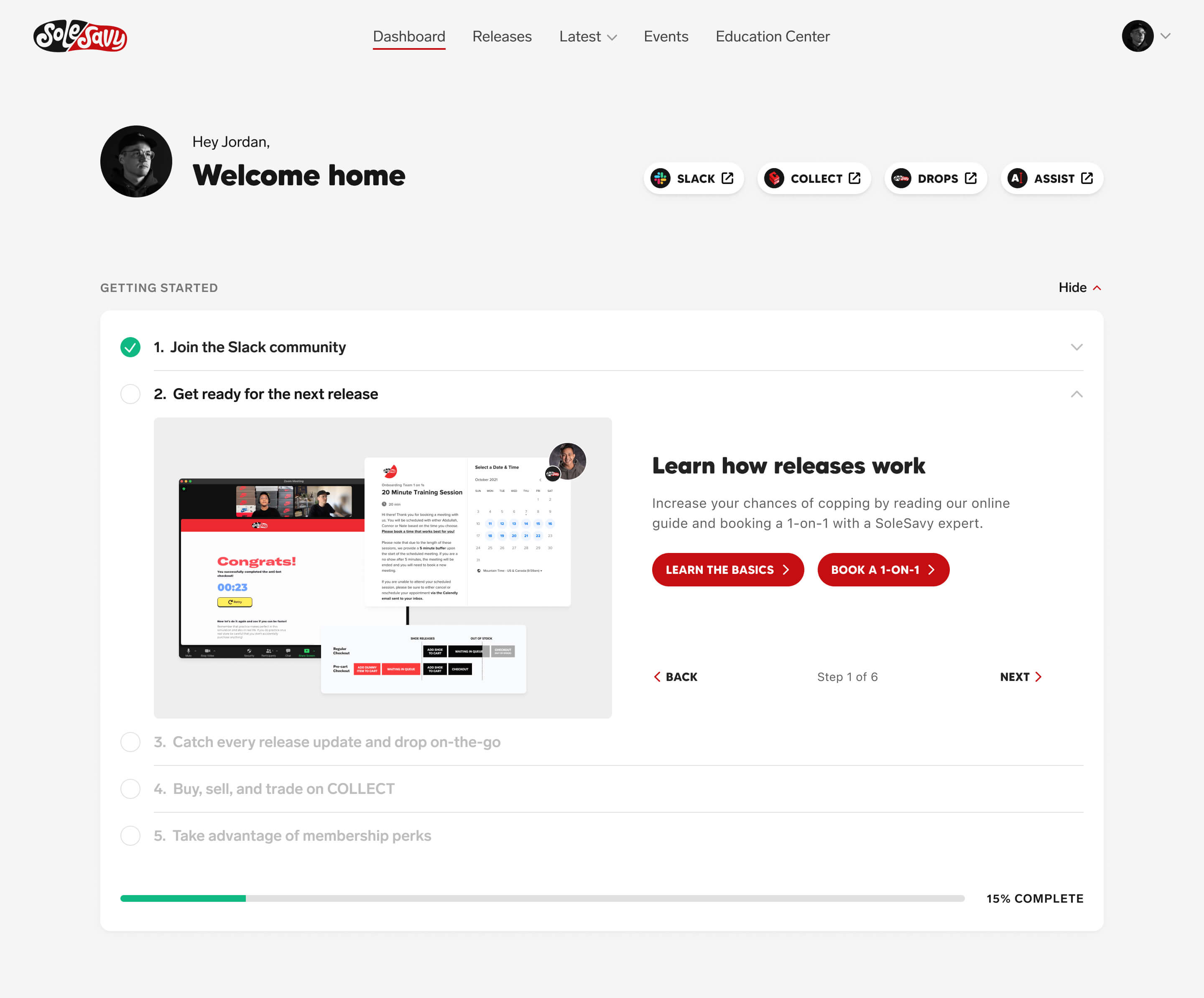
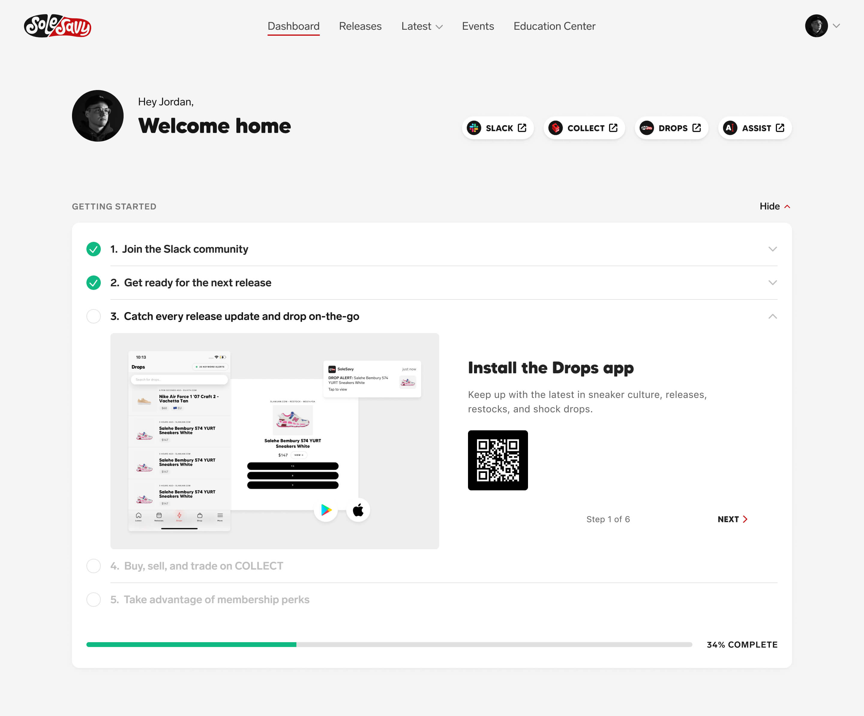
Onboarding
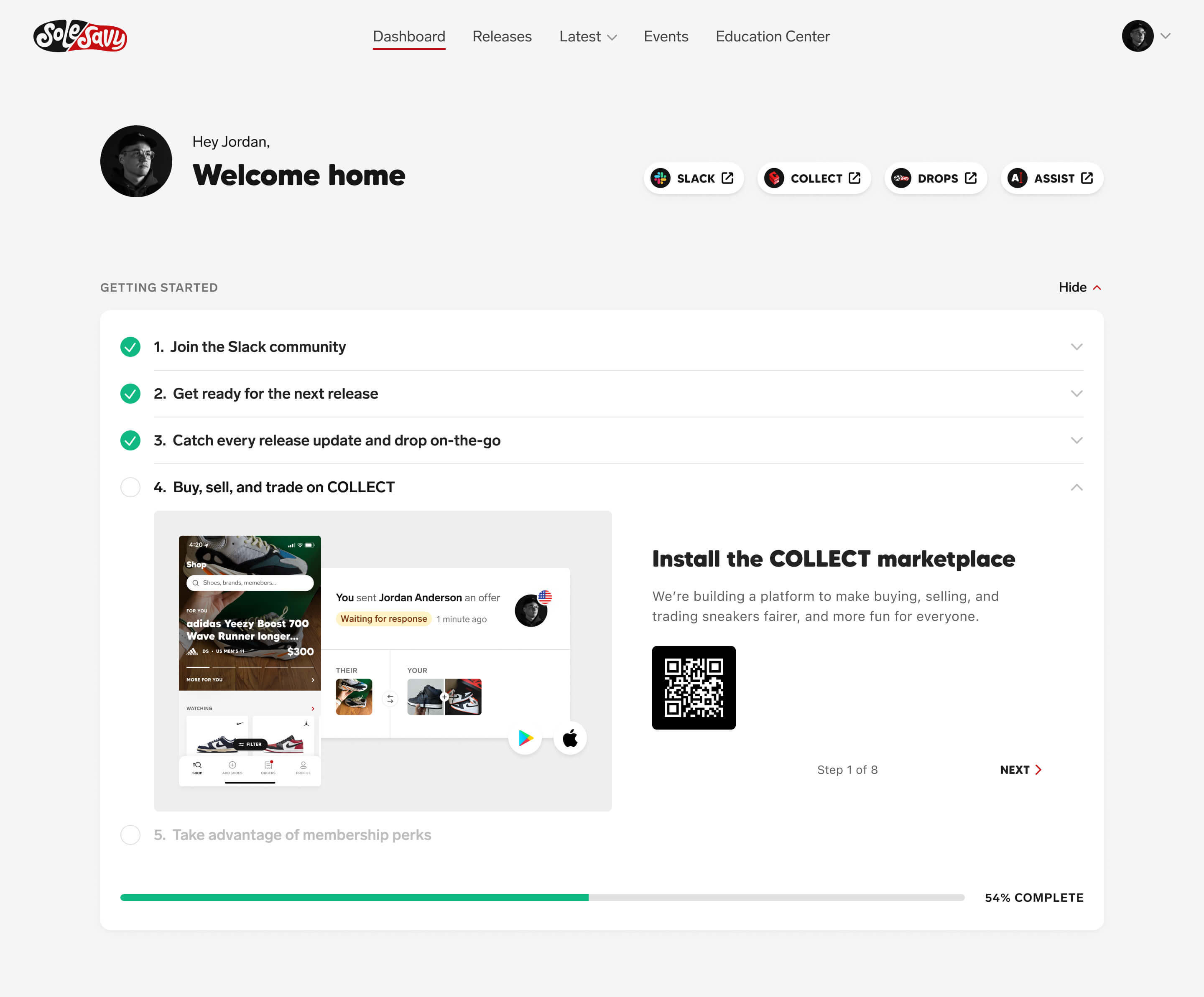
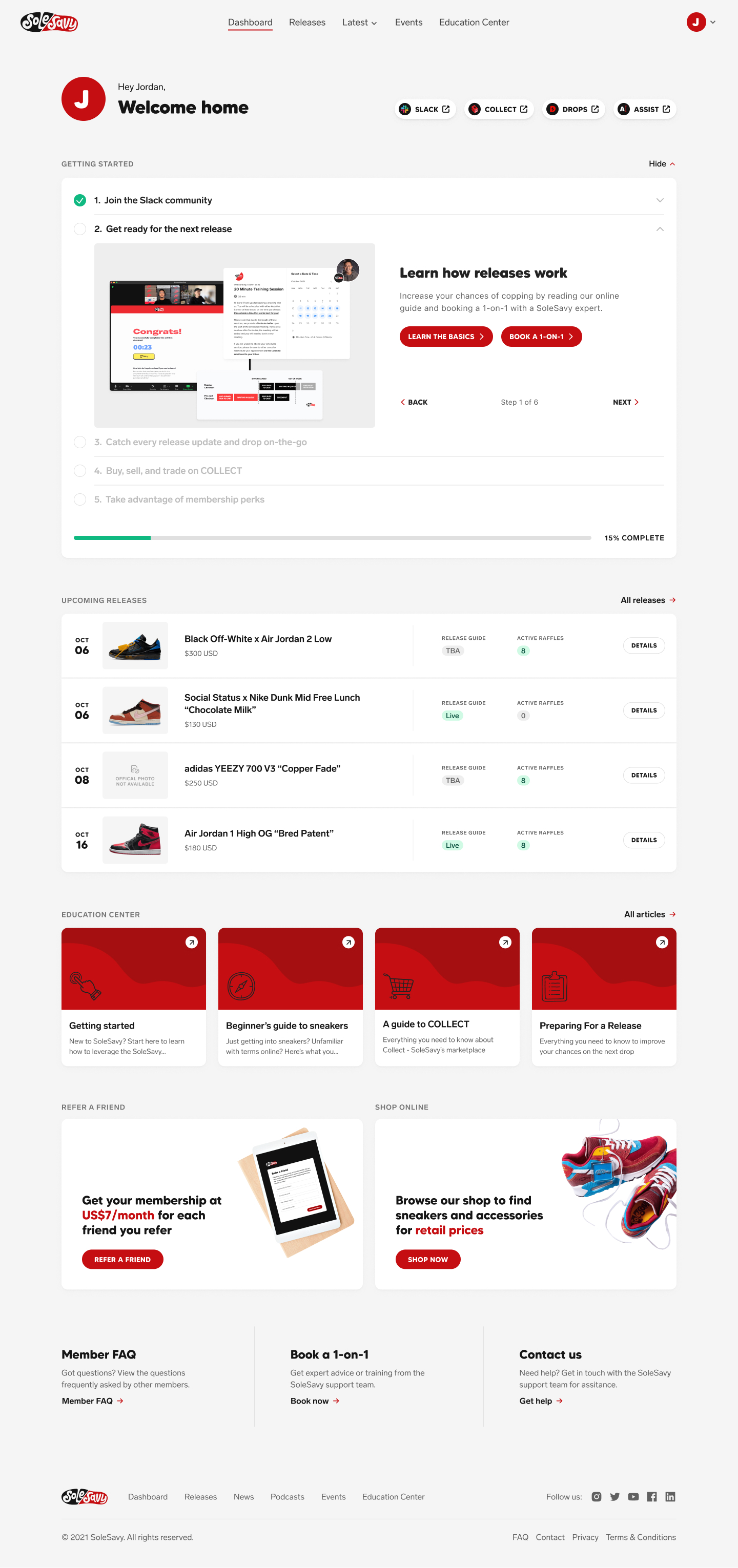
Up to this point, SoleSavy didn’t have a central hub to onboard users, provide access to their tools, or facilitate the discovery of their educational content. As a result, new users struggled to understand what steps they should take after signing up. This proved especially challenging for retention when considering how much knowledge was required to have success with SoleSavy’s tools. Recognizing this pain point, we began a complete overhaul of the onboarding flow which would guide users through this journey.
