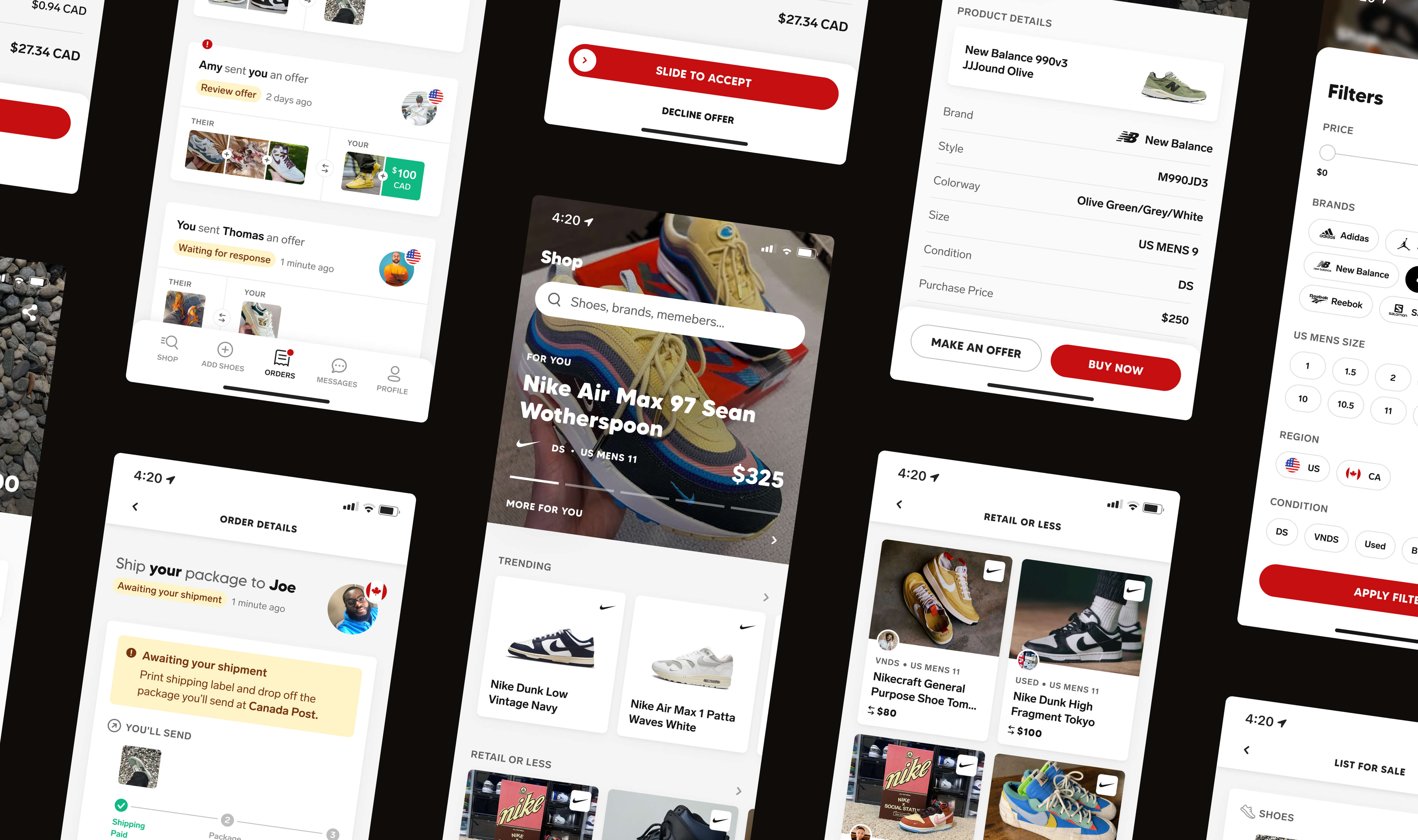
Overview
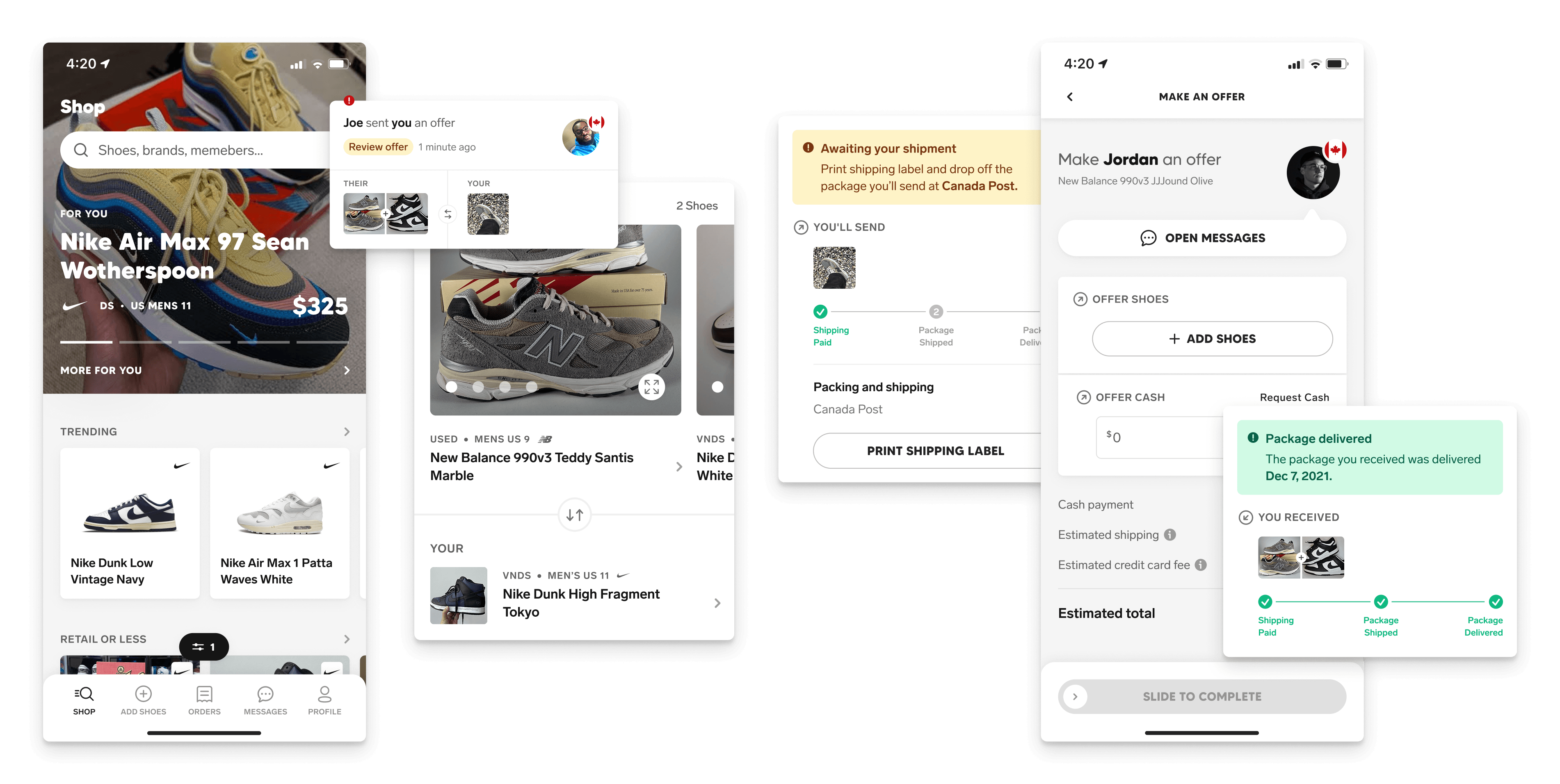
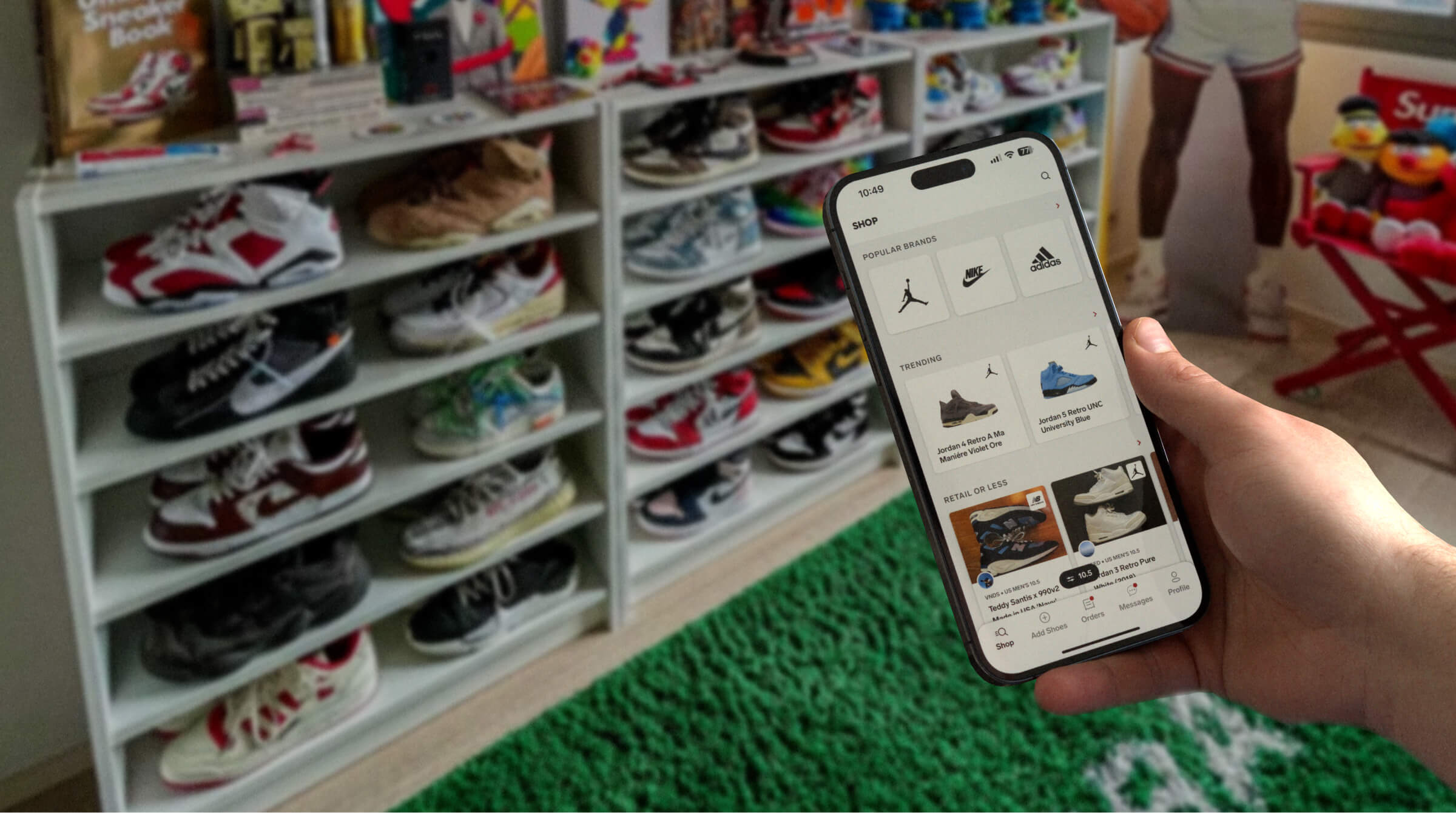
Collect is a peer-to-peer marketplace built for the SoleSavy community — a place for them to buy, sell, and trade away from the price gouging that defines most resale platforms.
While an agency was originally hired to design and build the Collect app, SoleSavy began building an internal team to take ownership of the platform once the initial build was complete. However, as our new team spent time familiarising ourselves with the project, we uncovered major gaps that led to a complete overhaul of the order flows, a delayed launch, and eventually a full redesign.
SoleSavy
Senior Product Designer — Research, Ideation, Prototyping, User Testing, UI Design, Interaction Design
Q3 2021 — Q2 2022
Context
SoleSavy built a large community around sneaker culture — its members wanted an alternative to the problems they saw in the resale market. Collect was designed to give that community a new place to buy, sell, and trade their collections, with no bots and no anonymous resellers.
But with the launch date already on the community's radar, we had little time to turn what the agency built into something we felt comfortable releasing. Beyond missing order states, every transaction used the same generic e-commerce templates intended for one-way purchases.
To properly support two-way exchanges, we needed new templates that could clearly communicate shipments and payments on either side of a transaction. Those weren't gaps we could leave for a future iteration — they were trust problems waiting to happen.
Research
Competitive analysis
While neither StockX nor GOAT supported two-way exchanges, we looked at them first because they were the platforms our users were most familiar with. Researching Tradeblock next, another two-way trading platform, gave us the clearest example of the order states, shipping logistics, and dispute scenarios we needed to consider.
Community input
We were building Collect for an existing community, so getting their buy-in was critical to our success. So we invited a group of members to form a focus group that could provide feedback on behalf of the community, vote on decisions that would shape the app, and beta test the platform ahead of the public launch.
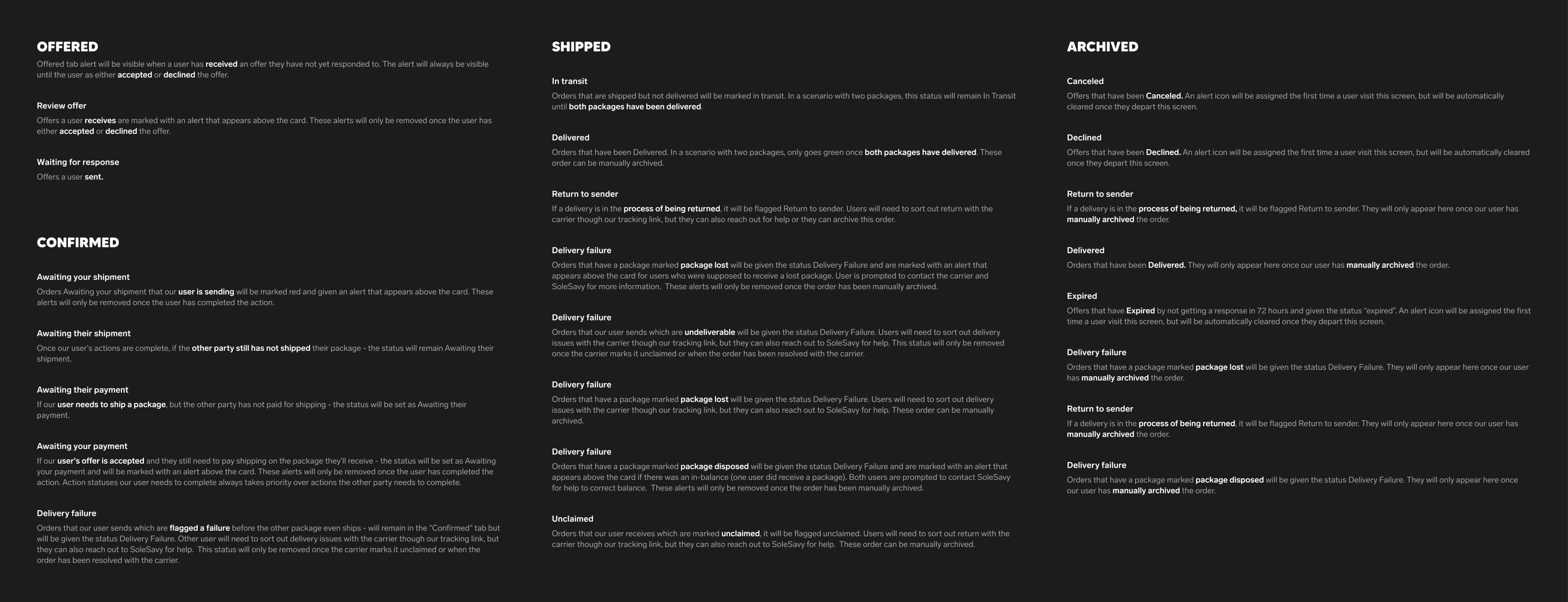
Order status audit
Using what we had already learned, we created a comprehensive list of every state an order could enter, along with the conditions required to trigger it. With that shared understanding of how an order moves through its lifecycle, we had the foundation needed to move into ideation and begin mapping our order flows.
Ideation
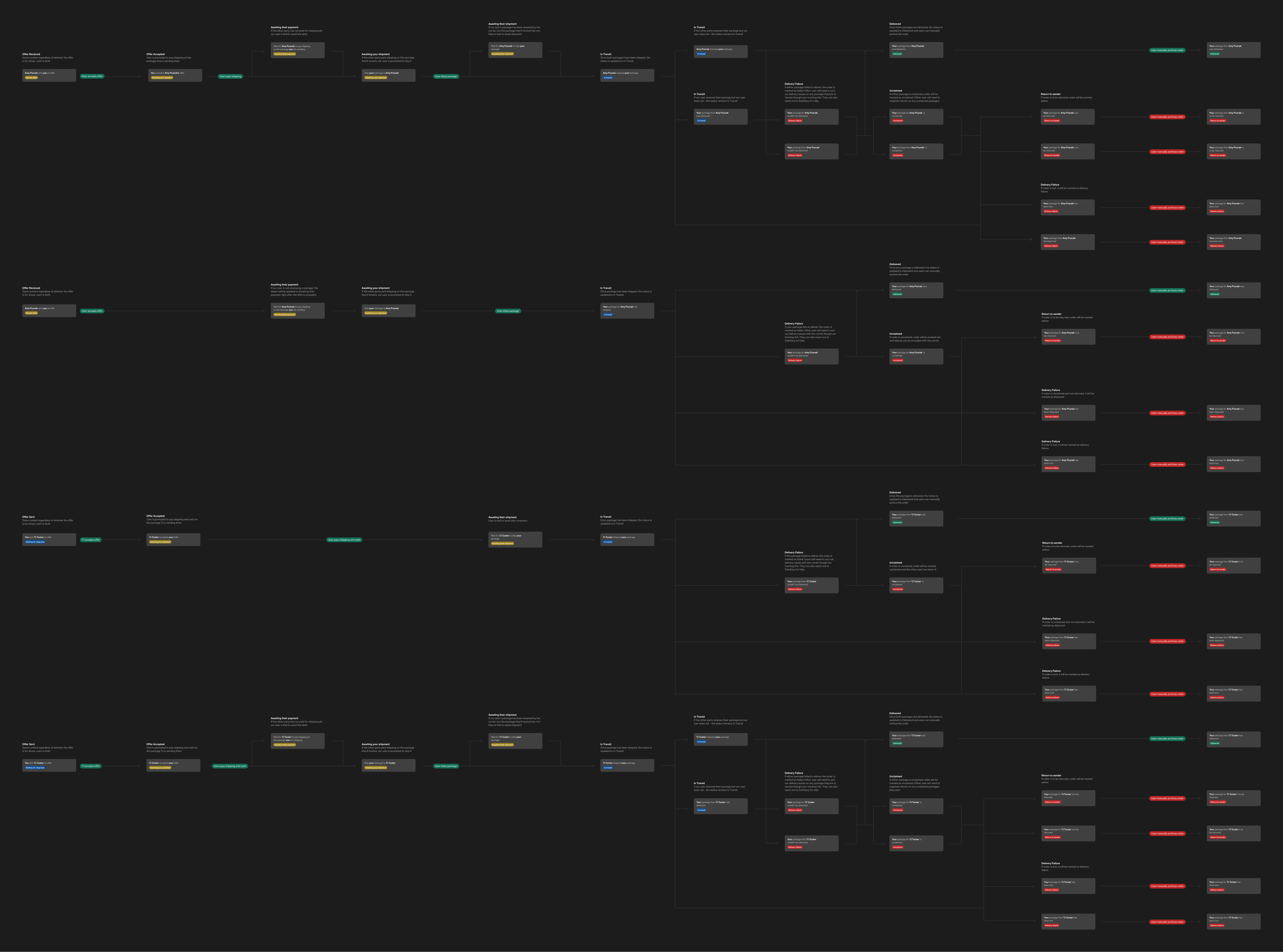
Order flows
We didn't want to deviate too far from familiar e-commerce patterns for one-way purchases, but supporting two-way exchanges required us to rethink parts of the experience on both sides. With little precedent to follow, we took our time determining what information each party needed to see across every possible scenario.
Policy playbook
We also needed to develop a policy playbook. Our CX team needed clear guidance on how to handle each scenario, and we needed those decisions before we could finalise the order flows. After drafting an initial version, we brought it to leadership and other stakeholders to review, refine, and align on how each situation should be handled.
Design
With part of the design work already completed by the agency, we started by identifying what we could keep. From there, we spent the next few weeks rebuilding both existing and new screens alongside the beginnings of what would become our design system. What you see throughout this case study reflects the final designs — the result of two years of user interviews, A/B testing, and iteration rather than what we shipped on day one.
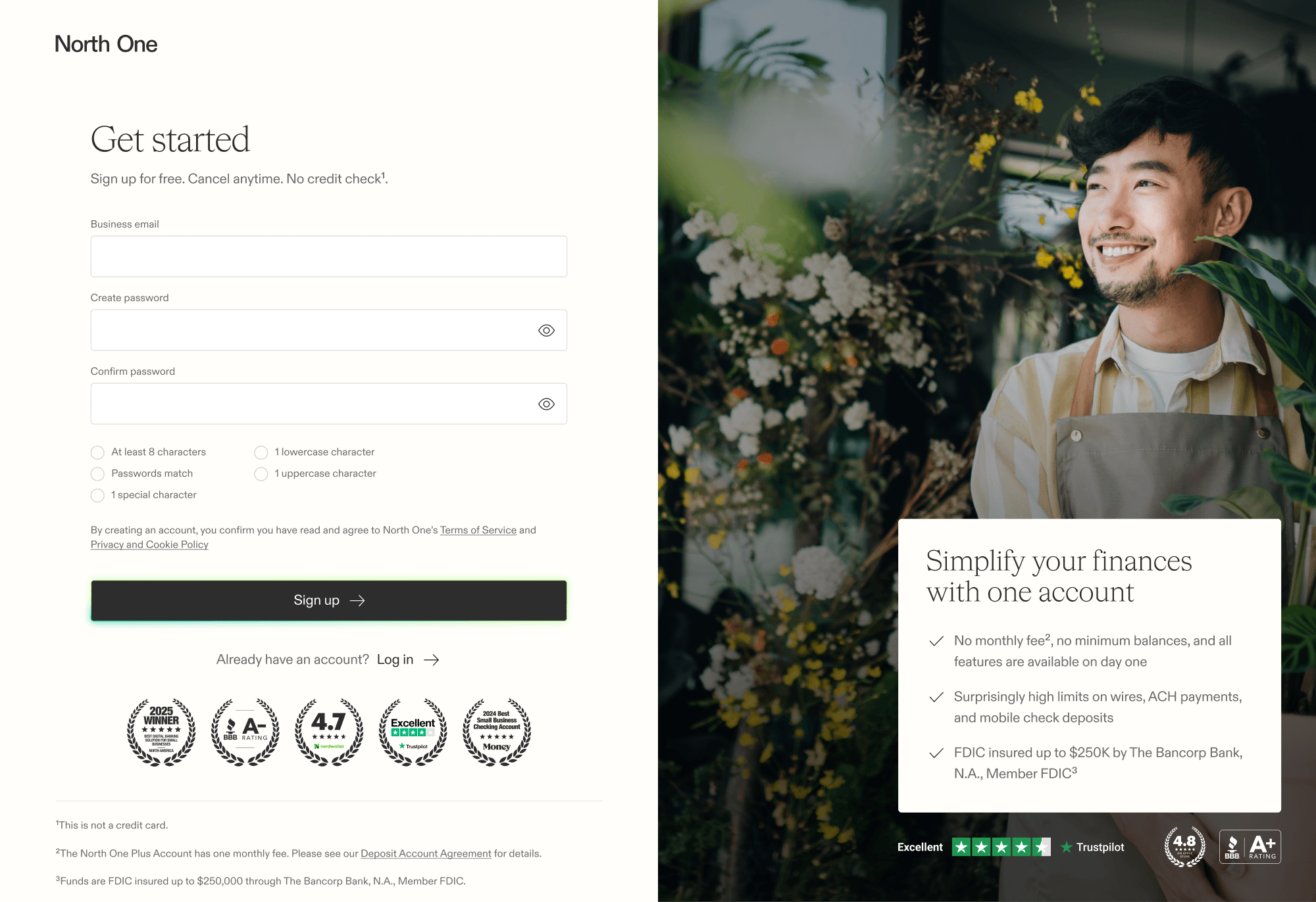
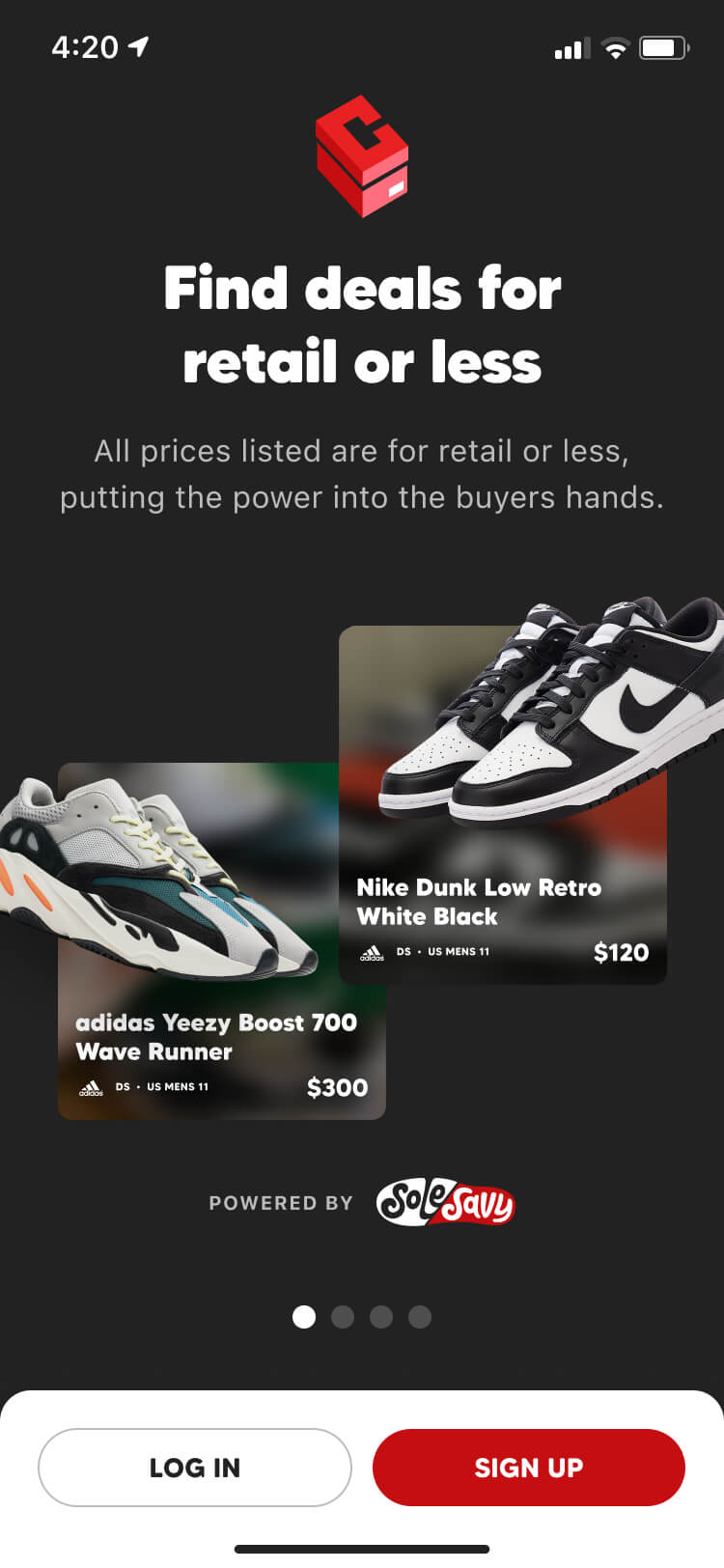
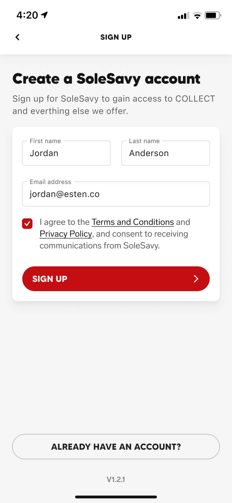
Sign up for SoleSavy
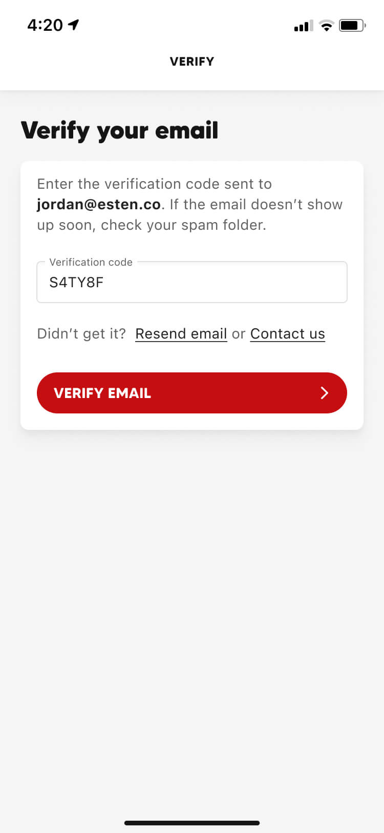
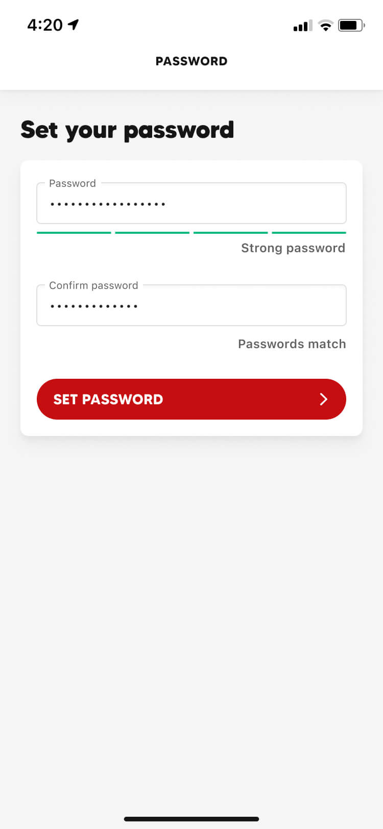
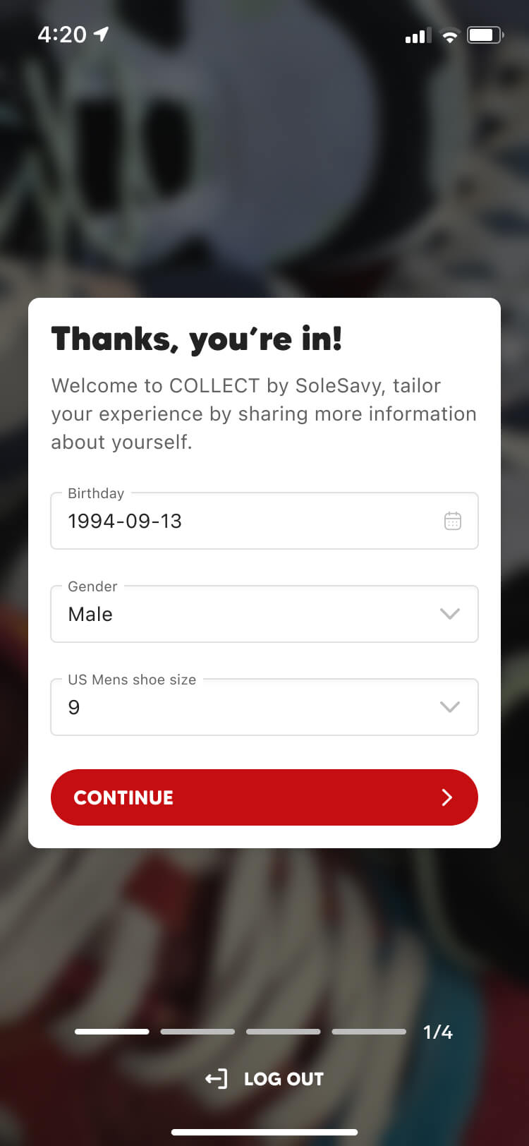
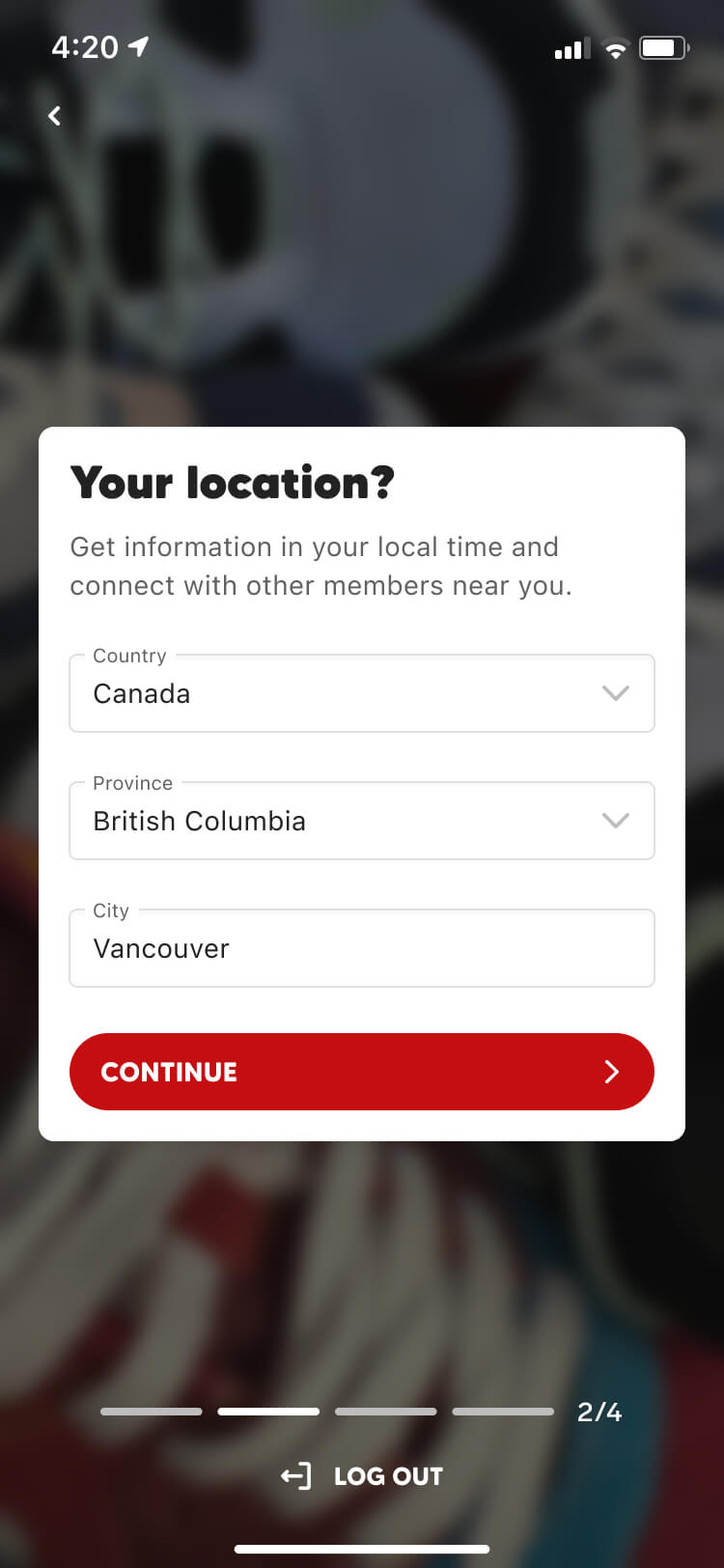
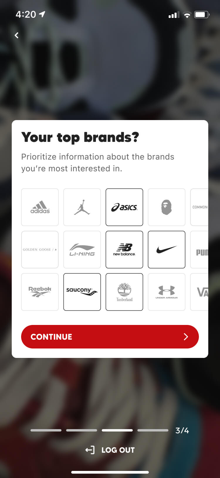
We wanted members to use the same login credentials across every SoleSavy platform, but since we also saw Collect as a marketing tool for attracting new members, we needed a way to let people in without requiring a paid membership. This eventually led us to introduce a new free membership tier, alongside a broader overhaul of our platforms that introduced paywalls and fees at key conversion areas.
Our initial launch only supported existing members, but alongside the rollout of the free tier, we released a new version of Collect that opened the platform to everyone. This became an important growth channel for SoleSavy — new users generated revenue through transaction fees, while fee-free trading and exposure to our other products gave us opportunities to convert them into paid members.
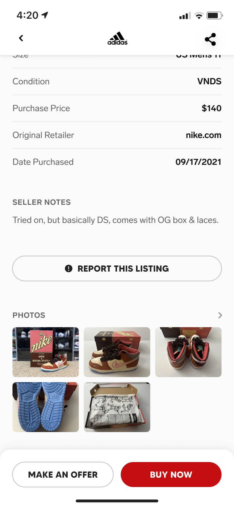
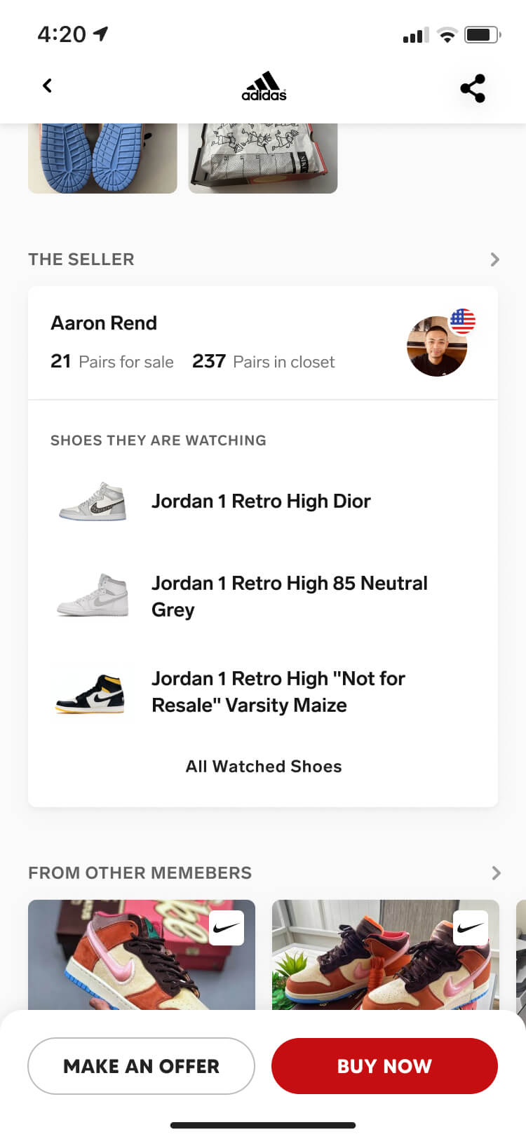
Shopping for sneakers
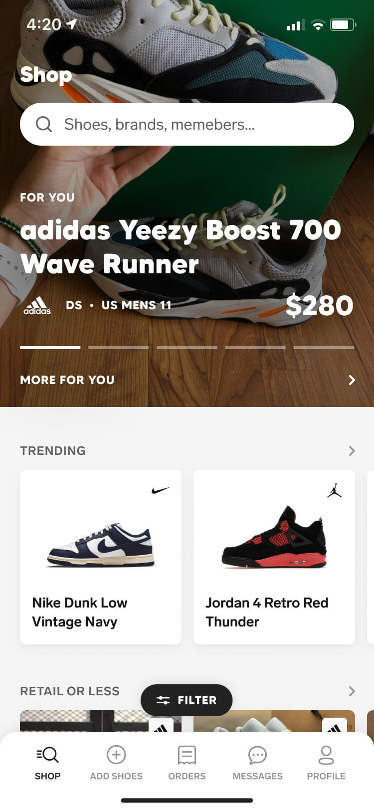
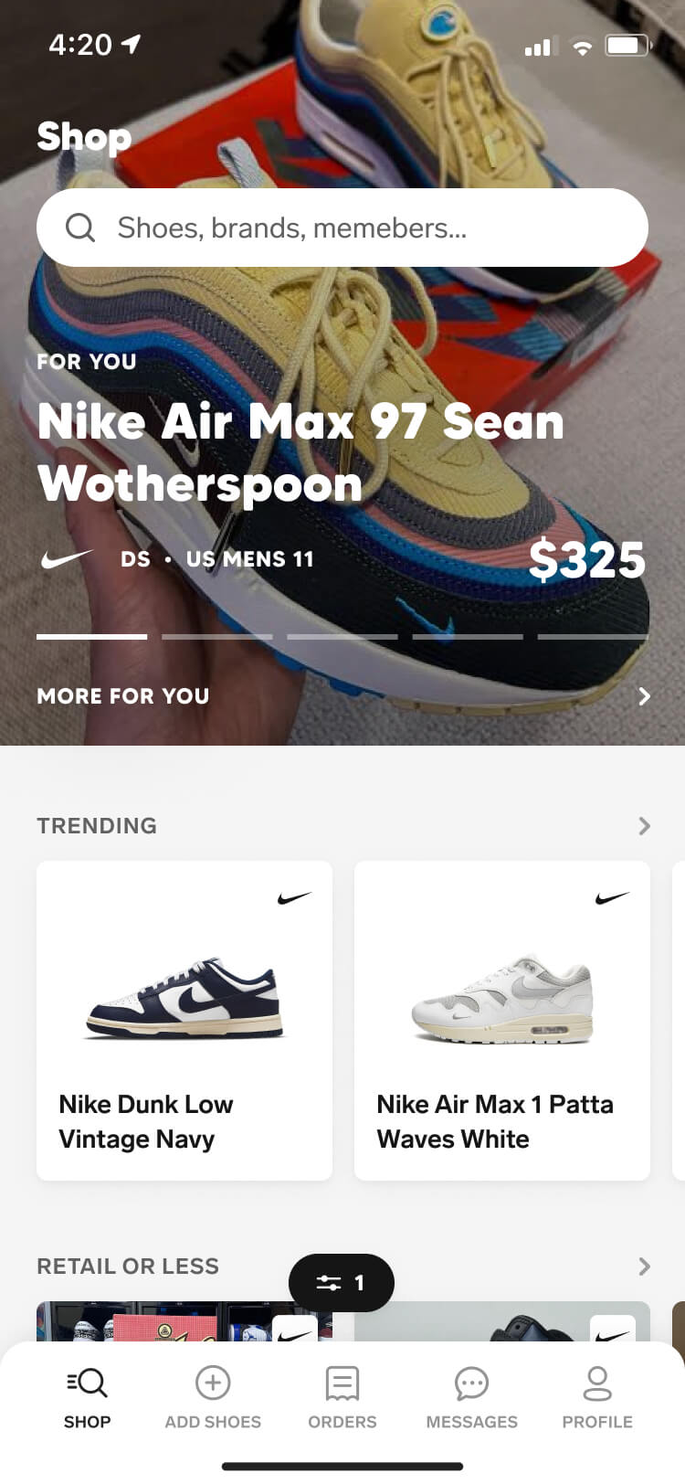
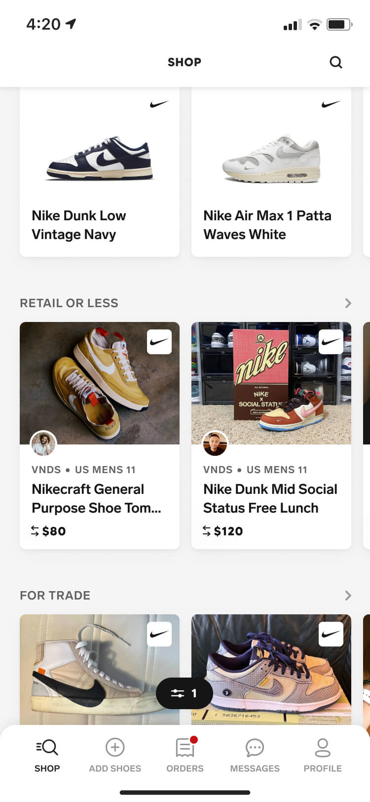
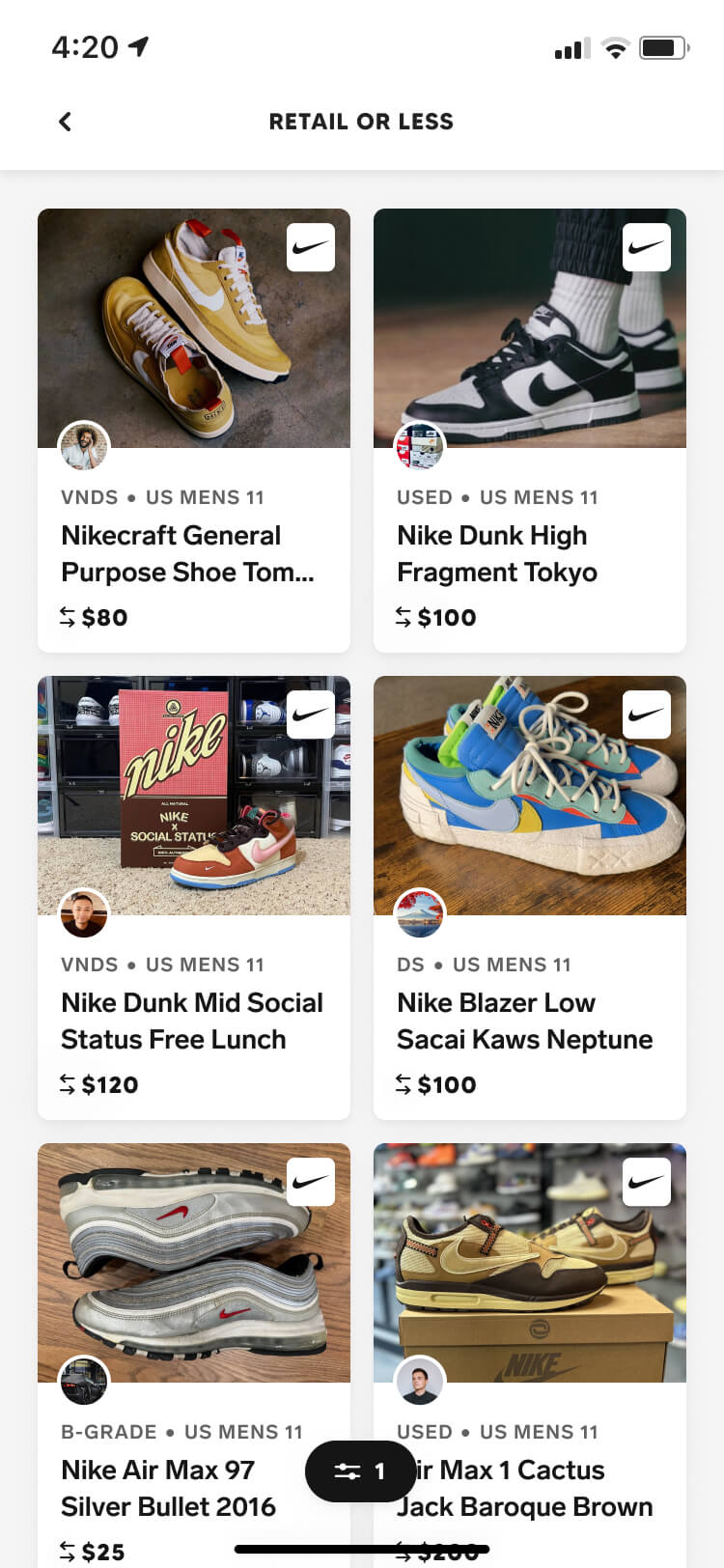
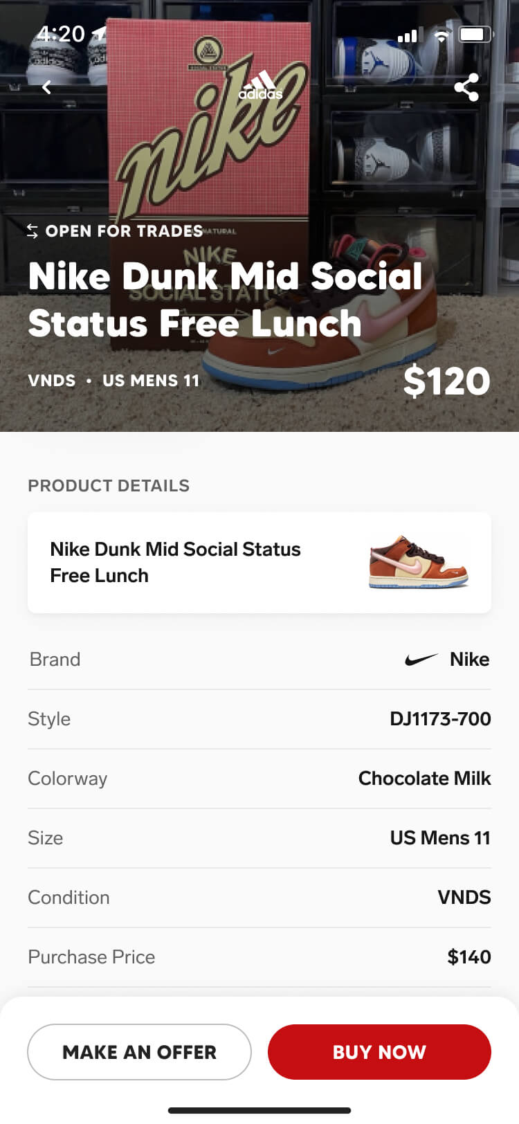
We kept most of the shopping experience that the agency designed — for the launch, we only made minor tweaks to bring each screen in line with the brand guidelines and the design system we were building.
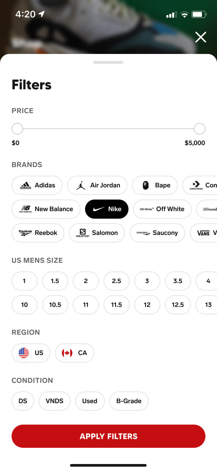
Post-launch, the experience evolved through analytics, user interviews, A/B testing, and the addition of the filter feature — improving how users discover listings as well as the language and layout used on those listings.
Adding shoes
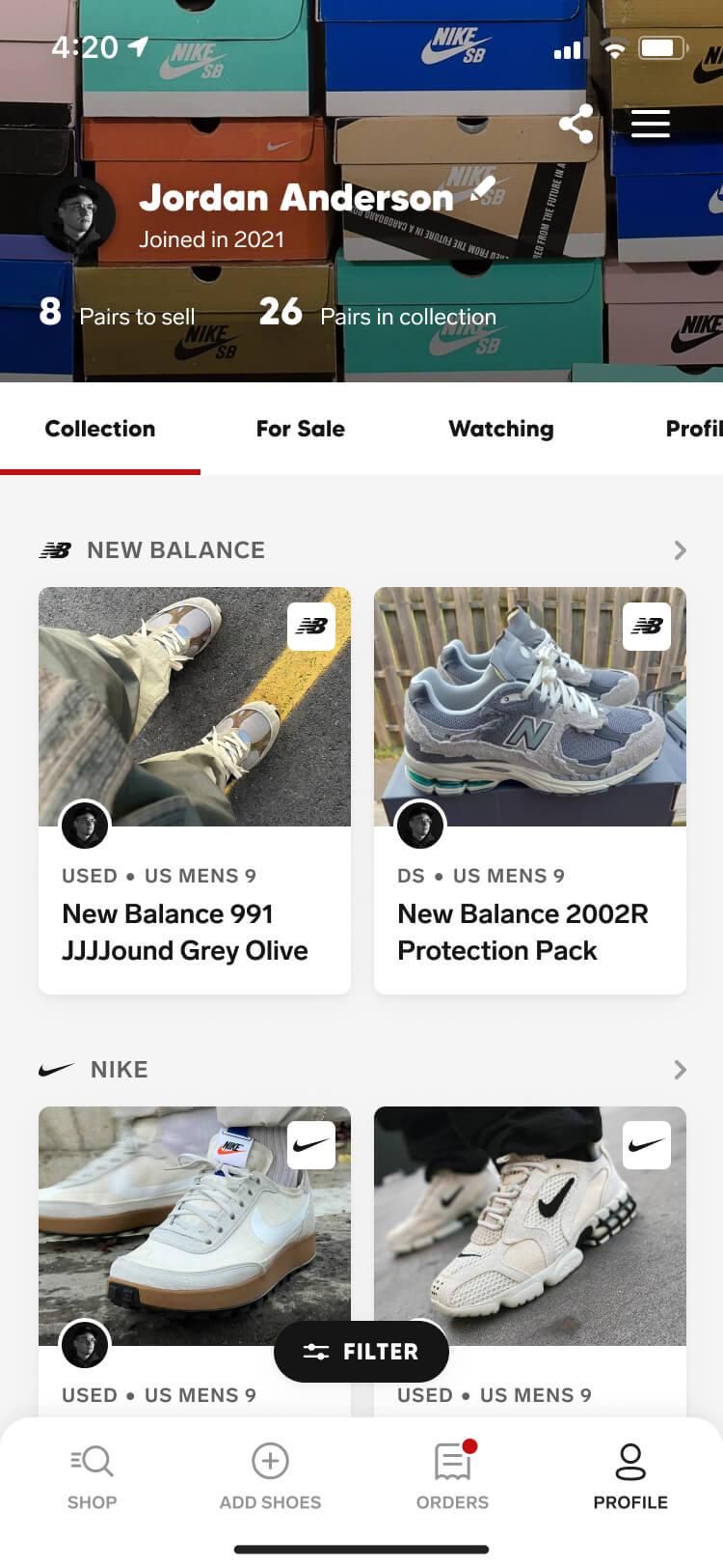
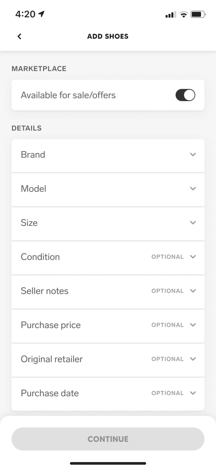
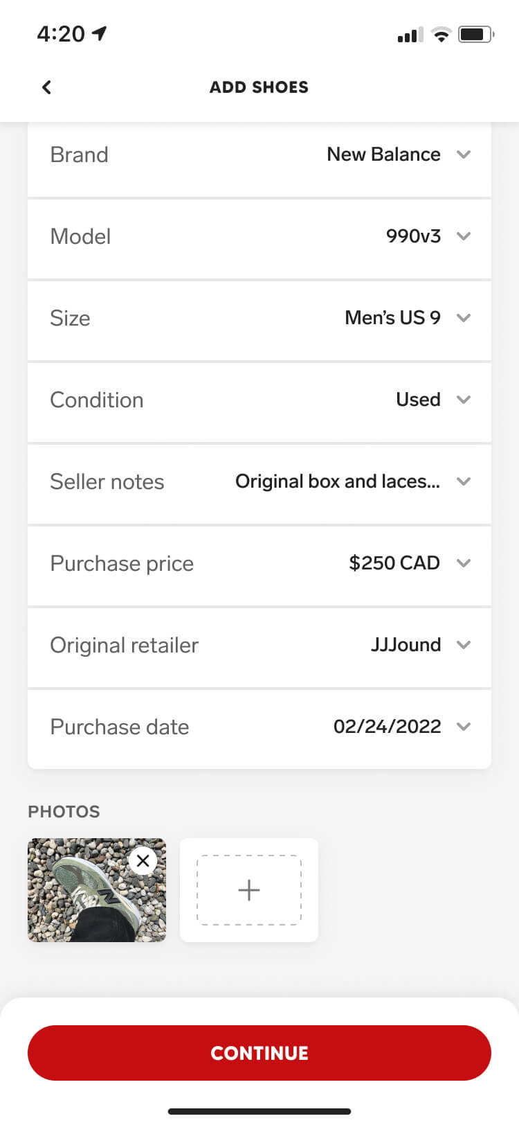
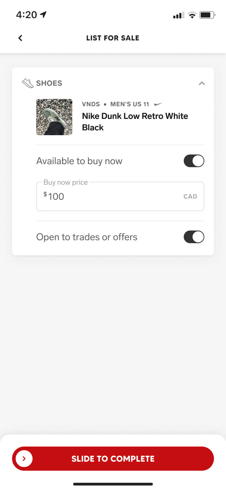
Adding shoes served two purposes — it gave members a way to show off their entire collection through just a link, and the shoes they add can be used as marketplace listings if and when the user decides to sell or trade them.
Similar to the shopping experience, the majority of work here was applying our brand guidelines and design system before launch. The existing designs were intuitive and flexible enough to evolve over time.
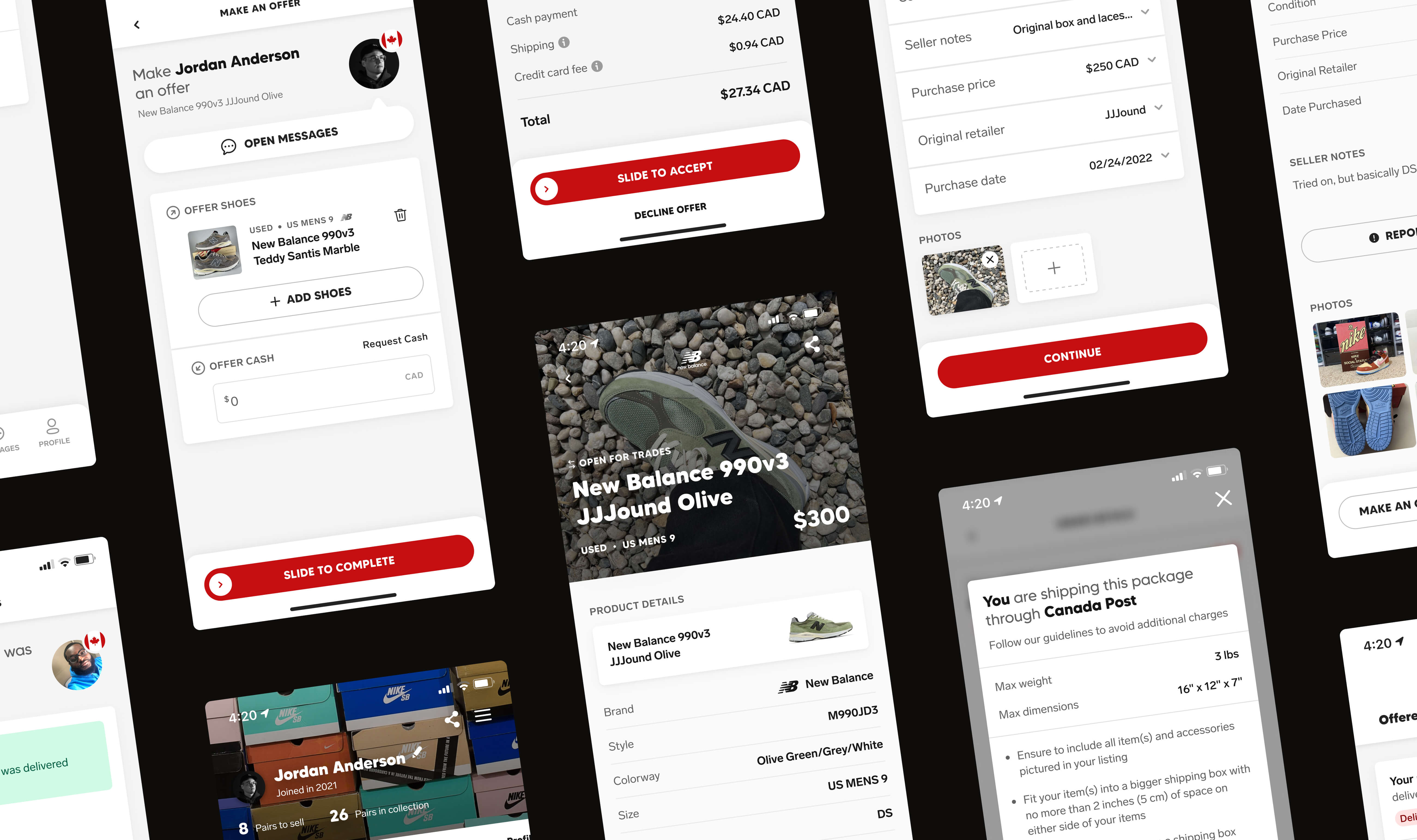
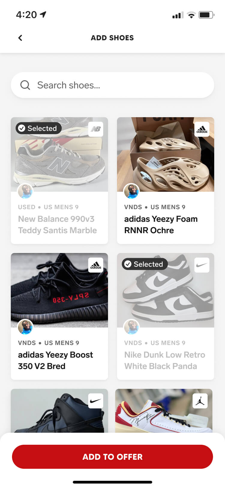
Making an offer
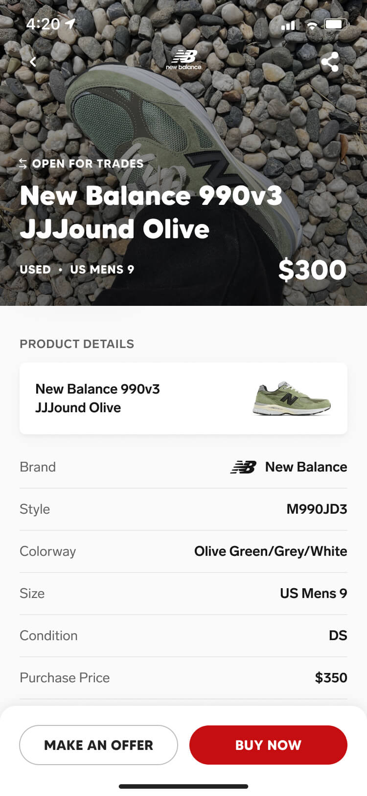
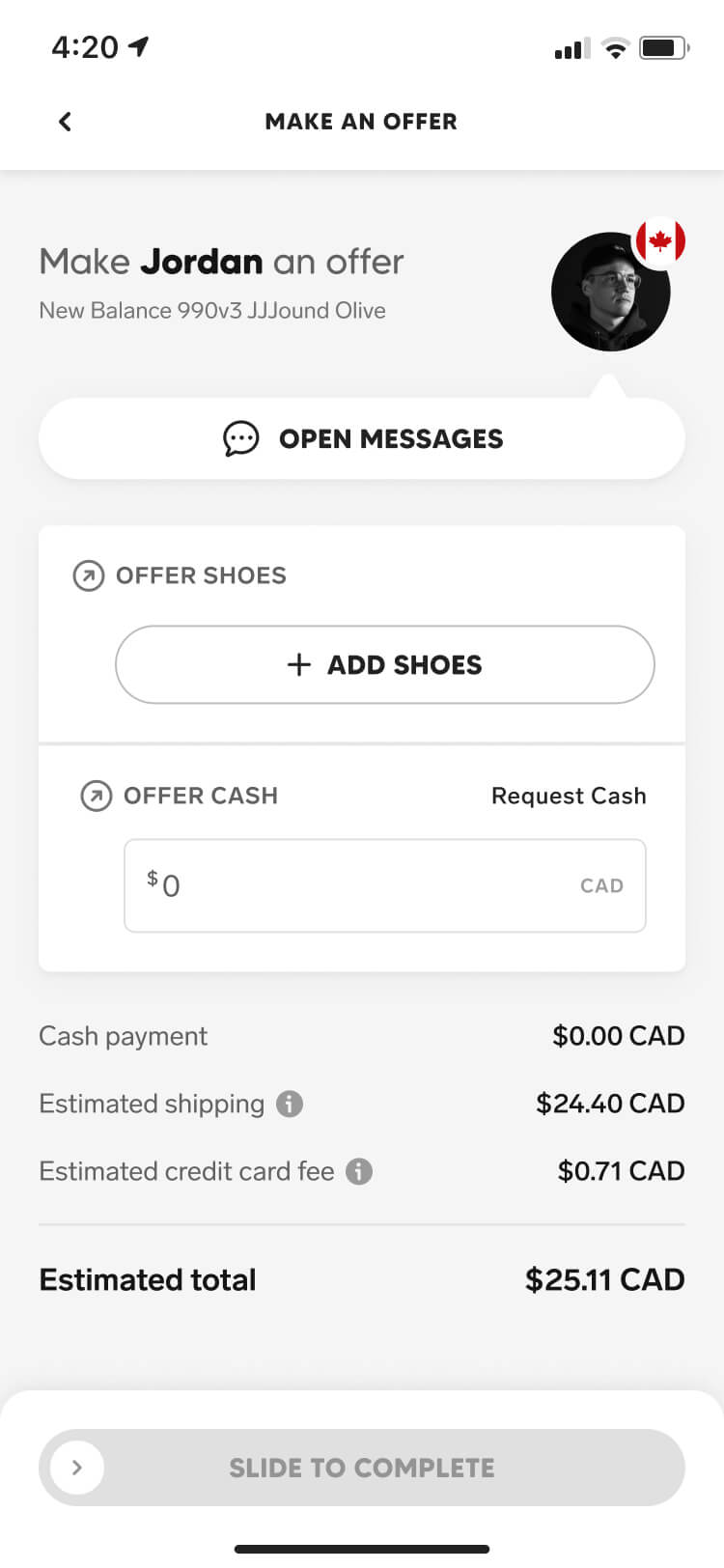
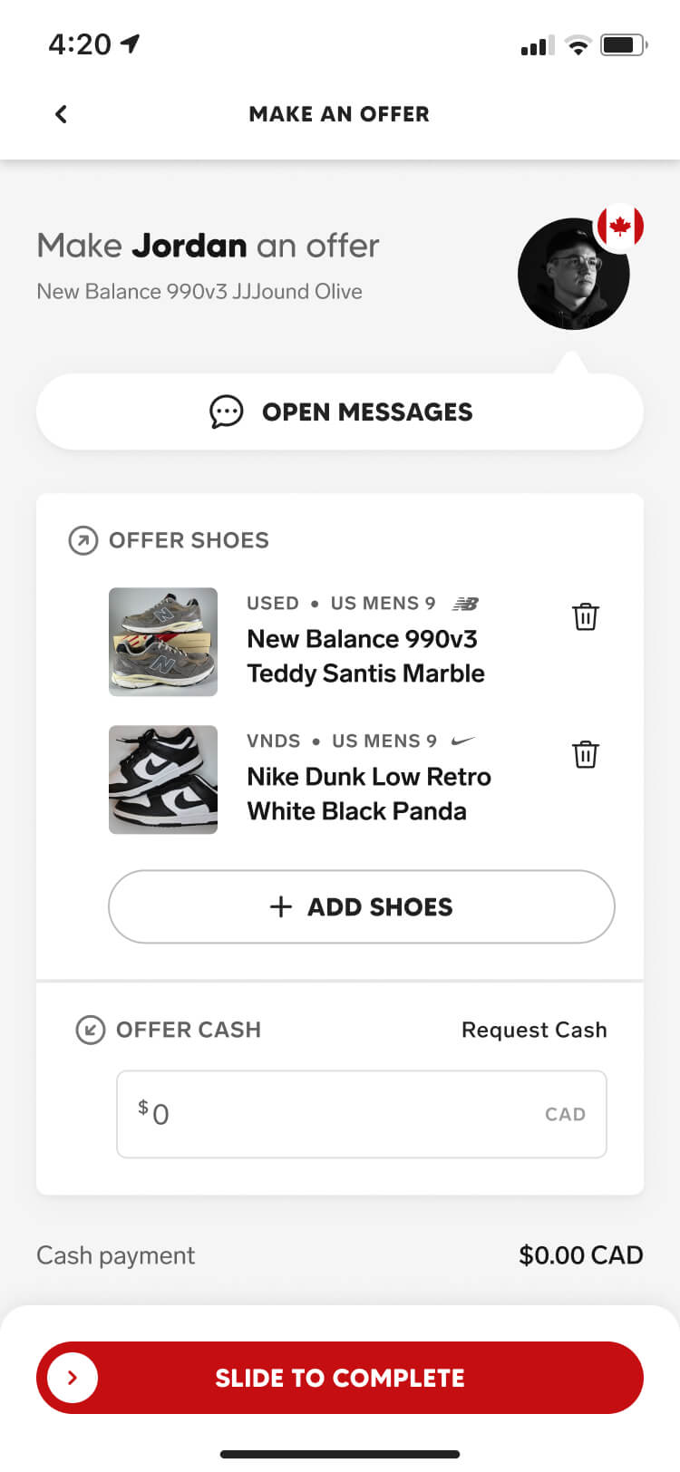
Before launch, we spent a lot of time making sure our offer flows reflected the same value they could bring to Collect and the community — giving members a way to build multi-pair deals under the safety of identity verification.
The main design challenge was fitting all of the necessary content and functionality into one intuitive screen. We wanted users to build, review, and understand an offer without bouncing between multiple steps.
Receiving an offer
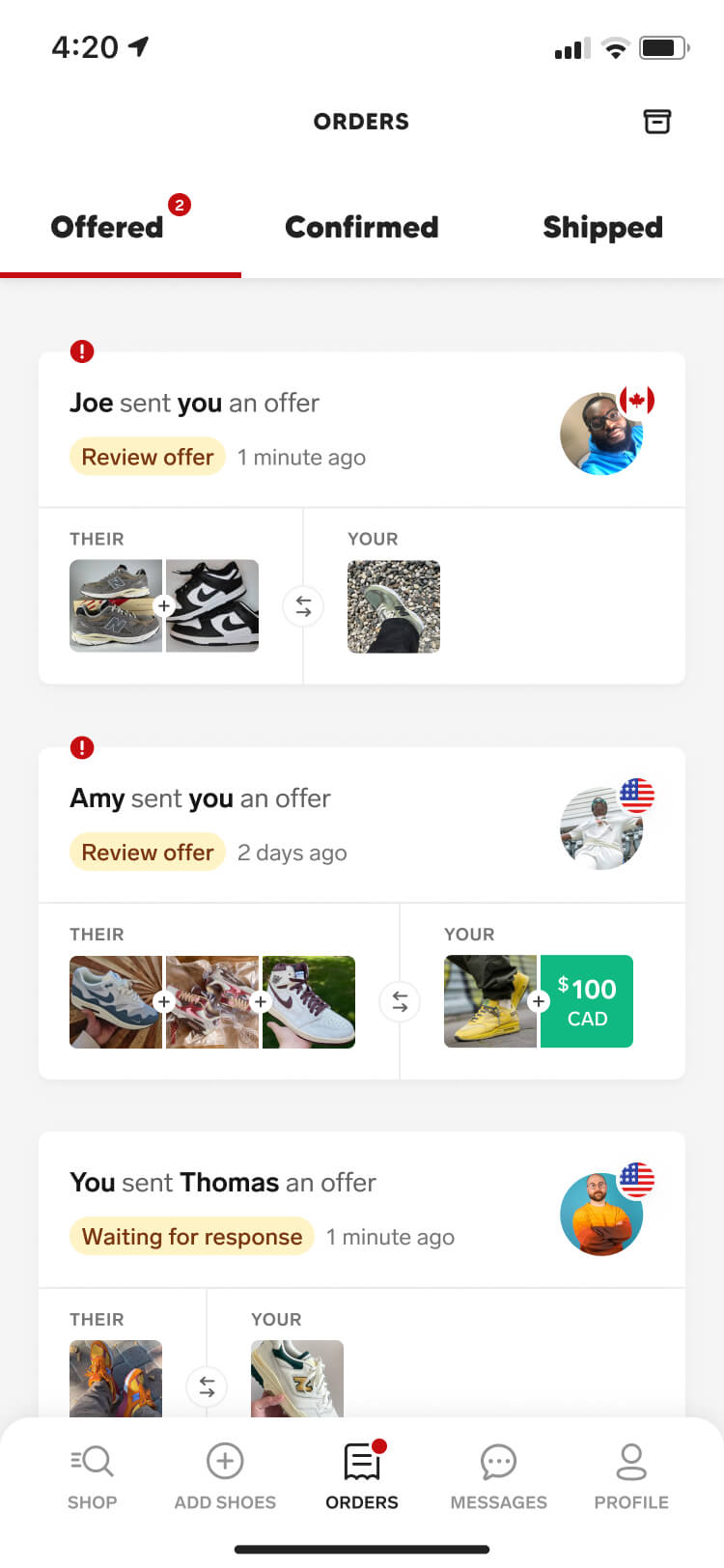
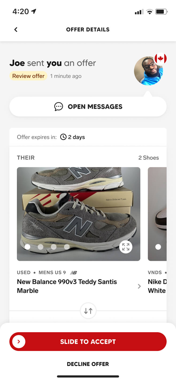
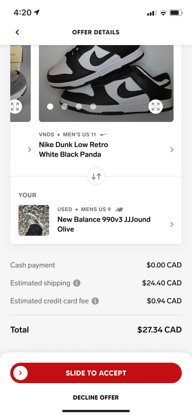
Once an offer is sent or received, it appears in the Offered tab — giving users a place to find and track every open negotiation. The primary focus here was to ensure recipients could quickly understand what was being proposed, that meant creating a clear hierarchy of information that included everything a recipient needed to consider.
Accepted offers
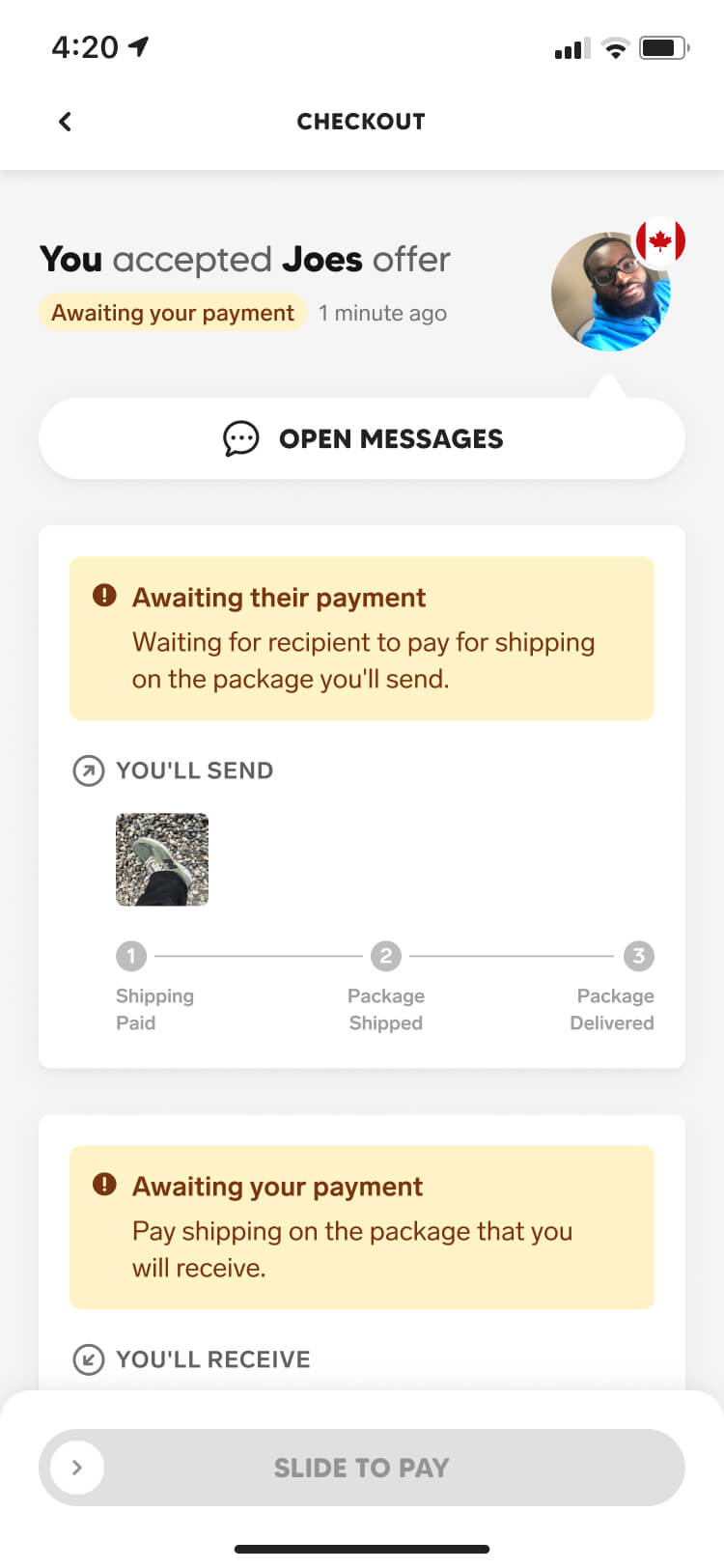
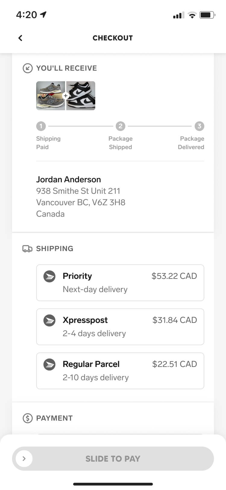
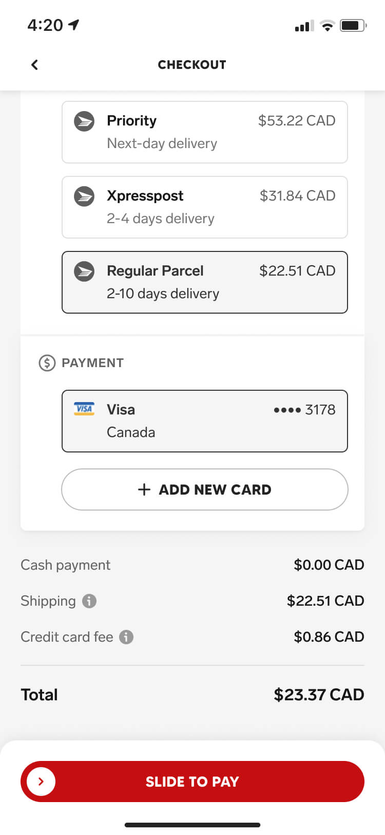
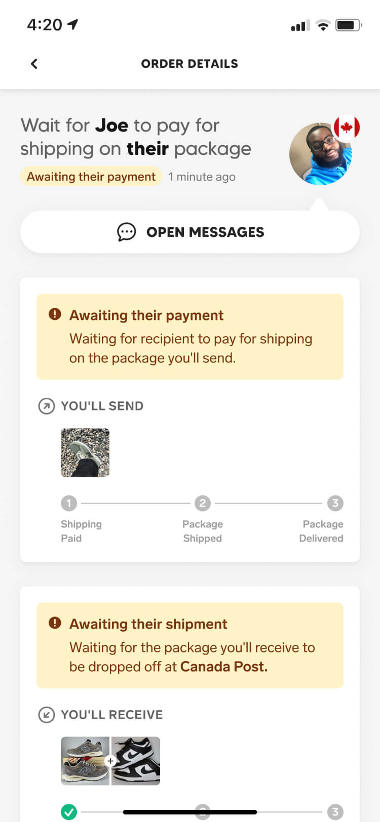
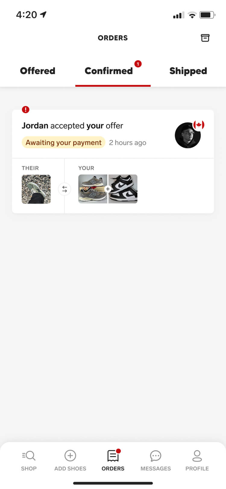
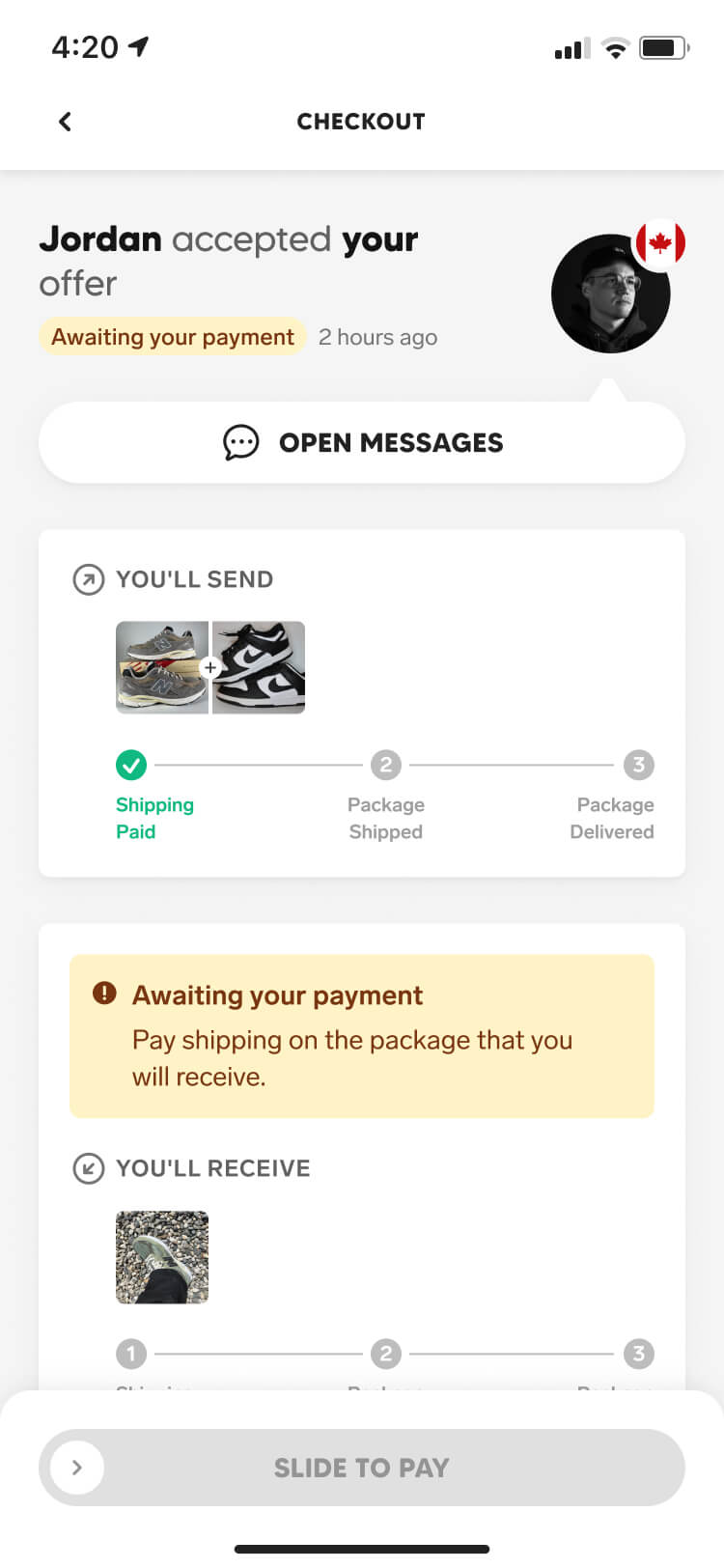
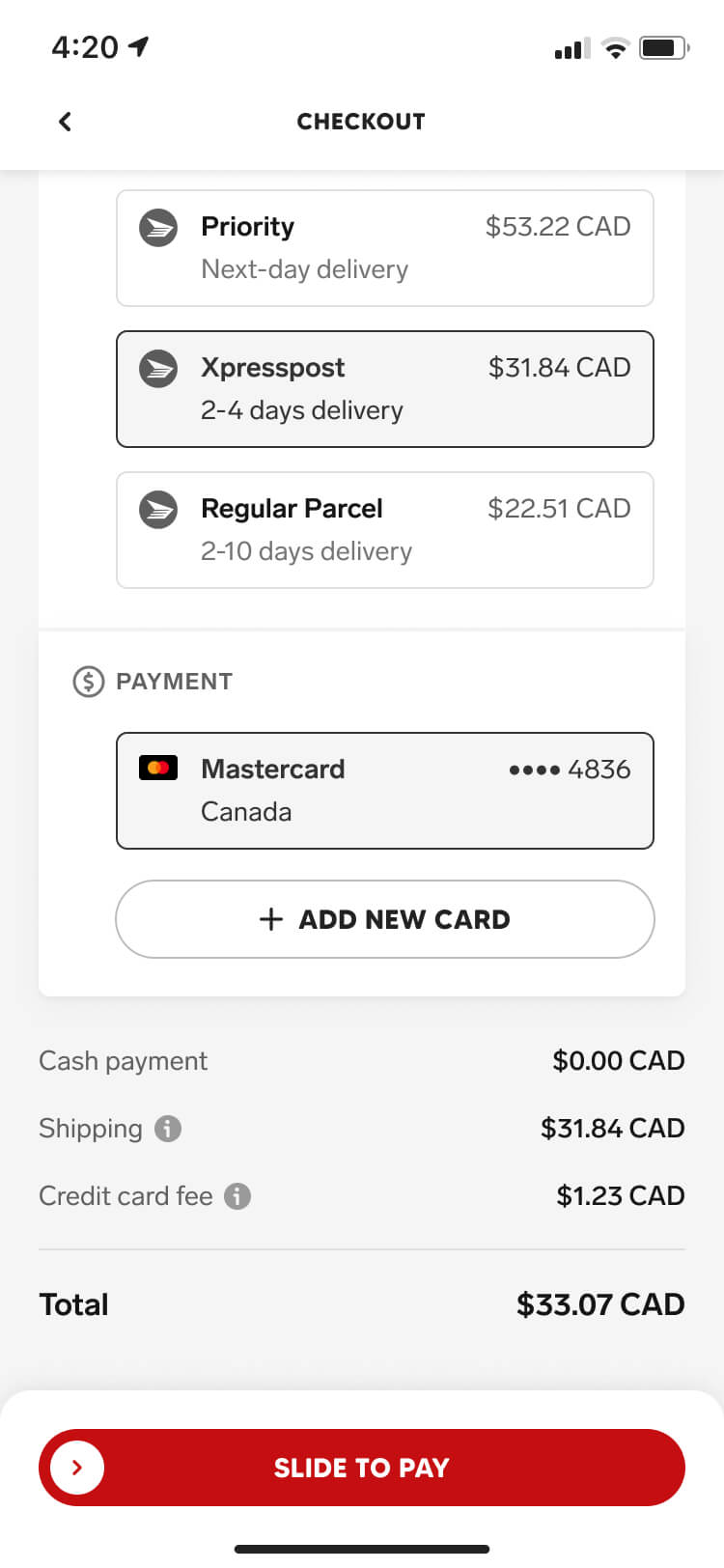
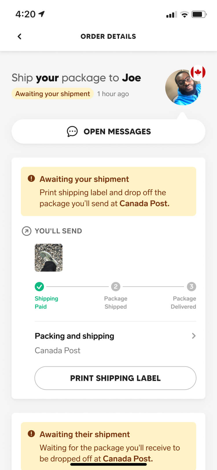
Once an offer is accepted, the order moves into the Confirmed tab — where each user is guided through the final details of their offer. First we ensure all packages have paid shipping labels, before then guiding them on how to ship their order.
Shipping an order
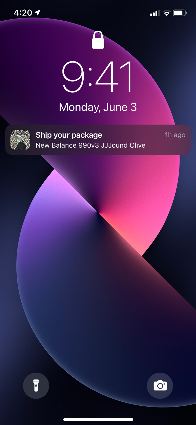
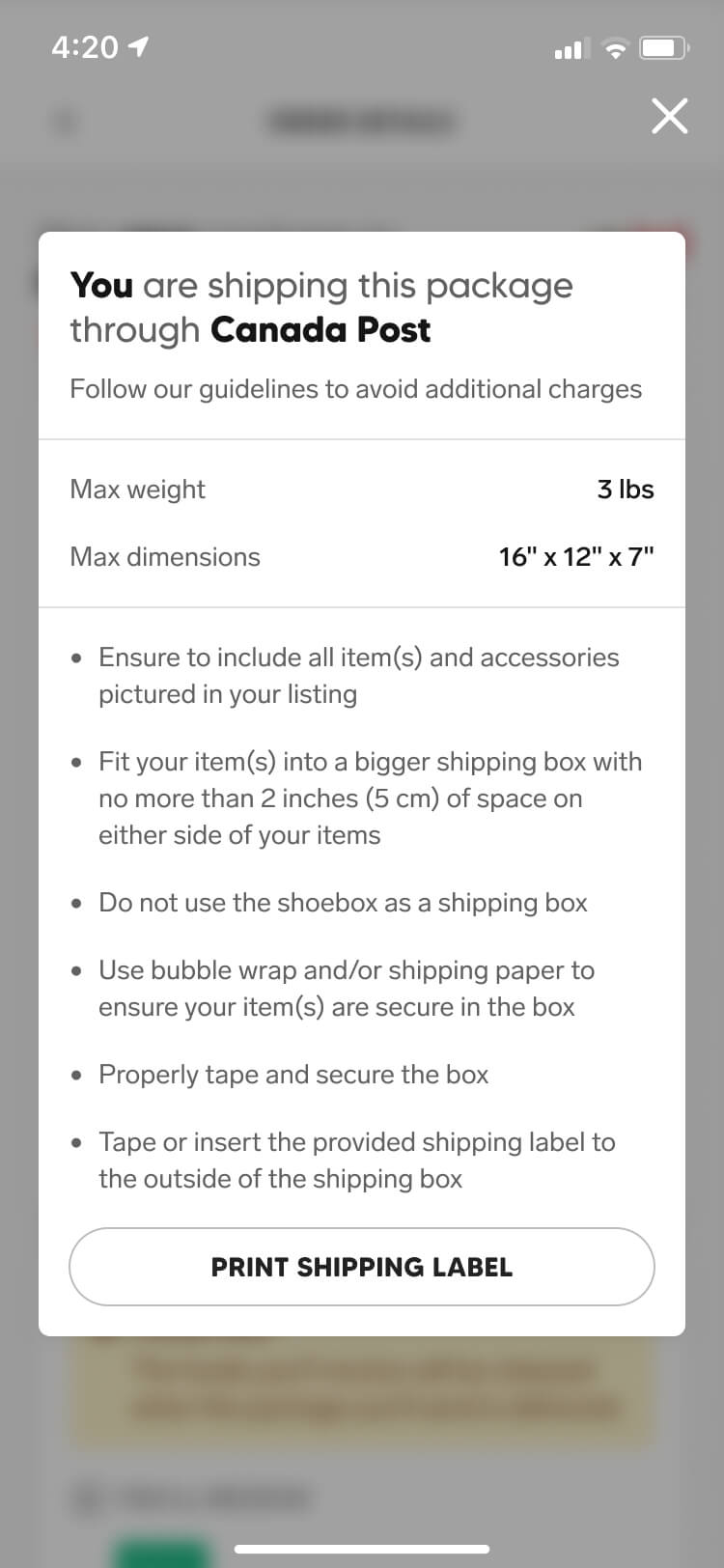
Once both shipping labels are paid for, each user is instructed on how to properly prepare and ship their package. By automating our shipping label generation, users could instantly print their label without leaving the app or manually entering package details.
Order status
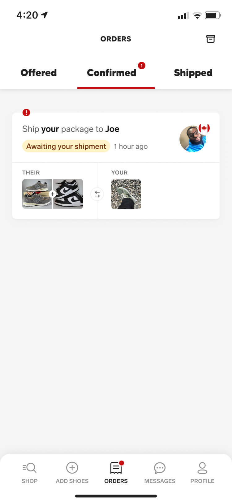
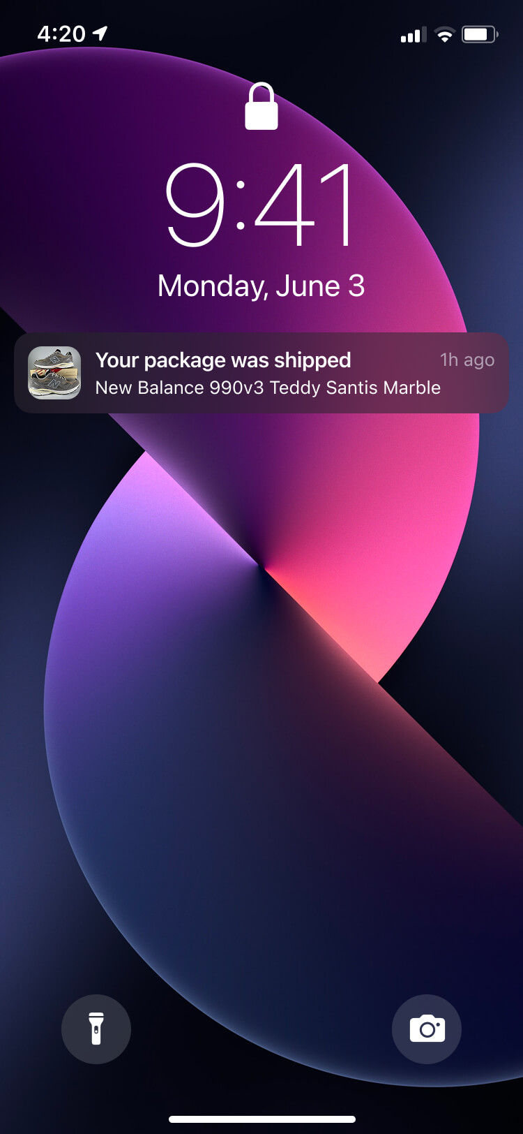
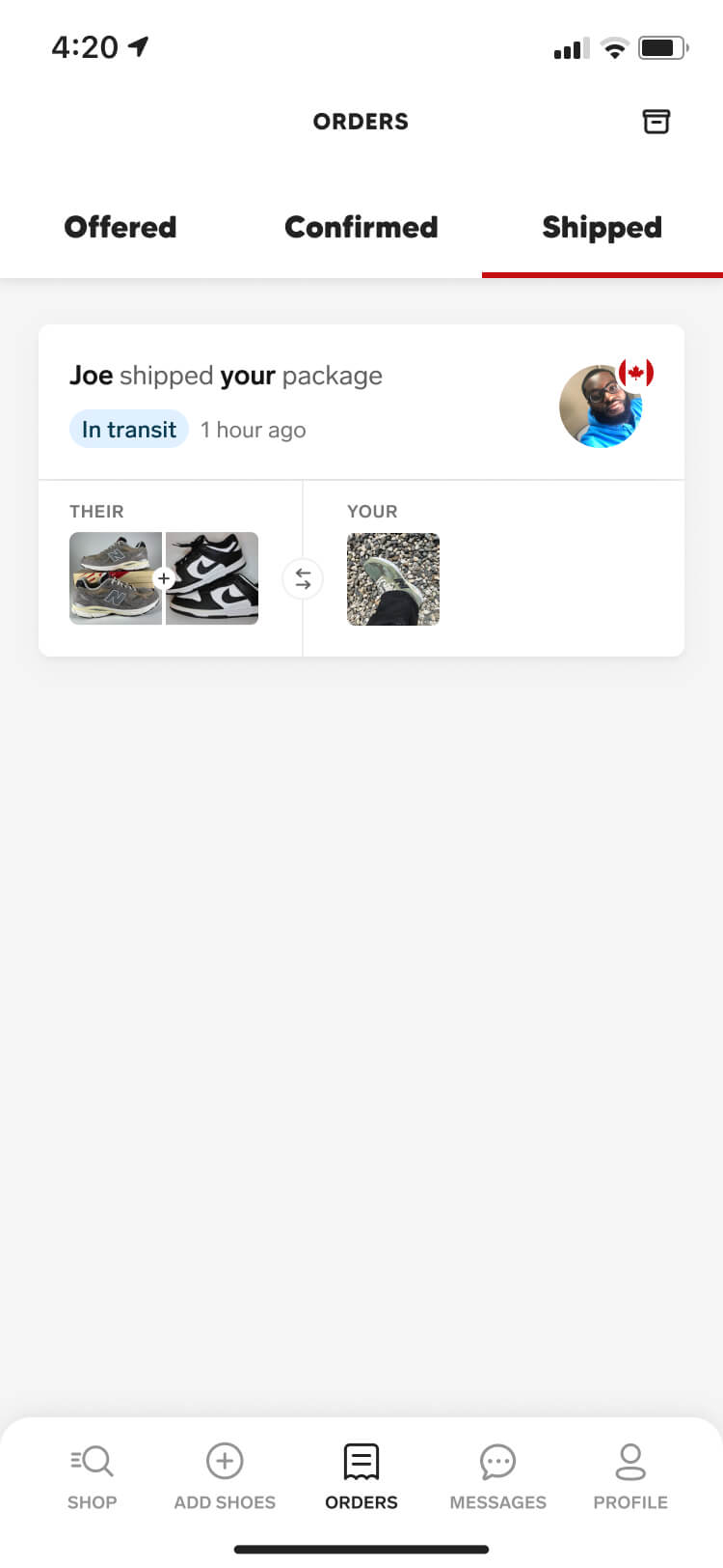
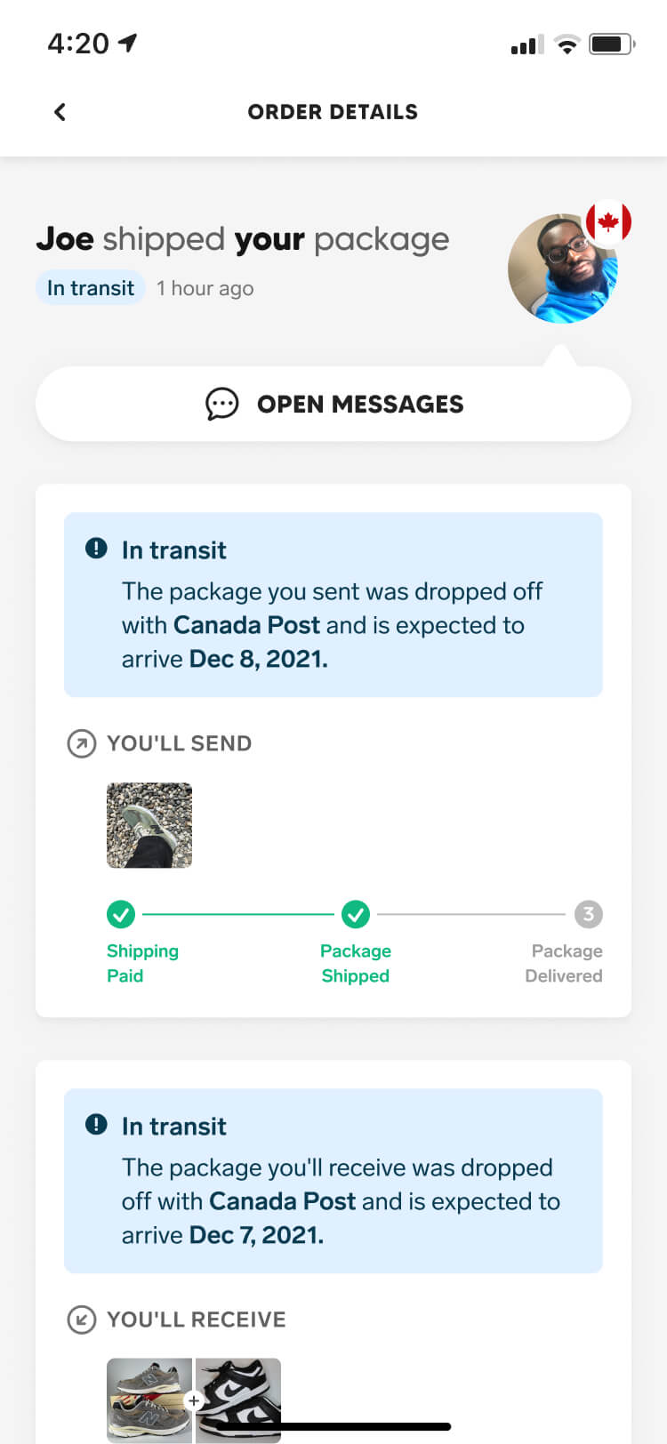
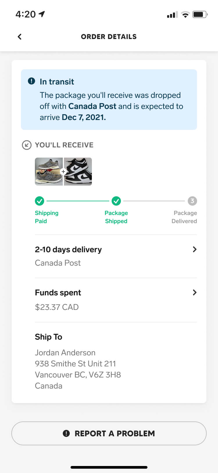
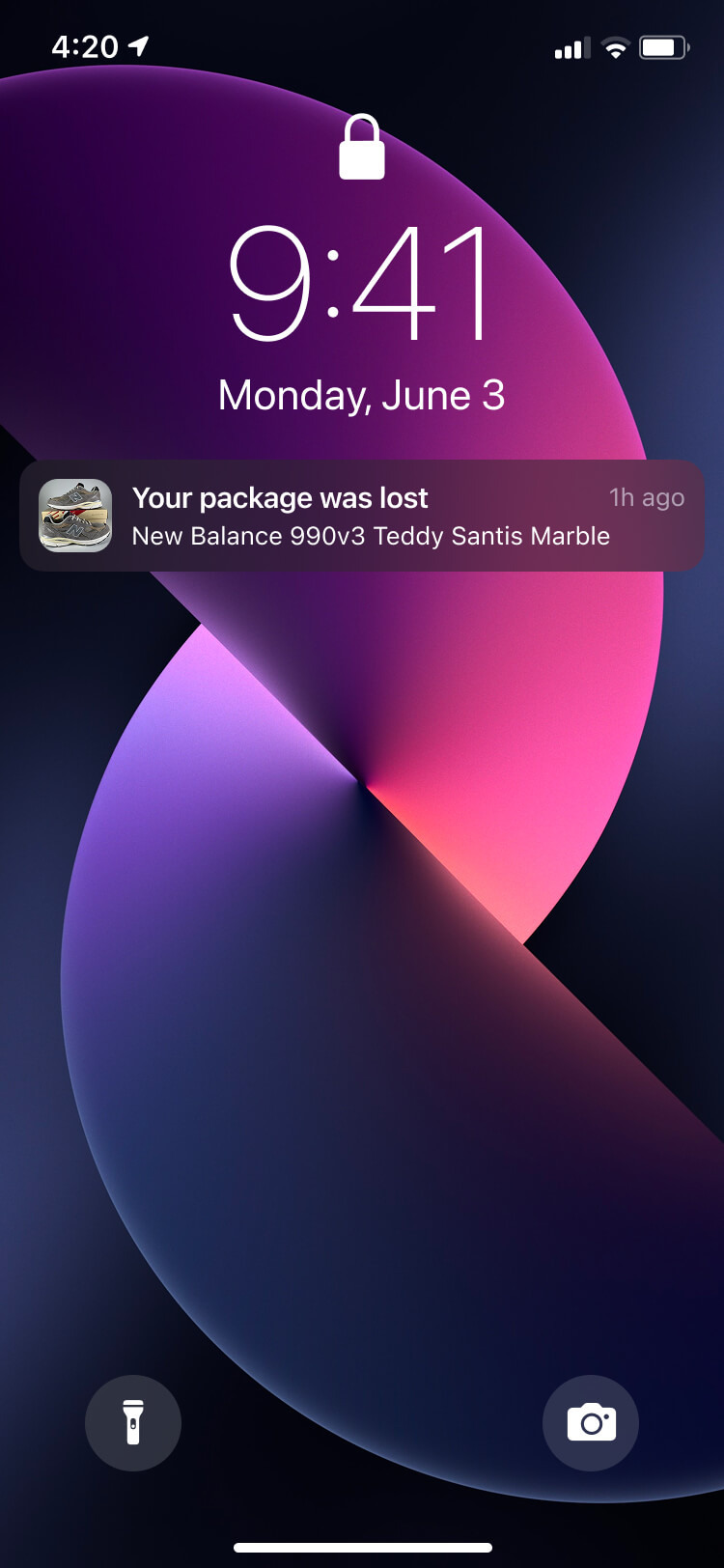
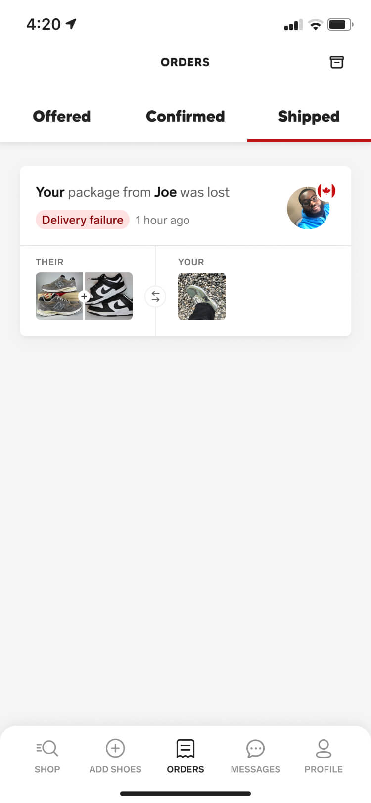
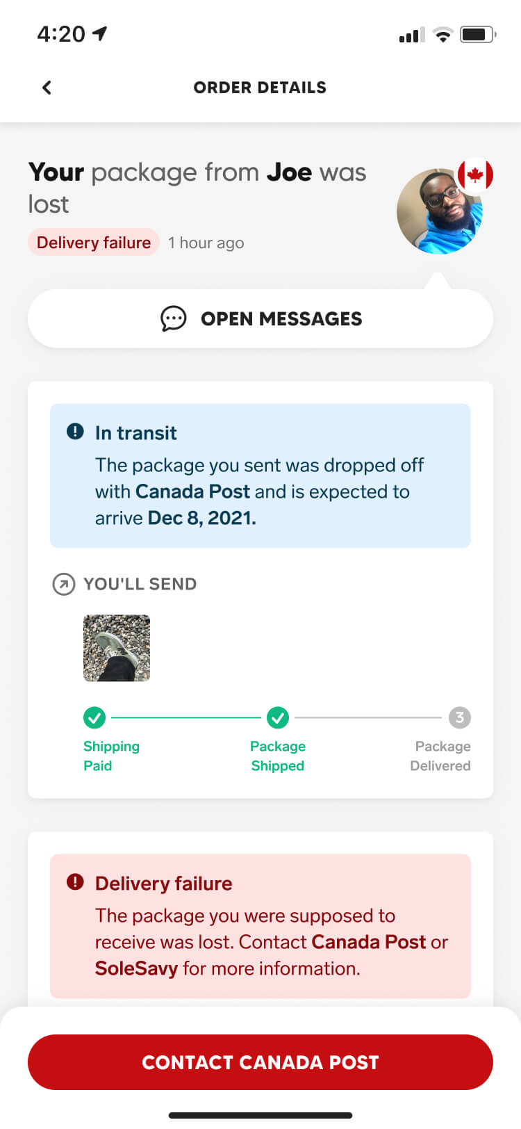
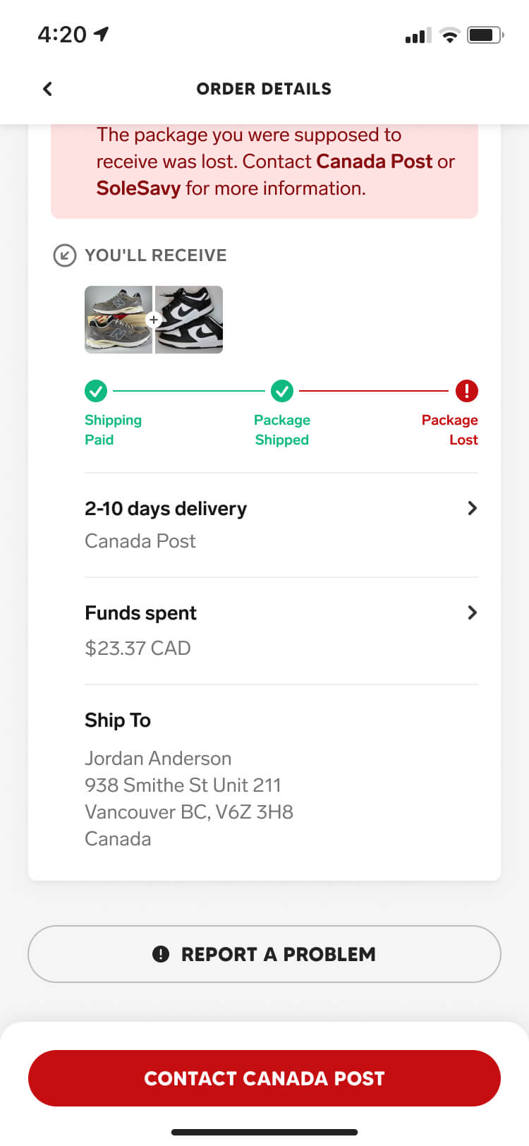
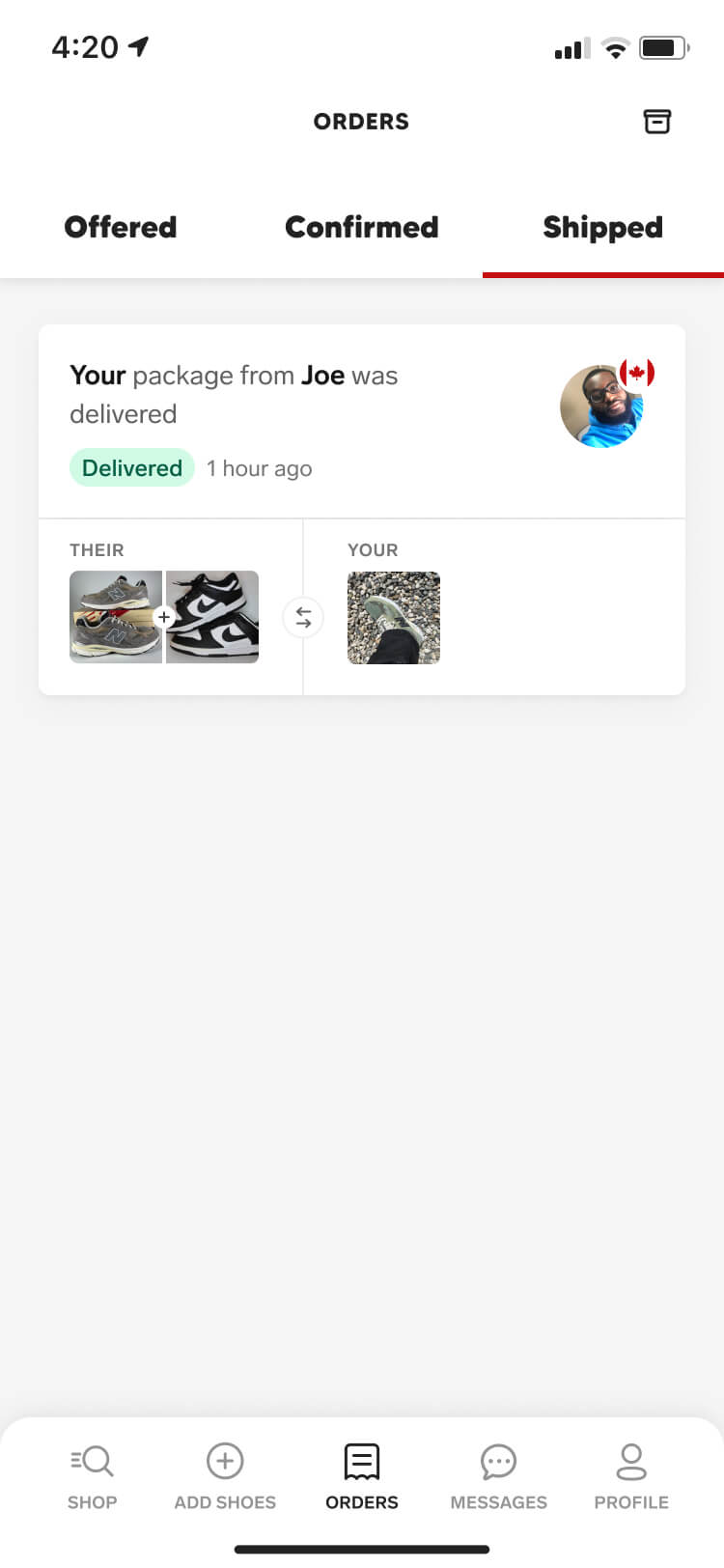
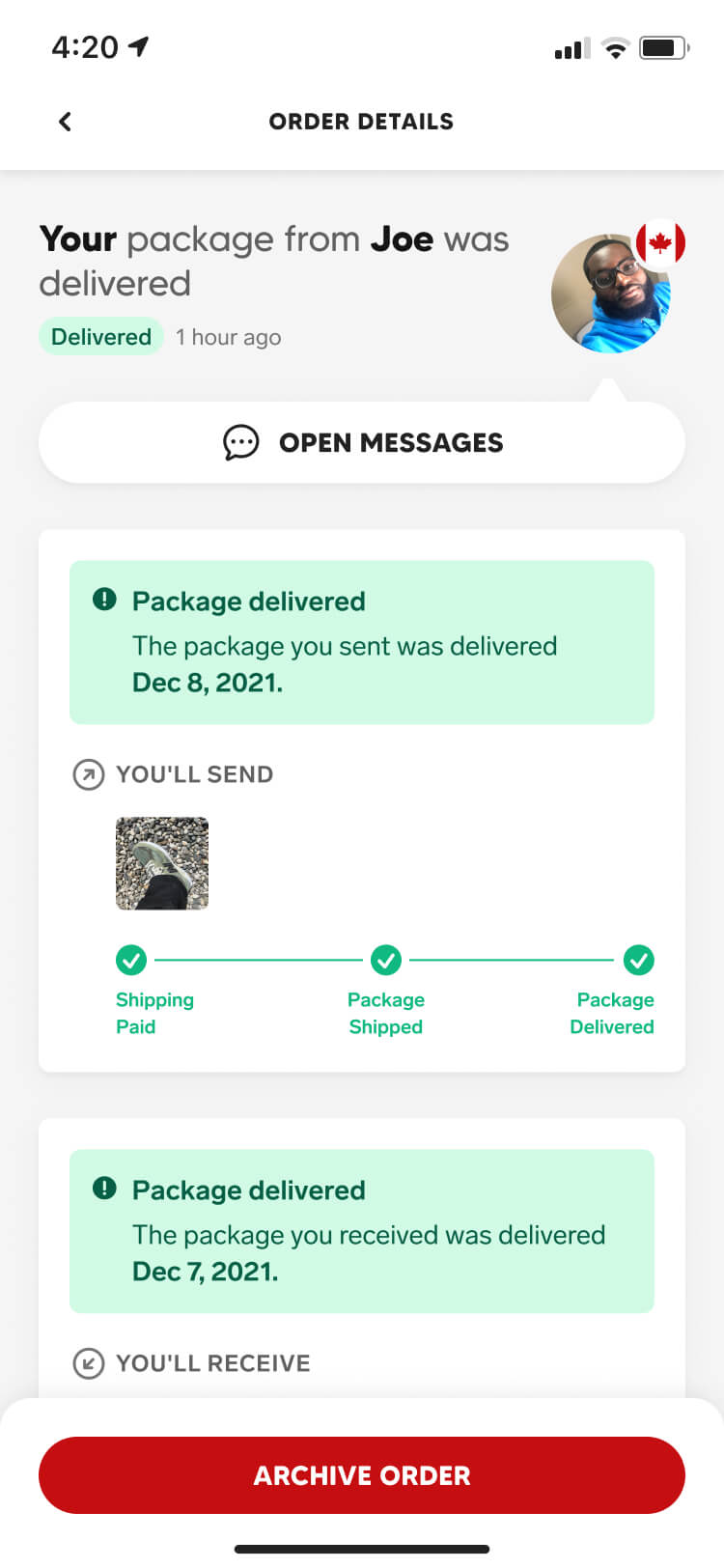
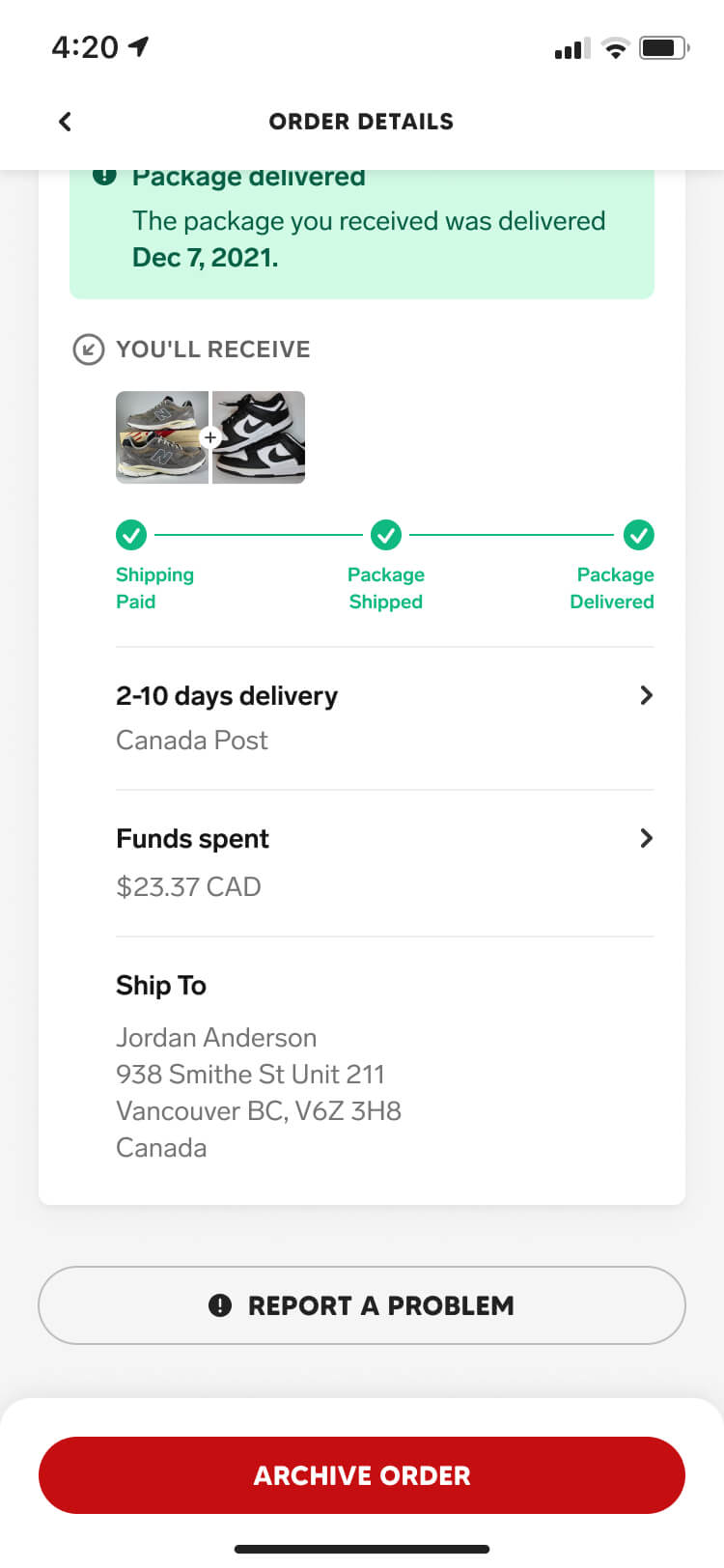
Our research and ideation told us every order state we needed to consider. Whether it was a failed transaction, failed delivery, or lost package — we treated fail states with the same priority as our happy path. Those moments are the ones that most directly determine whether a user trusts the platform enough to transact again.
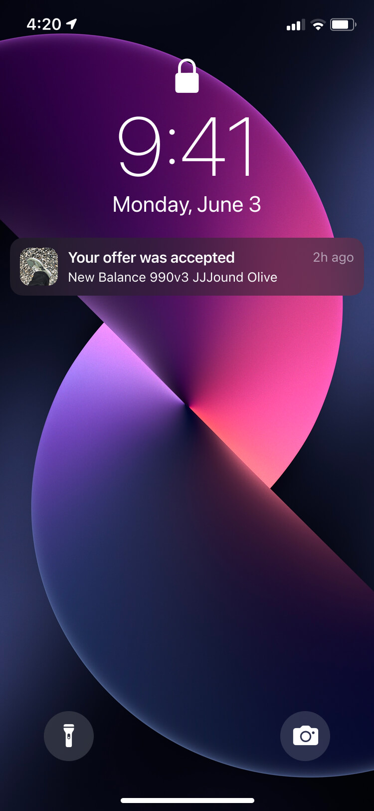
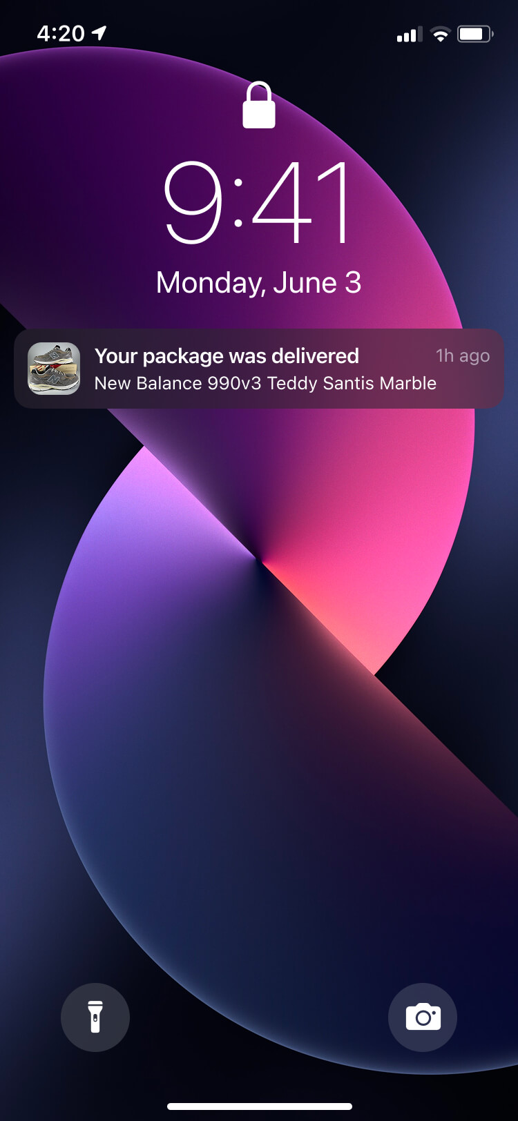
The design focused on ensuring both parties knew exactly where their order stood and what, if anything, they needed to do — using notifications to proactively update users when a status changed, with tailored communication for each user.
Impact
After beta testing and addressing the issues uncovered by our focus group, we finally launched Collect to the SoleSavy community. Over the next two years, Collect continued to grow and evolve through user interviews, testing, analytics, and shifting business goals.
Public launch
After rounds of learning and iteration, we opened Collect to the public alongside our free membership tier. This created a new acquisition channel and allowed us to monetise those users through transaction fees, while giving them an incentive to upgrade. Through continued A/B testing, we increased upgrade conversions by over 31% following the public launch.
Community led
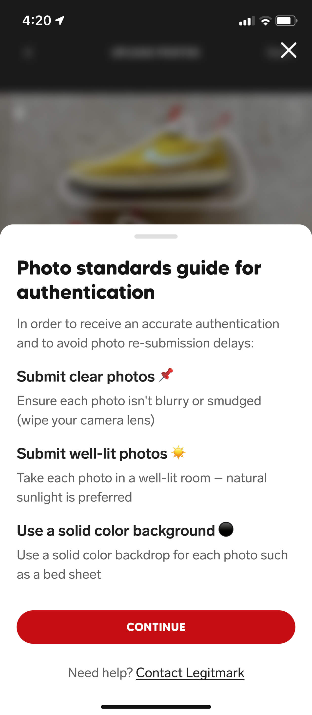
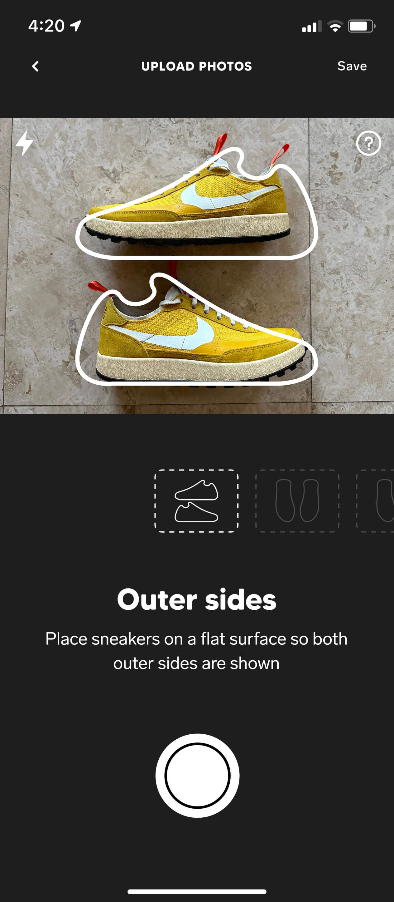
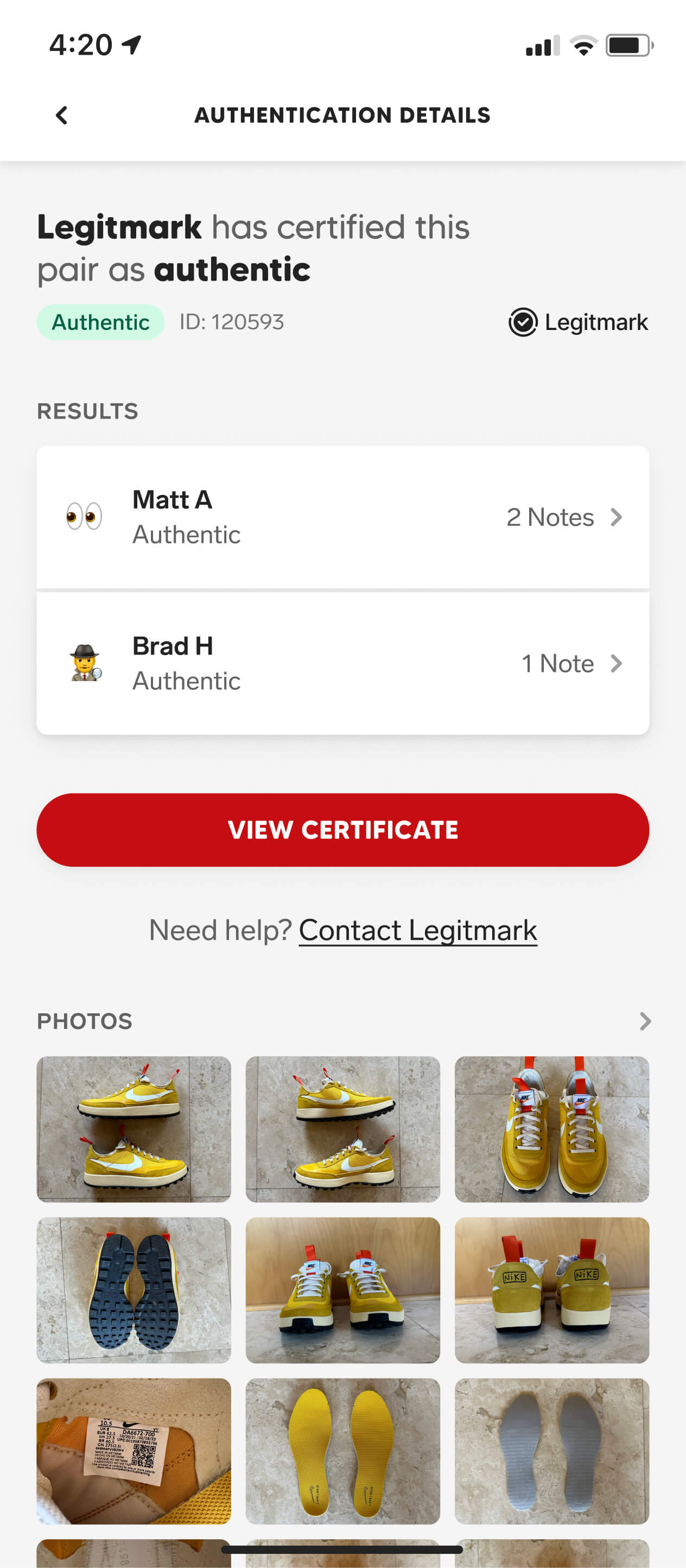
While we still needed to consider our business goals, the community had a hand in everything we built — whether through focus groups, polls, or interviews. Our sneaker authentication feature is a perfect example of that balance, originating directly from user feedback and ultimately helping increase our transaction rate by over 24%.