Overview
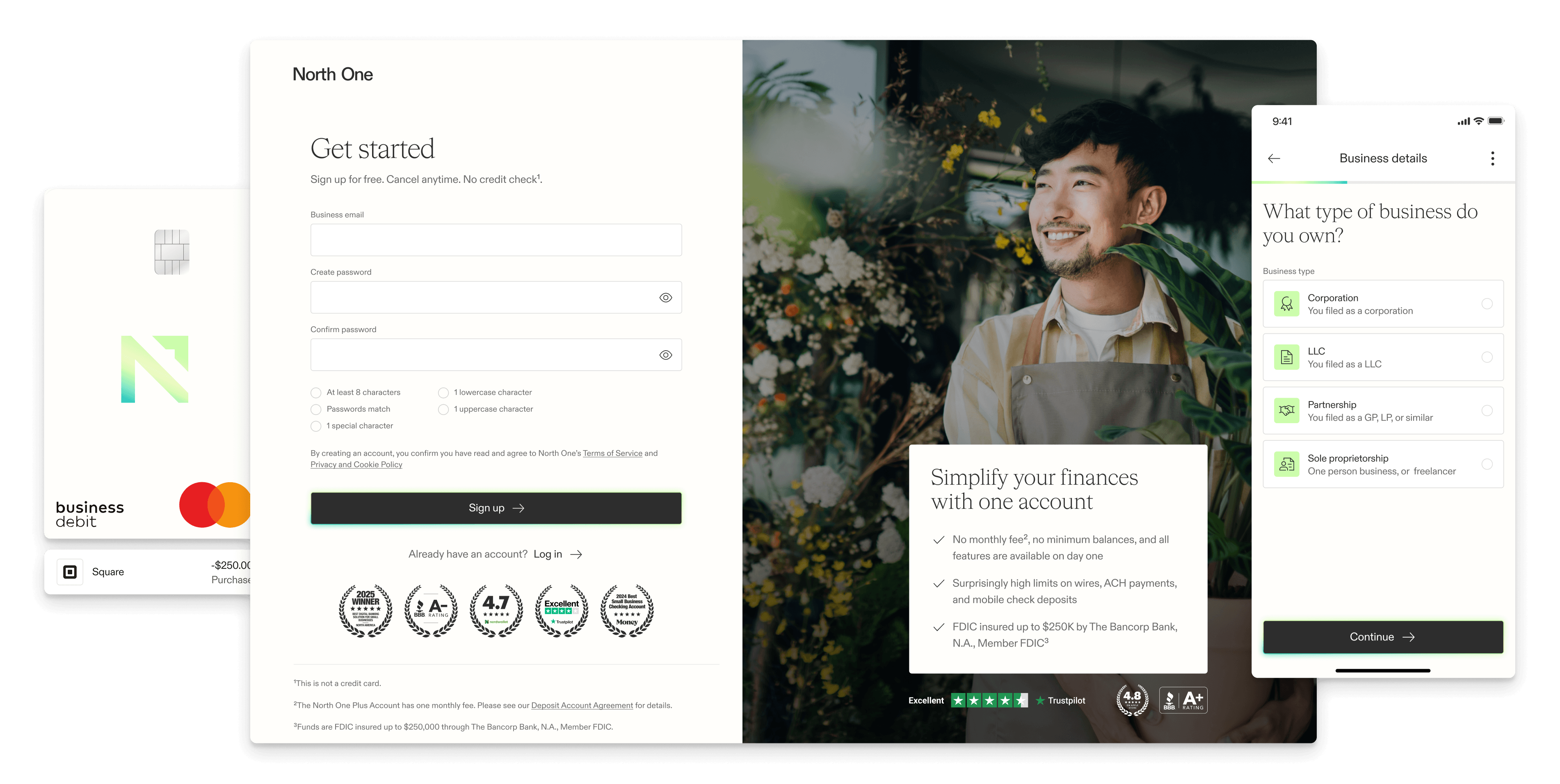
North One was a neo-bank built for small business owners — a technology focused alternative to the friction and fees of traditional banking. When I joined the team, my first task was to audit the existing sign up flow and come back with recommendations.
What I found had been patched together over time with new decisions layered on top of old decisions, many no longer serving the product or the user. The audit led to a larger conversation and eventually a complete rebuild.
North One
Senior Product Designer — Research, Ideation, Prototyping, User Testing, UI Design, Interaction Design
Q4 2023 — Q3 2024

Context
Setting a strong first impression is an important part of user retention. Unfortunately, not only did my audit reveal that we were setting a bad first impression, but also that we were converting users at a much lower rate than our competitors.
Starting fresh
It was hard to make meaningful improvements on top of our tech debt — not only had the flow accumulated fields and logic that were no longer needed, but many steps lacked consistency with the current design system and each other. With the support of our development team, a decision was reached to rebuild the flow from scratch.
Account funding
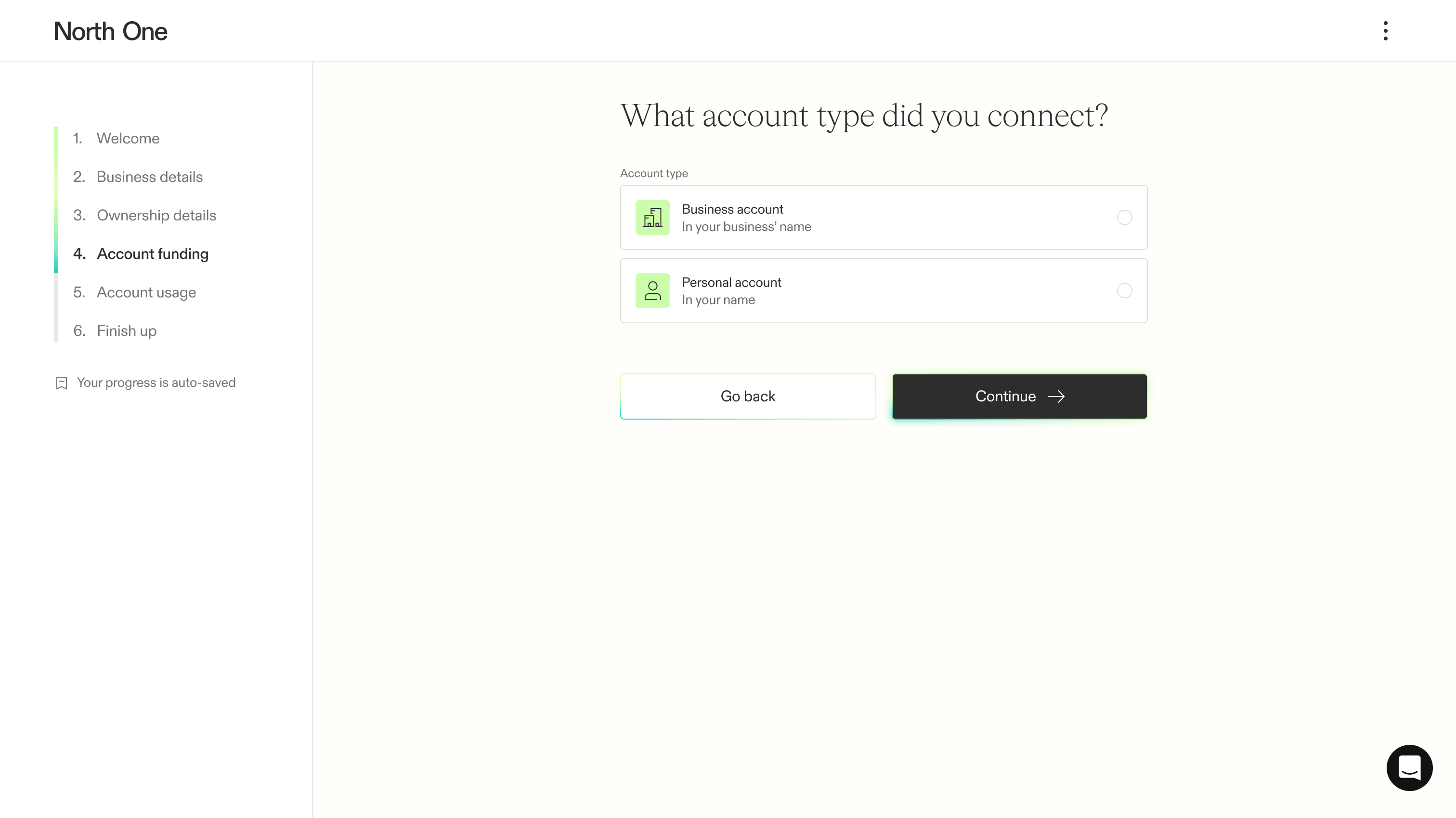
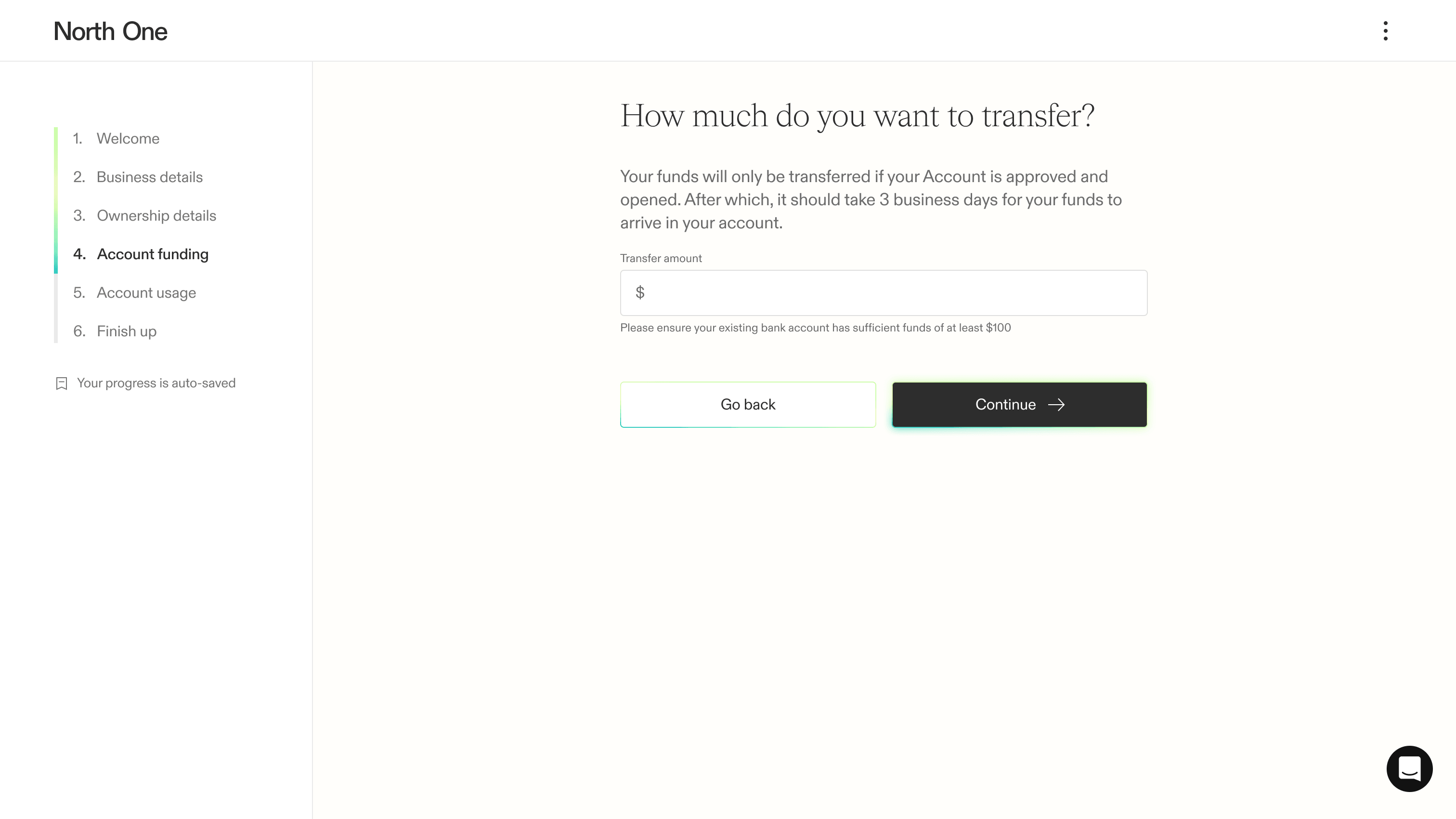
While the decision was originally made to require funding during sign up, the analytics showed that this was where we were losing people. Expecting users to deposit their money before getting to experience the product was not realistic, especially from a neo-bank whose biggest differentiator is the technology backing its service.
Manual review
About half of the users who signed up for North One were flagged for manual review, and our process felt like a punishment rather than a procedural step. Meanwhile, our trust and safety team was spending time on cases that could have been handled automatically.
Research
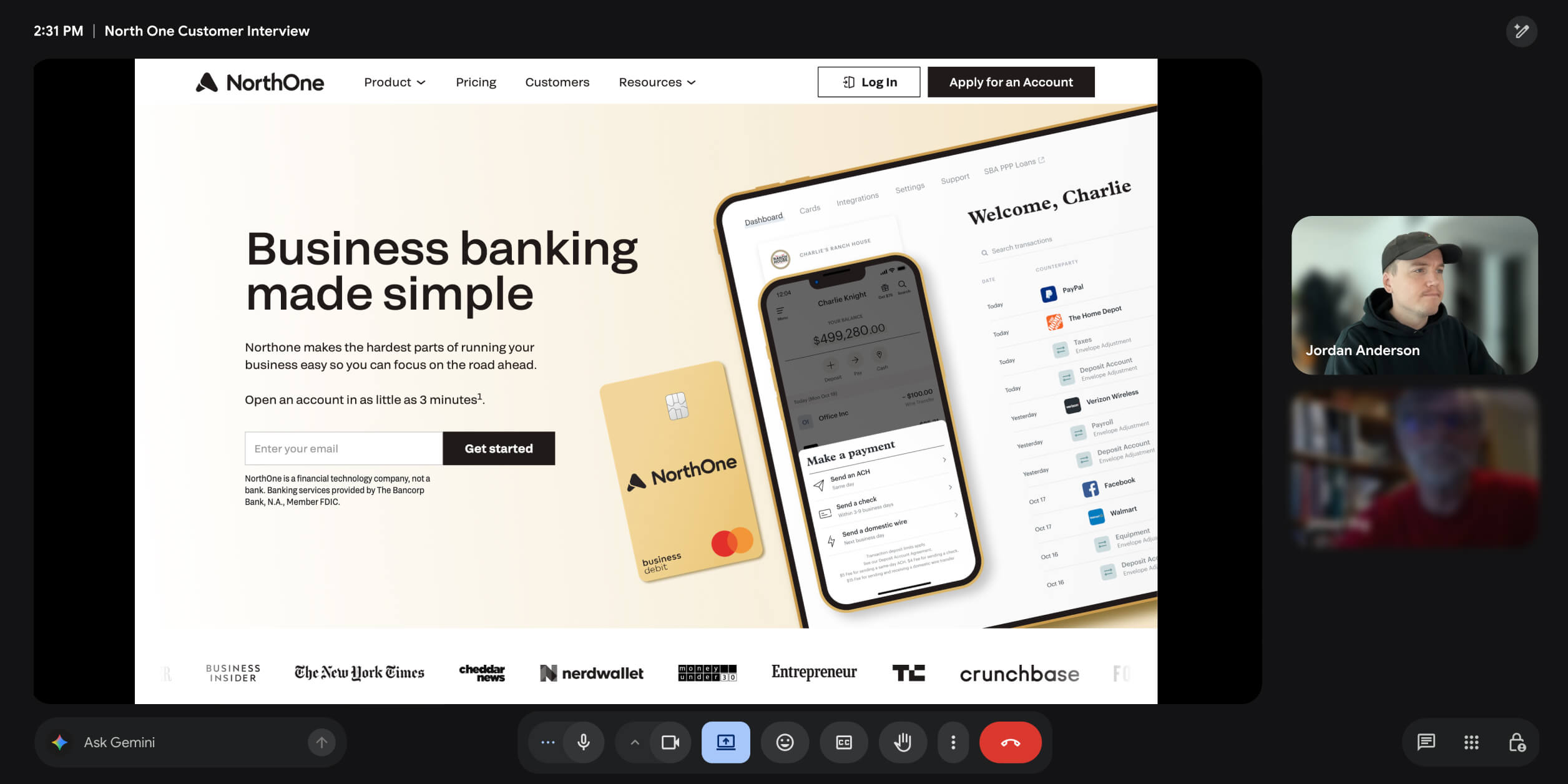
Competitive analysis
What stood out most about our competitors’ sign up flows was that nobody else asked users to fund their account before exploring the product. In addition, most had a more seamless experience — every step, redirect, and integration felt like one cohesive experience.
Stakeholder interviews
To determine what info we needed to collect, we met with most North One departments individually to unpack their core goals and challenges. This not only helped us uncover areas for improvement, but it gave us a chance to brainstorm solutions with them.
Analytics
Our data showed concentrated drop-off at three notable steps — ownership profiles, funding, and manual review. To better understand those friction points, we began watching countless recorded user sessions in Hotjar to analyse how they navigated the flow.
Customer interviews
We took this opportunity to talk to a handful of new customers as well as potential customers who dropped out of the flow part way. Focusing on their sign up experiences, we verified some of our predictions and uncovered new areas of improvement.
Ideation
Ideation began by mapping the user flows — what compliance or technical limitations we had, what order we should collect information in, and what branching logic we needed to support for each business type, edge case, and review flag.
Ownership profiles
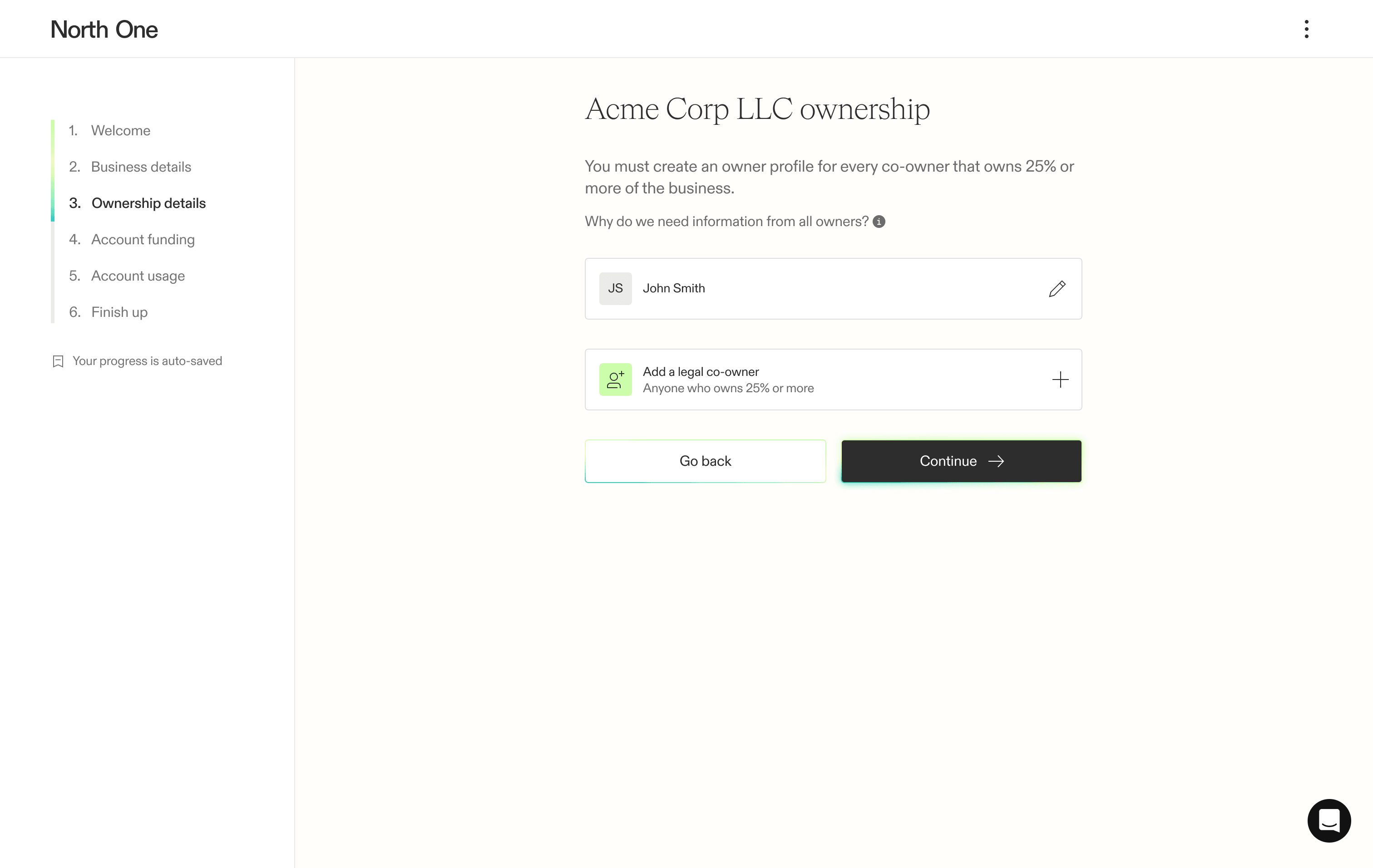
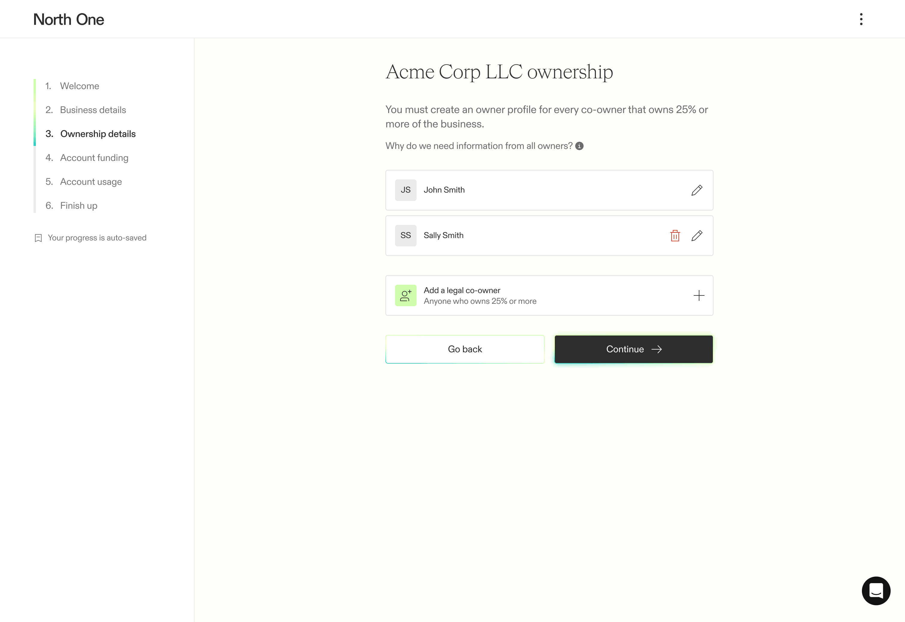
We saw two key opportunities to improve our ownership profiles. First, we break the information into more digestible screens and give users a hub to add, edit, and delete co-owners. Then we introduce the ability to invite co-owners by email, allowing everyone to complete their own profile without sharing sensitive information.
Funding debate
Removing the funding requirement created genuine concern that funding numbers would drop and fraud would rise. But trading a narrow set of funded users for a larger group we could convert downstream was a growth risk we needed to take. With comparative data to support the decision, we agreed to run an A/B test after launch.
Manual review
Manual review was not only a major area of drop-off, but it also drained more of our internal team’s time than necessary. Working with the trust and safety team, we explored how integrations vetted by our developers could automate parts of the flow — leading us to plan our most ambitious multi-phase release of the sign up flow.

Design
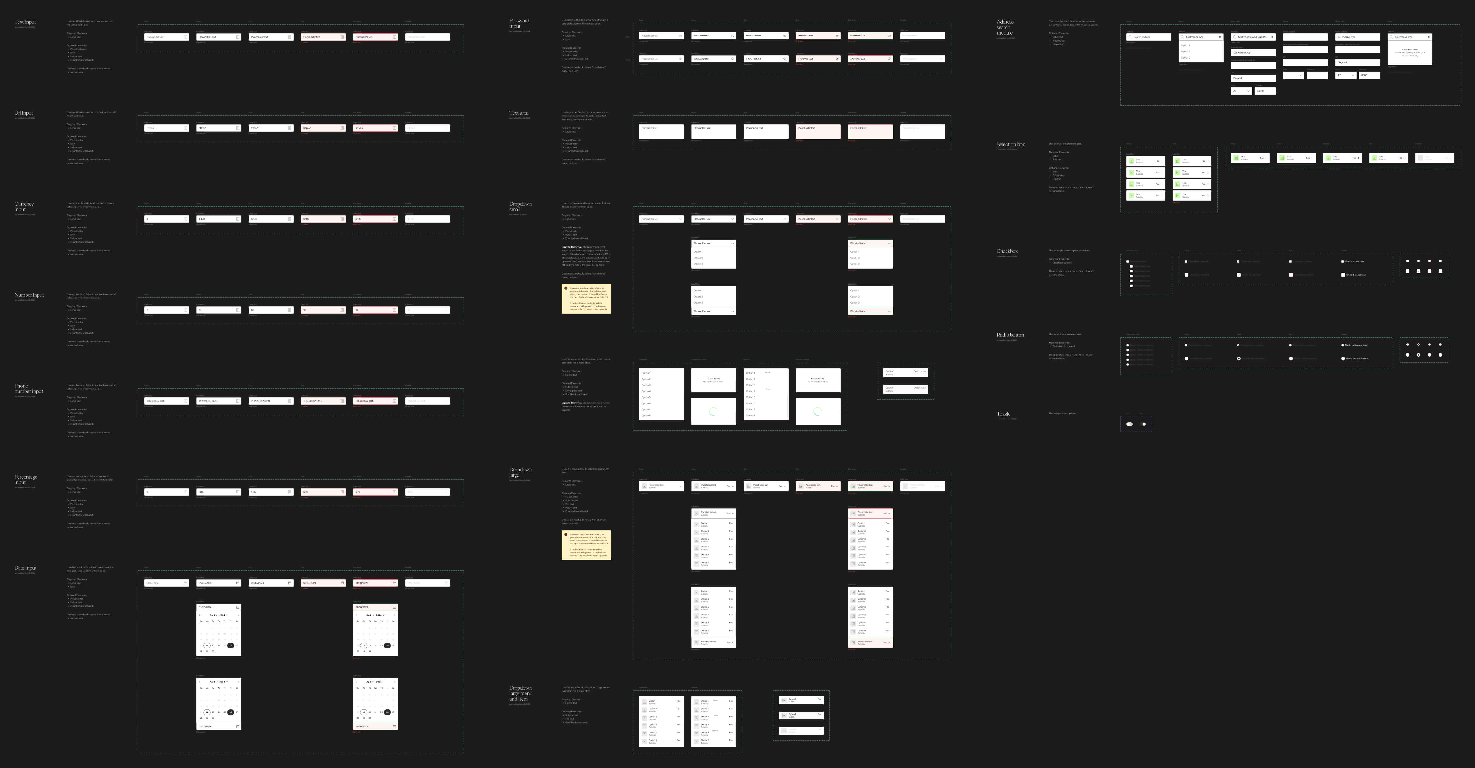
Our first design task was establishing new components for the design system. To make information easier to submit, we introduced input types that could collect different forms of data more effectively. Beyond the user-facing improvements, this also allowed us to collect information more consistently, resulting in cleaner and more reliable data.
Opening an account
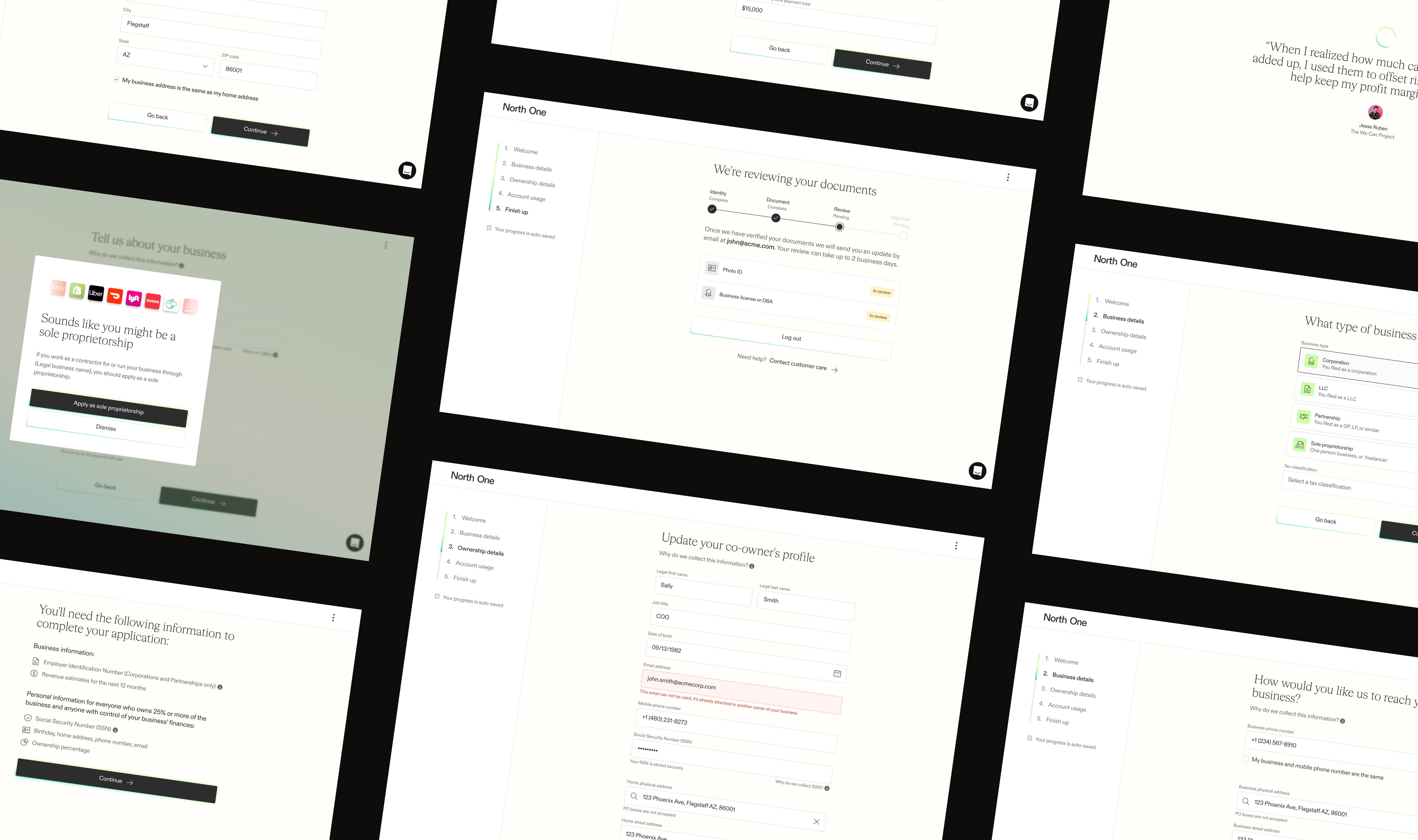
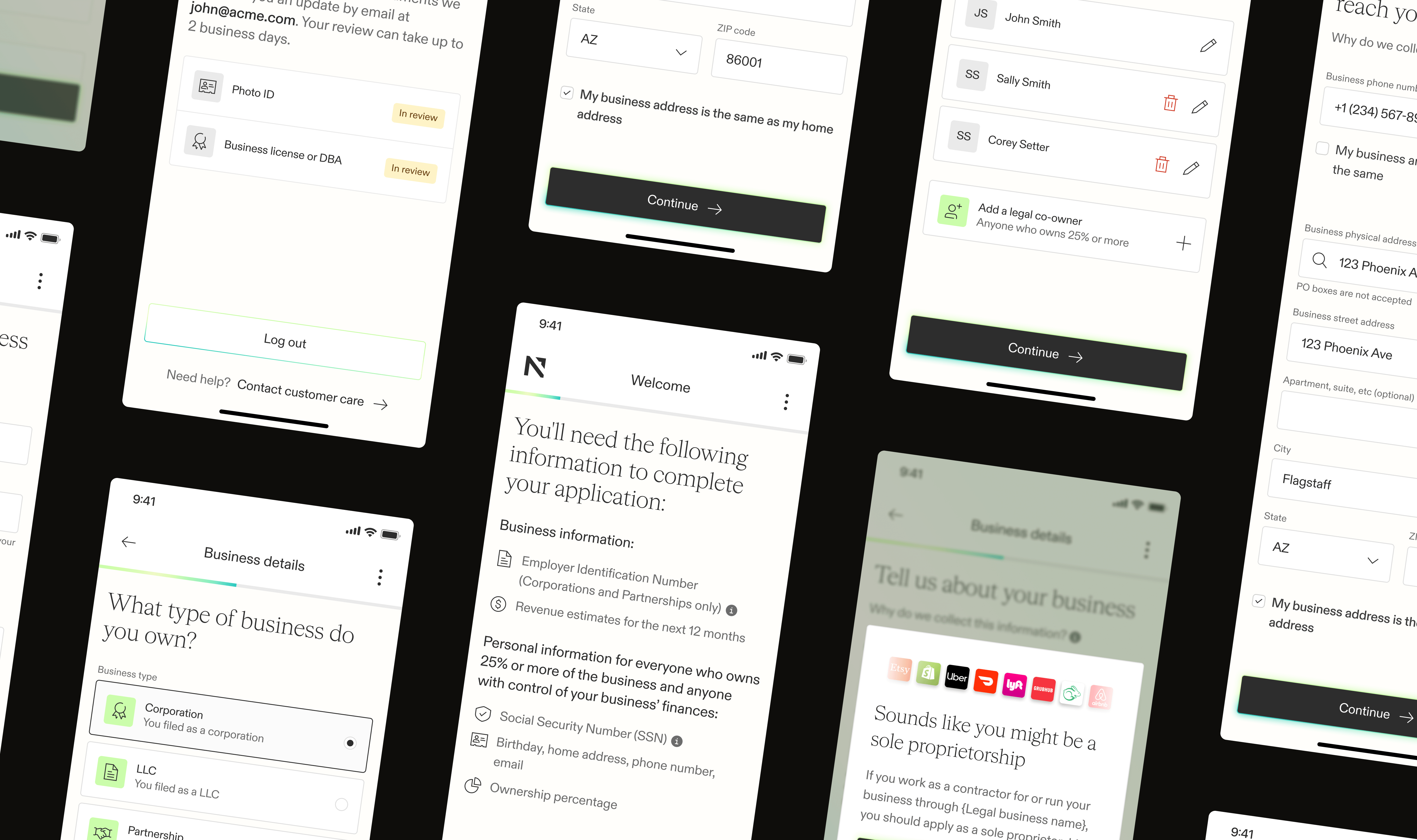
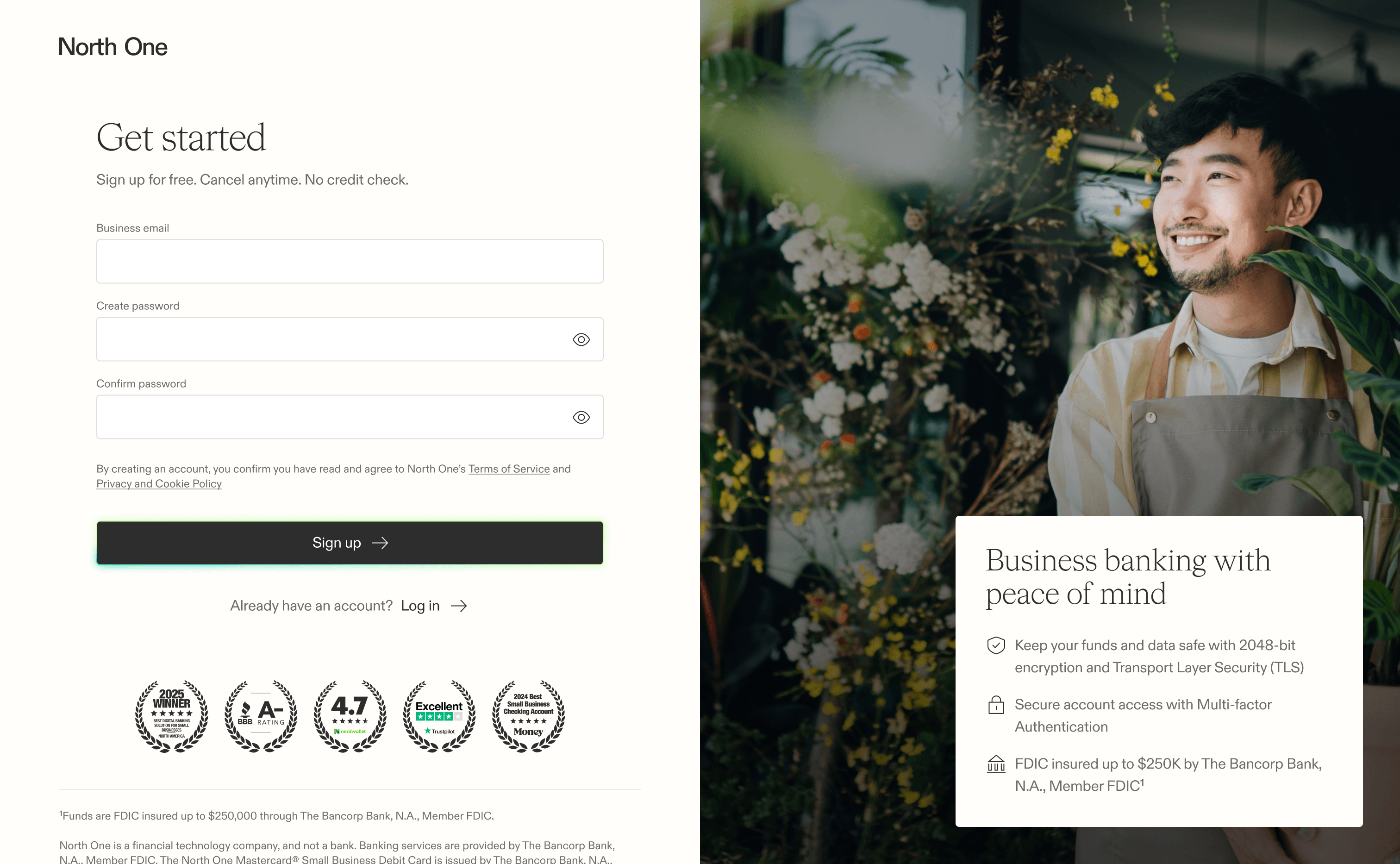
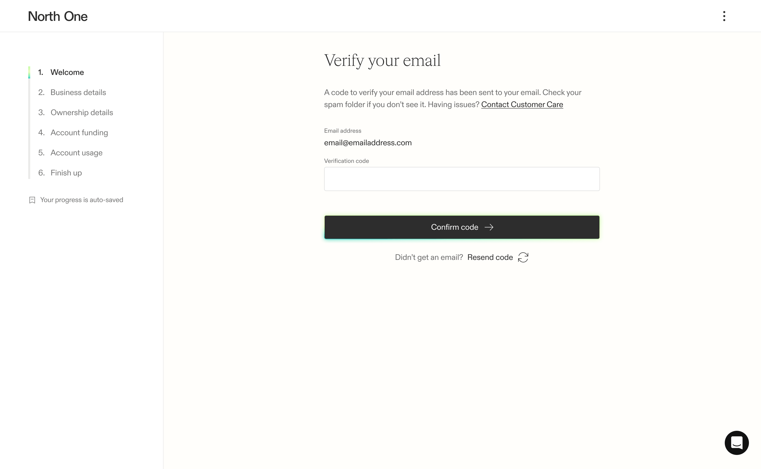
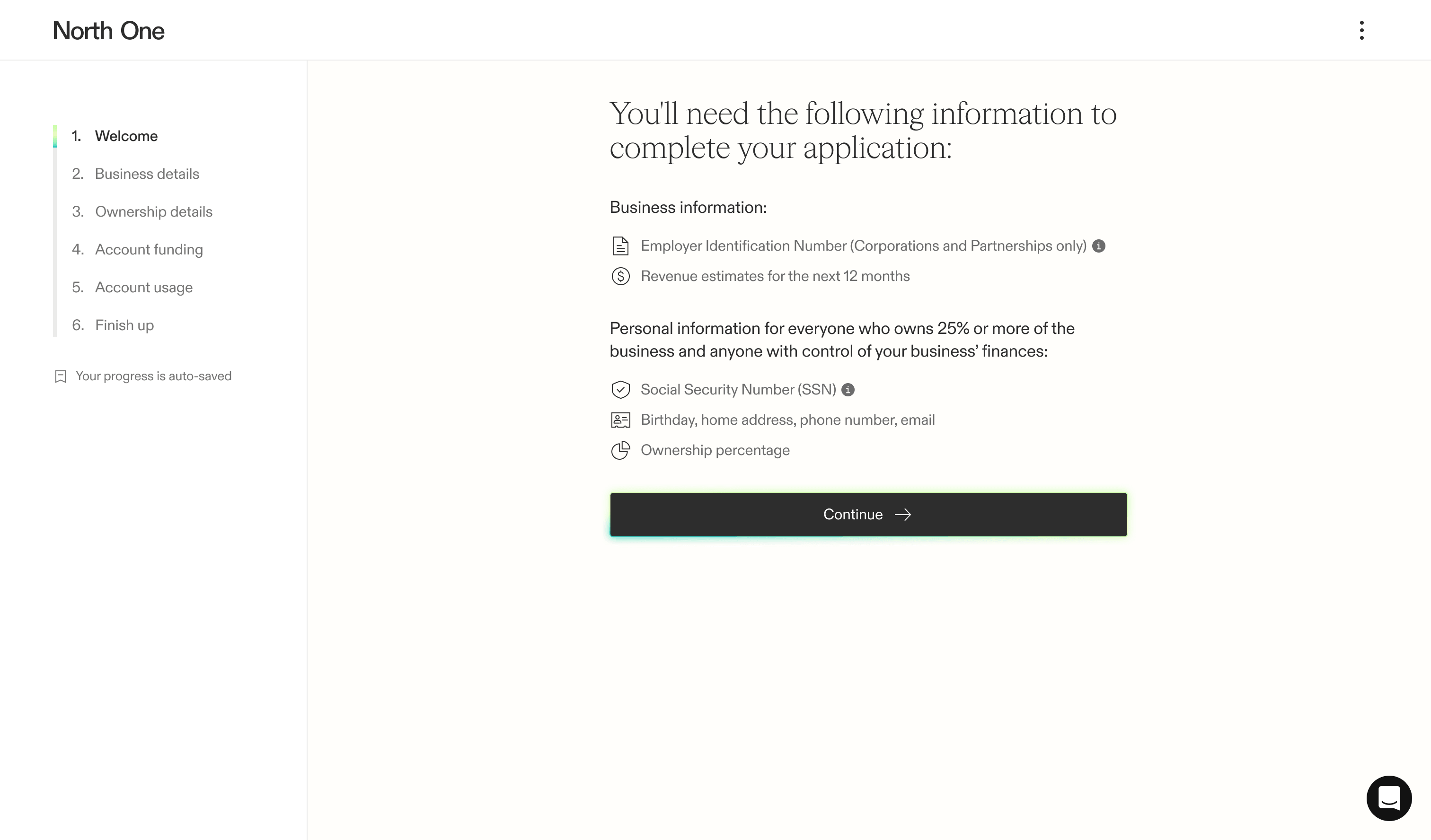
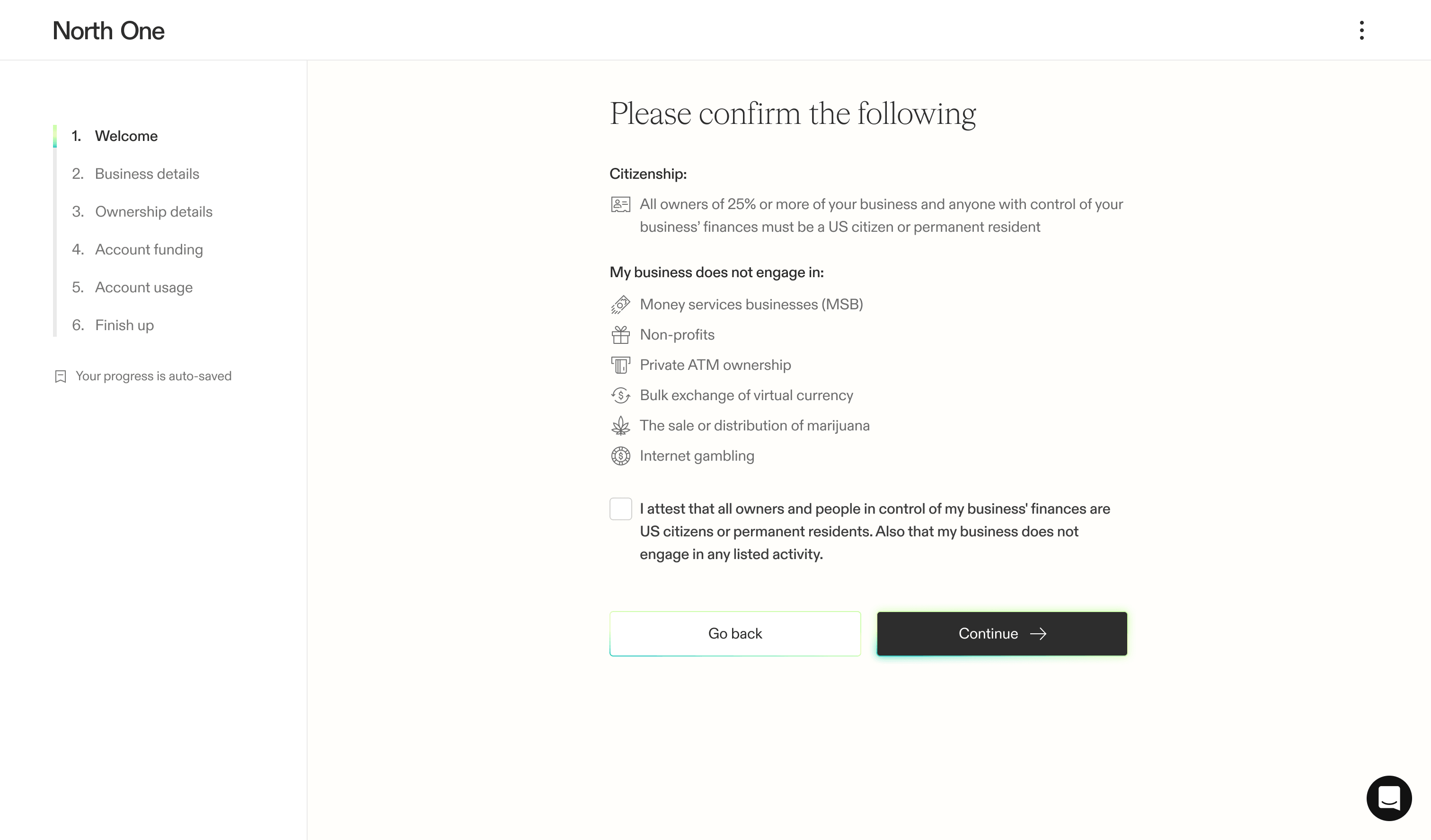
The first handful of screens focused on capturing the user’s email, setting expectations, and filtering out unqualified businesses. Once we had a way to re-engage users who dropped off, we used these early steps to make sure users had the information needed to complete the flow while preventing unqualified businesses from investing more time.
Business details
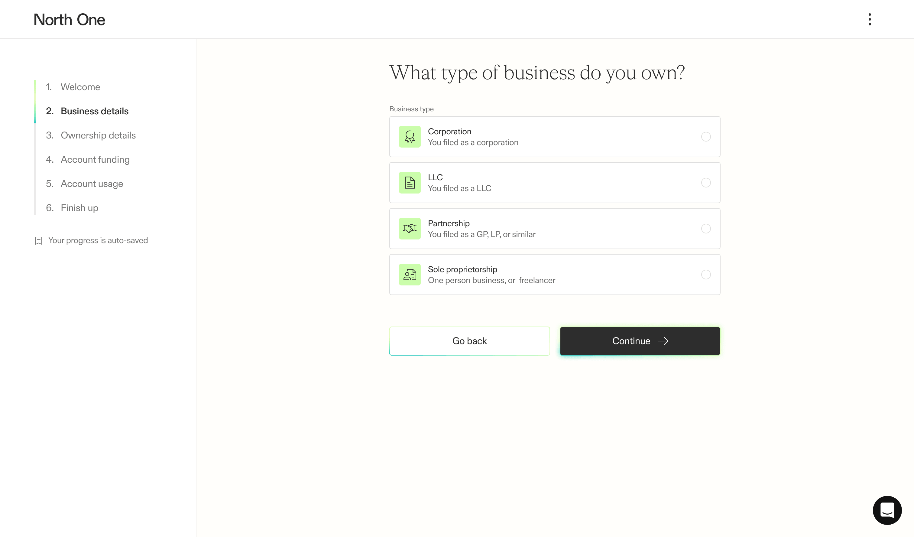
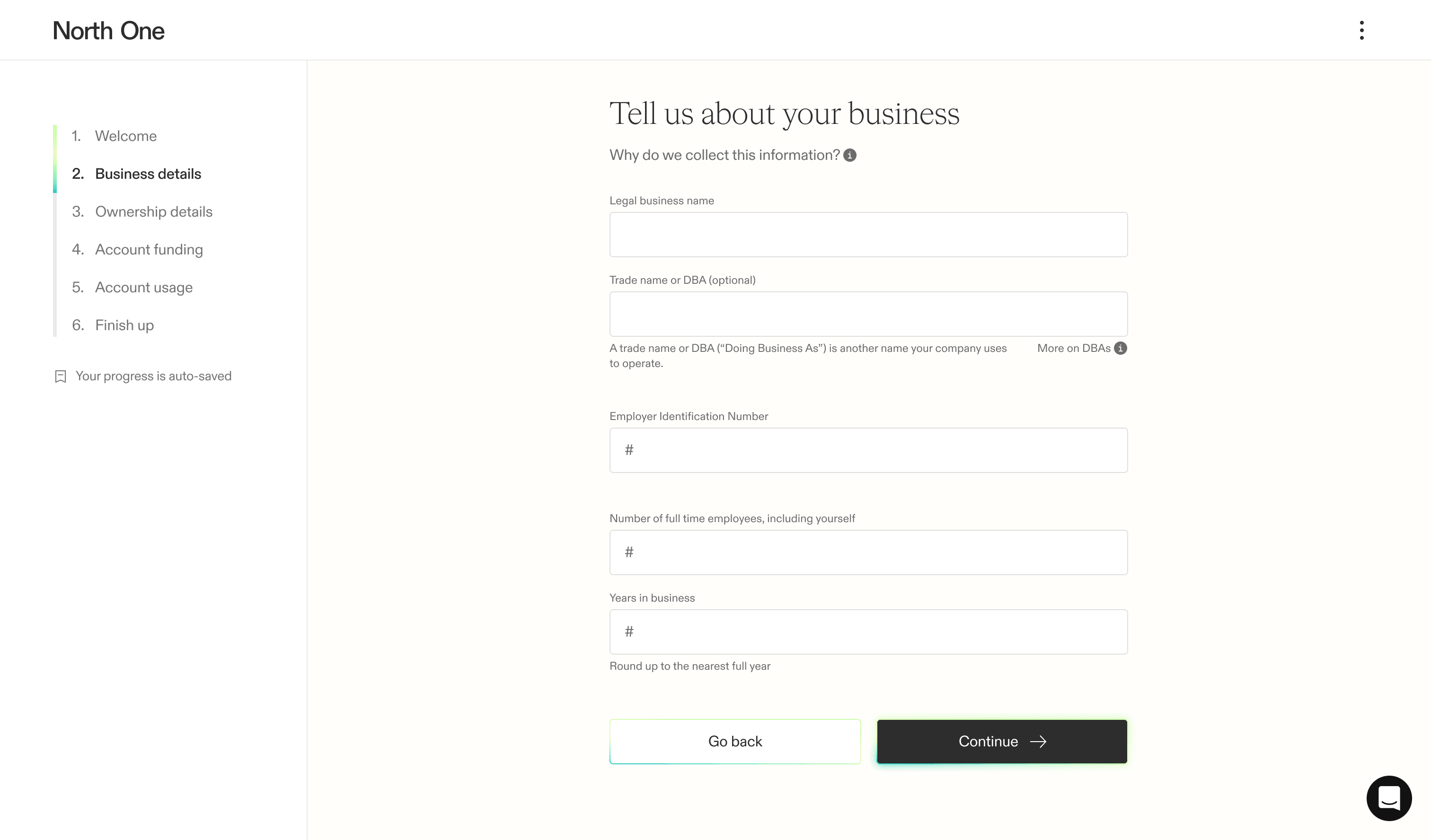
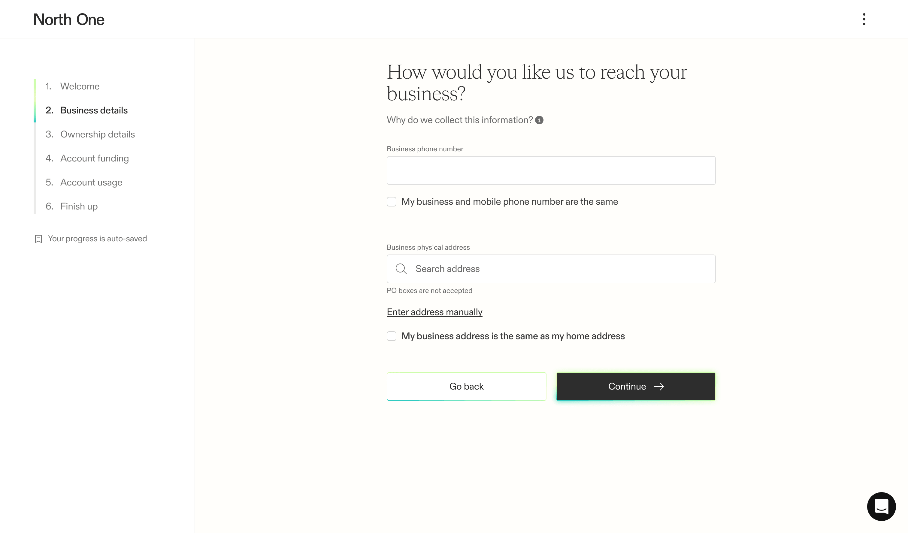
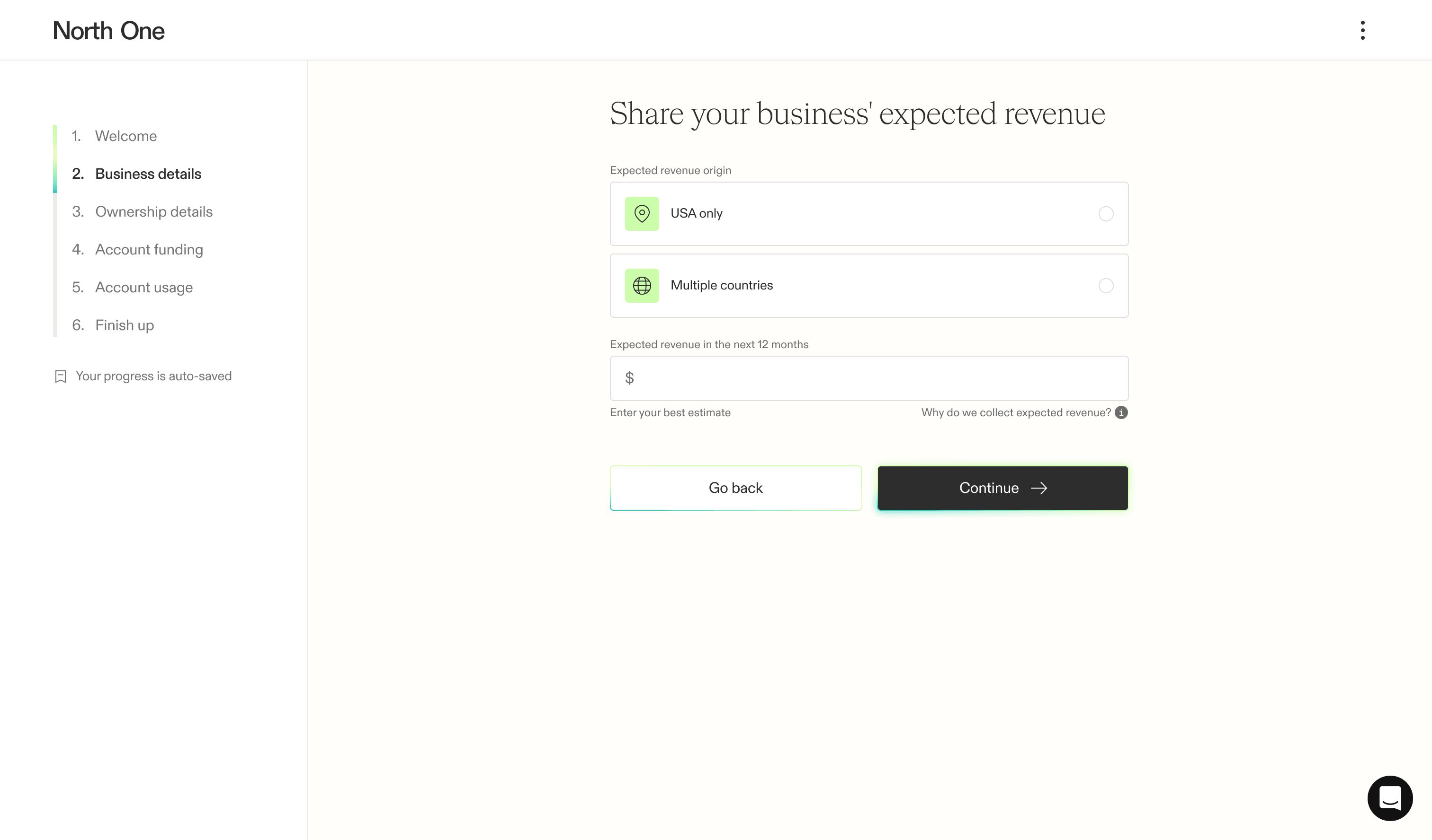
The experience began to branch in the business details section — by first asking users to select their business type, we could determine what they saw next. While the differences between most business types were negligible, sole proprietors were required to provide significantly less information. The design challenge was finding a sequence of grouped information that worked well for every business type.
Ownership details
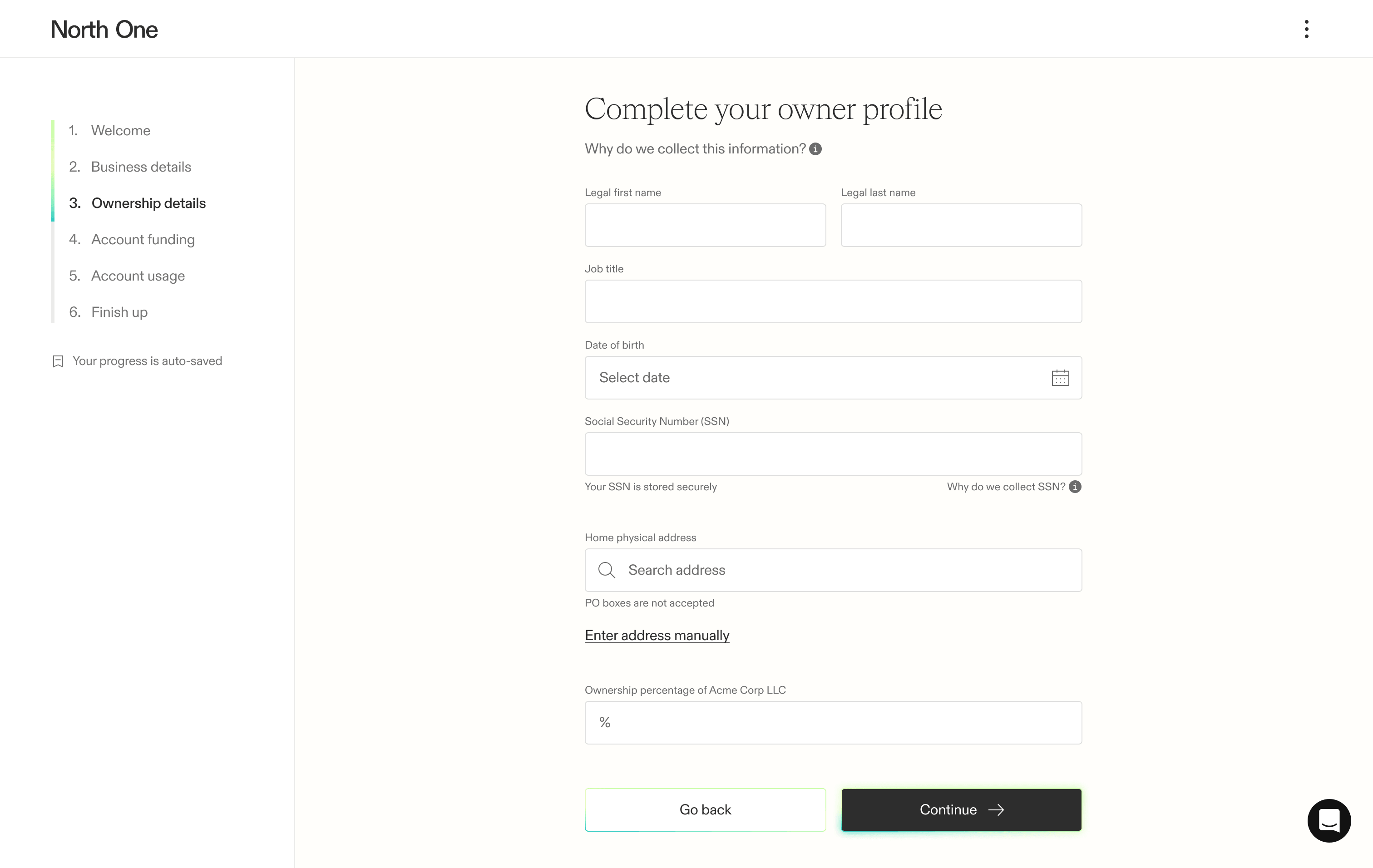
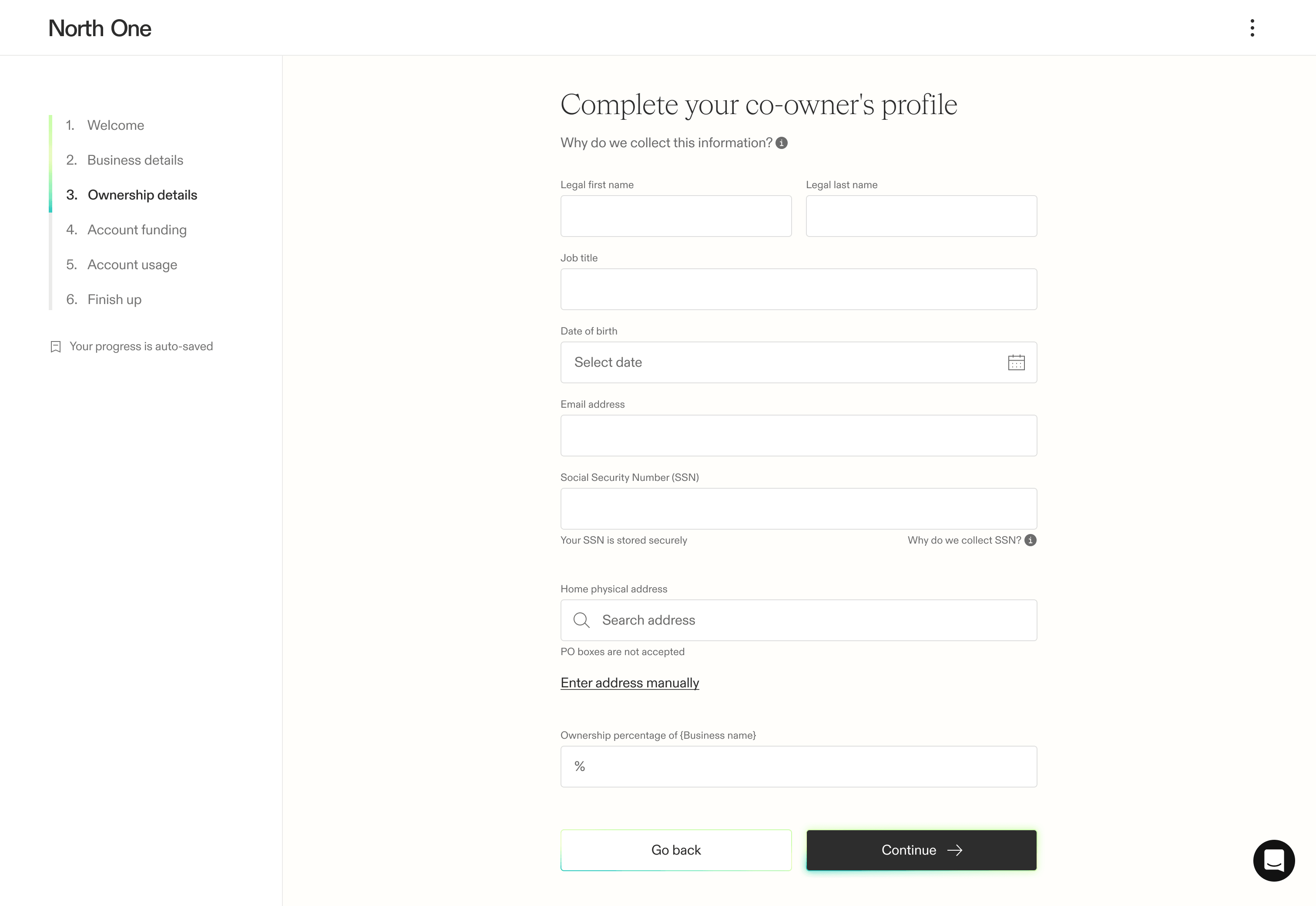
Our research showed that the ownership section presented a major opportunity to improve conversions. Our theory was that by first prompting users to complete their own profile, they would become familiar with the process. Then, when asked to add co-owners, the next steps would feel less daunting.
This iteration also aligned naturally with our plan to support co-owner invitations by email, allowing everyone to complete their own profile without sharing sensitive information.
Account funding
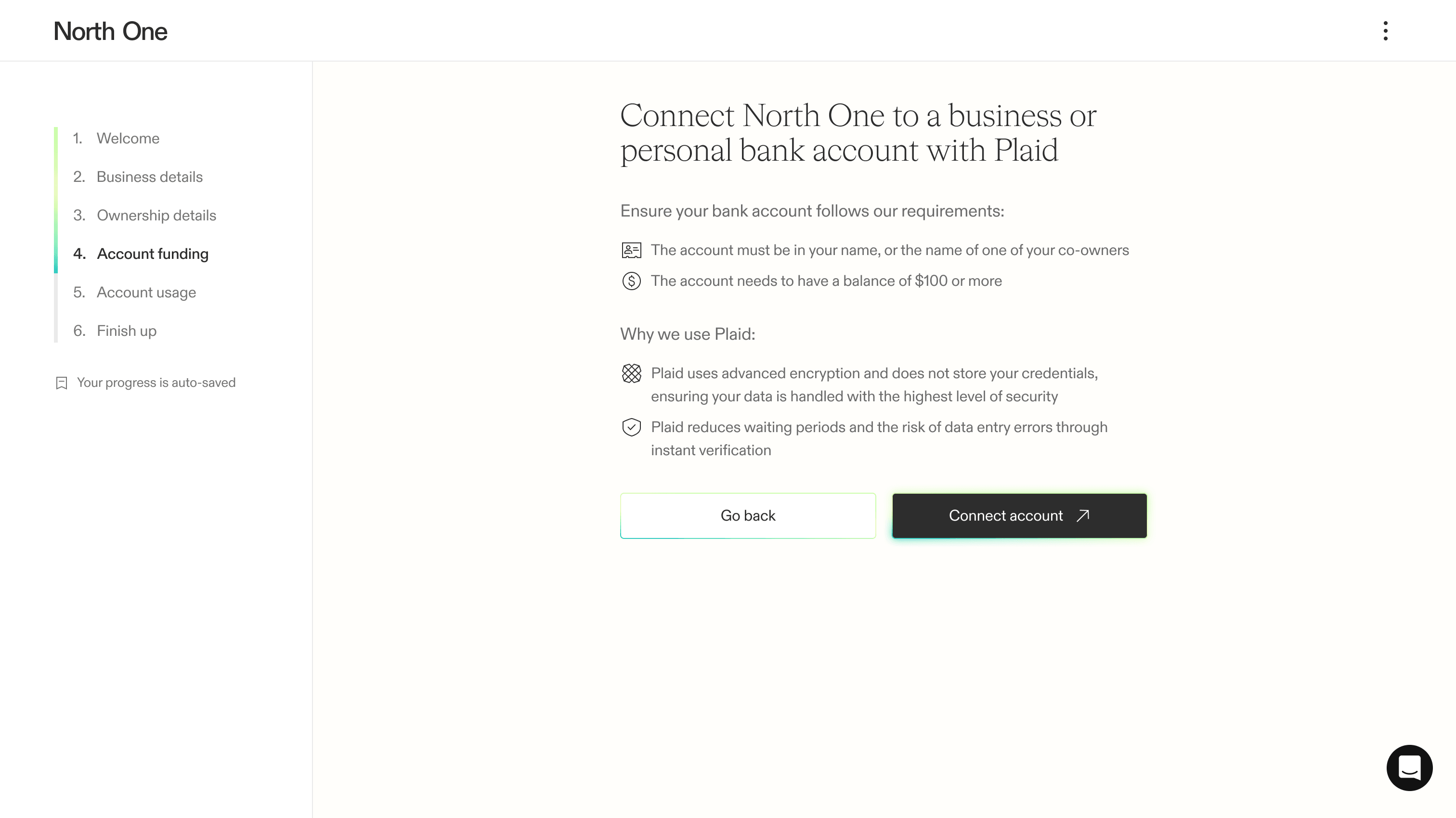
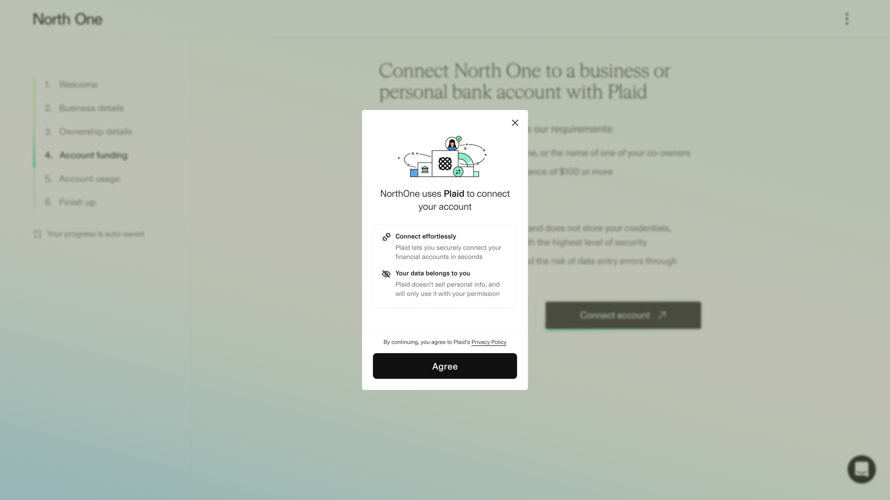
Until we had the data, we couldn’t remove the required funding step. So rather than invest more time in something we might ultimately remove, we simply reskinned the existing experience to make it feel like a consistent part of the flow.
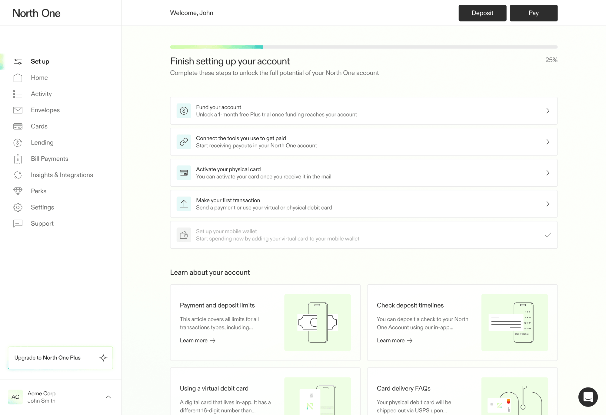
As the results came in, our predictions were confirmed — removing the funding step meaningfully grew the top of the funnel. Then through various activation efforts, we recovered the funds we gave up while also driving more conversions overall.
Account usage
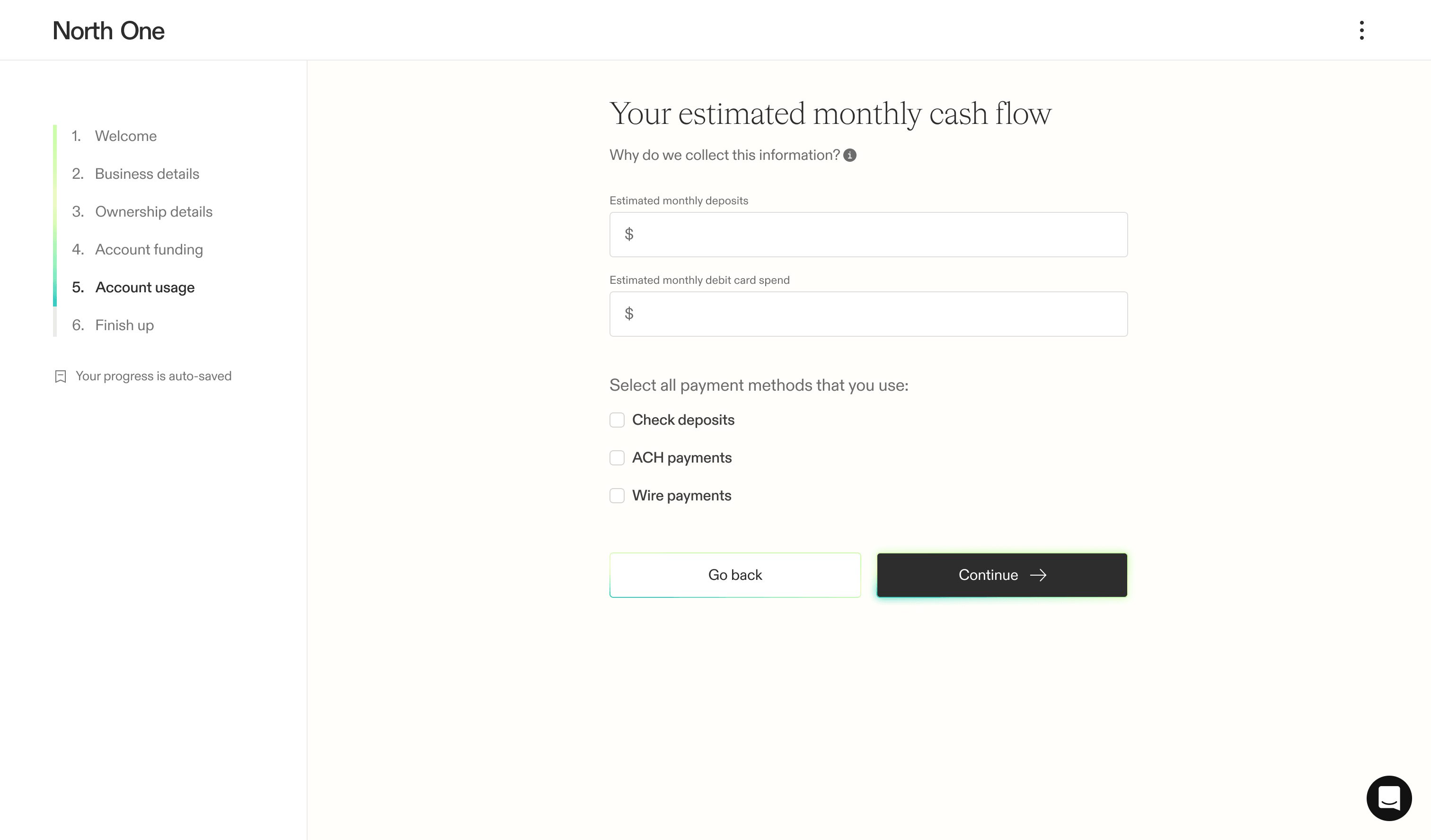
Unfortunately, account usage was a compliance requirement — otherwise, we wouldn’t have included it at all. Working closely with the compliance team to find a compromise, we consolidated what had been six screens into one concise screen.
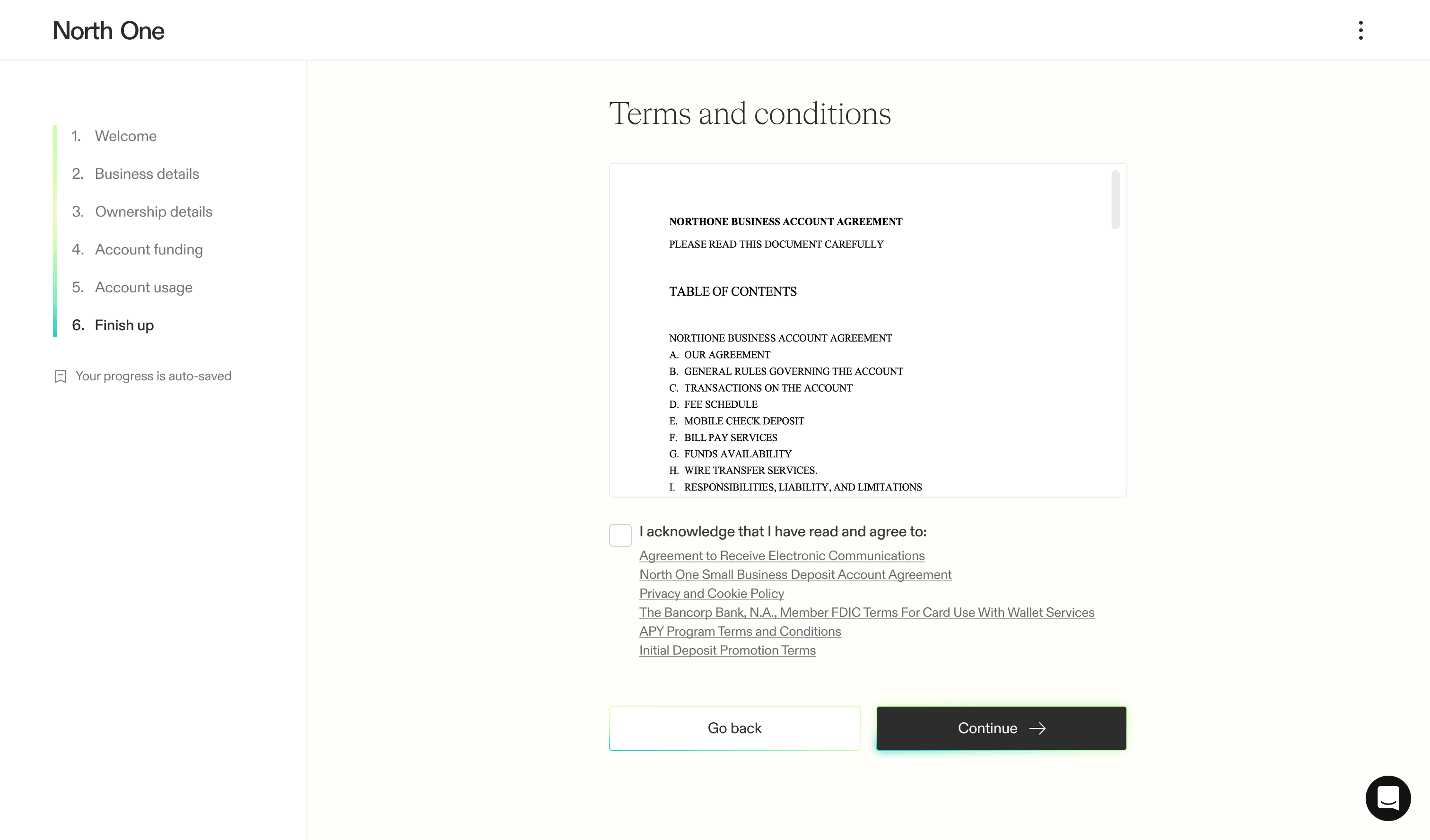
For about half of our users, terms and conditions is the final step of the flow. However, the other half are now sent to manual review due to mismatched information or risk levels.
Manual review
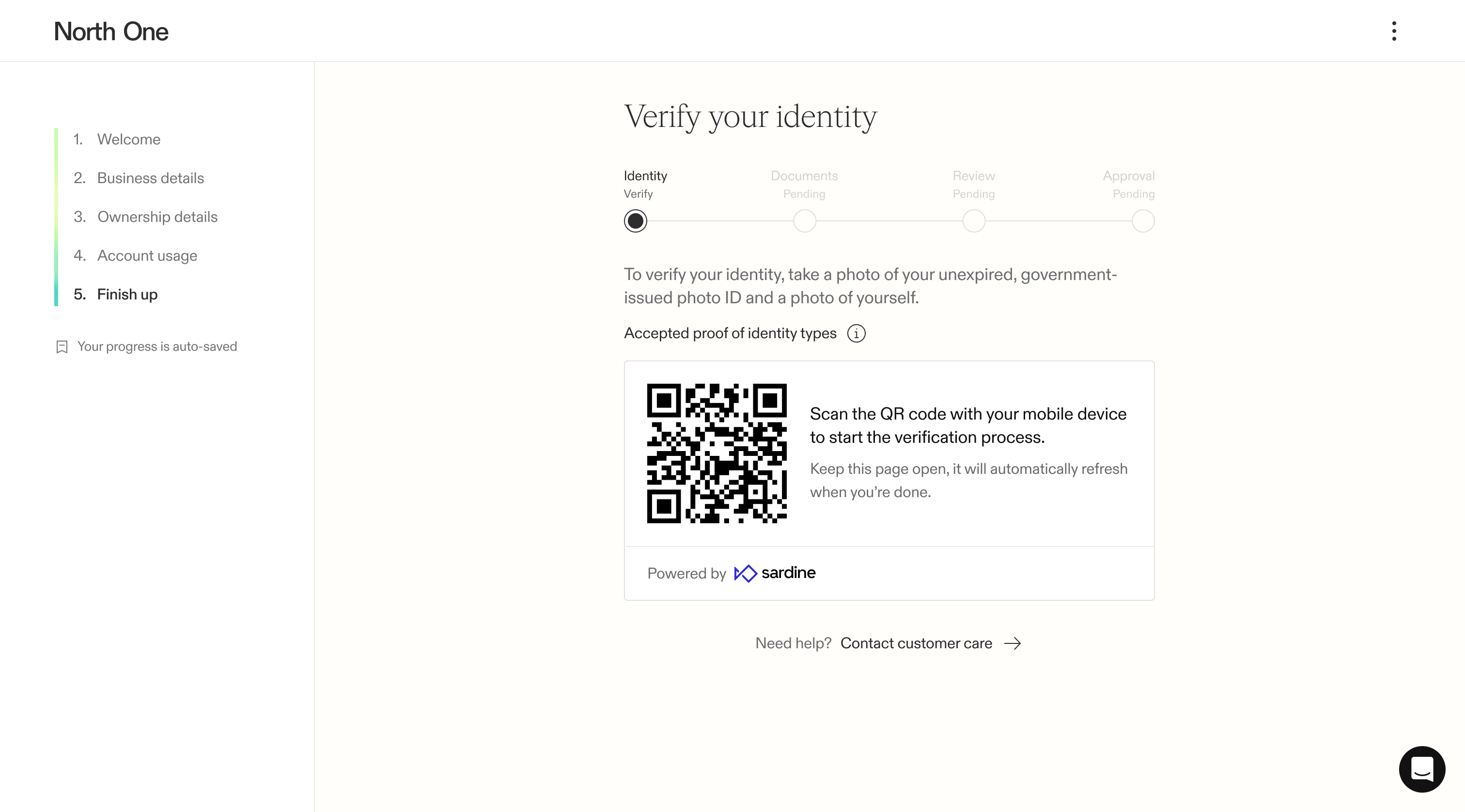
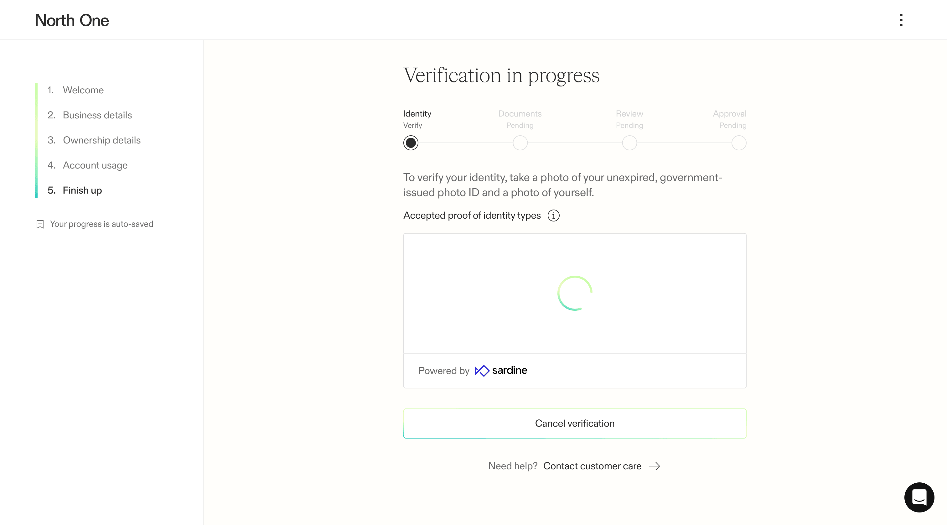
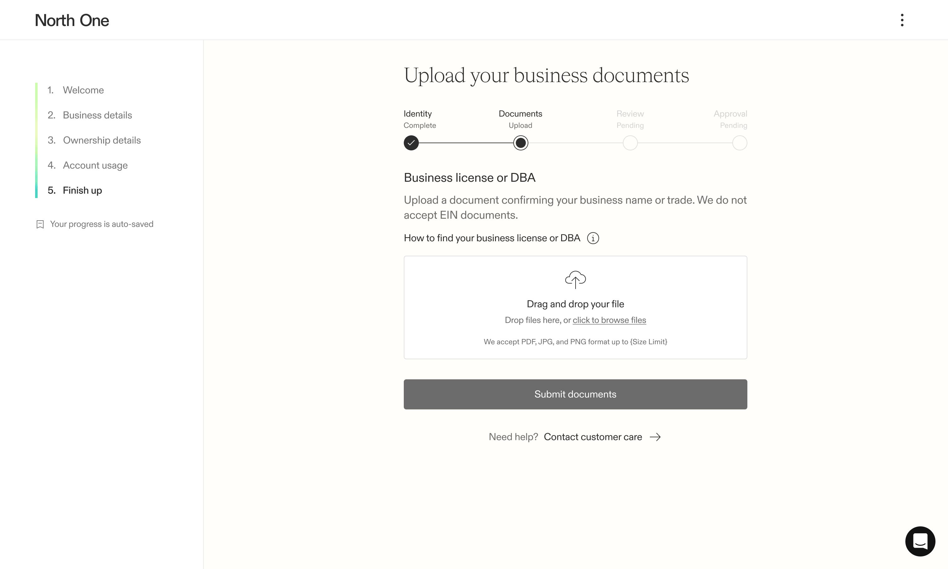
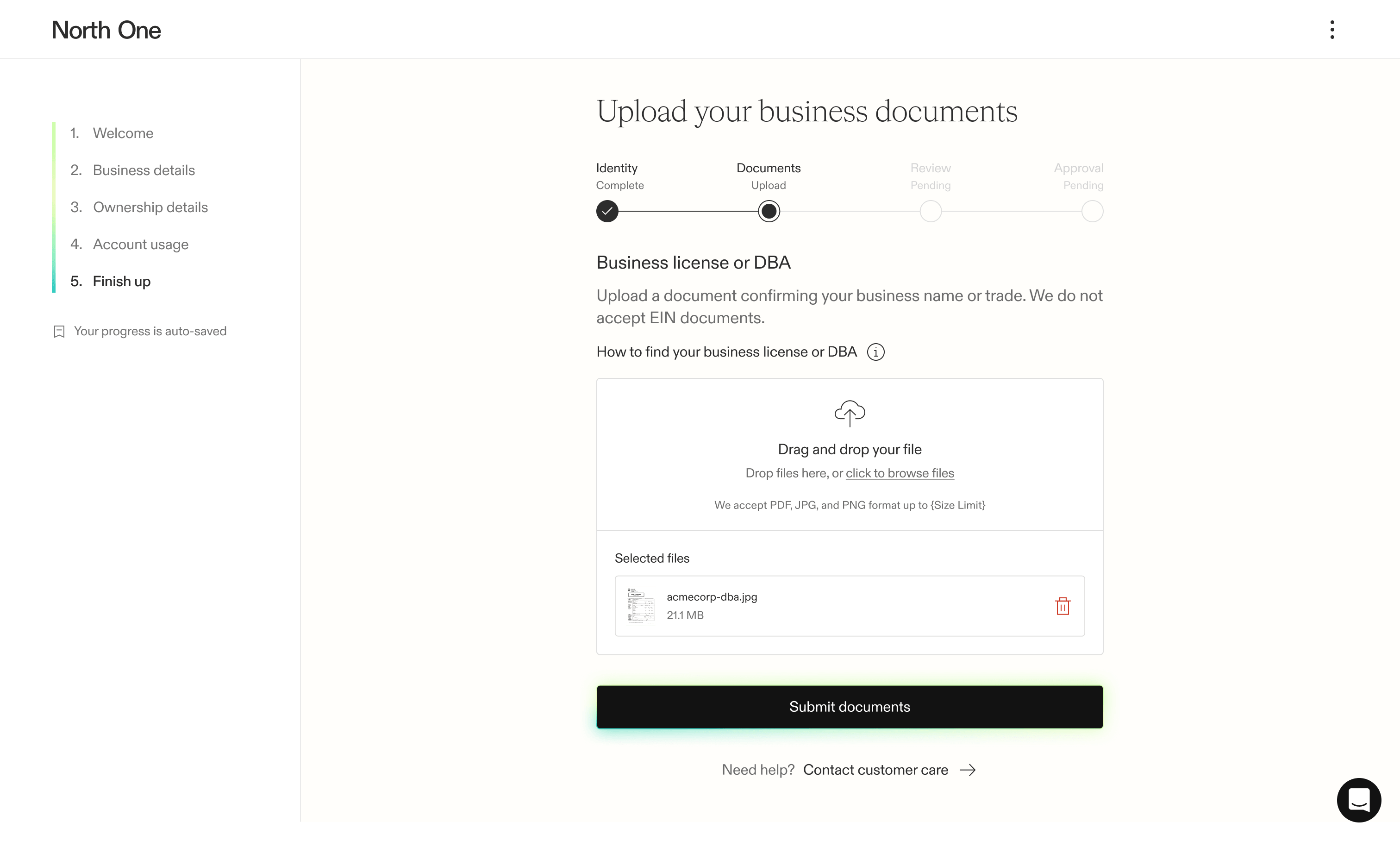
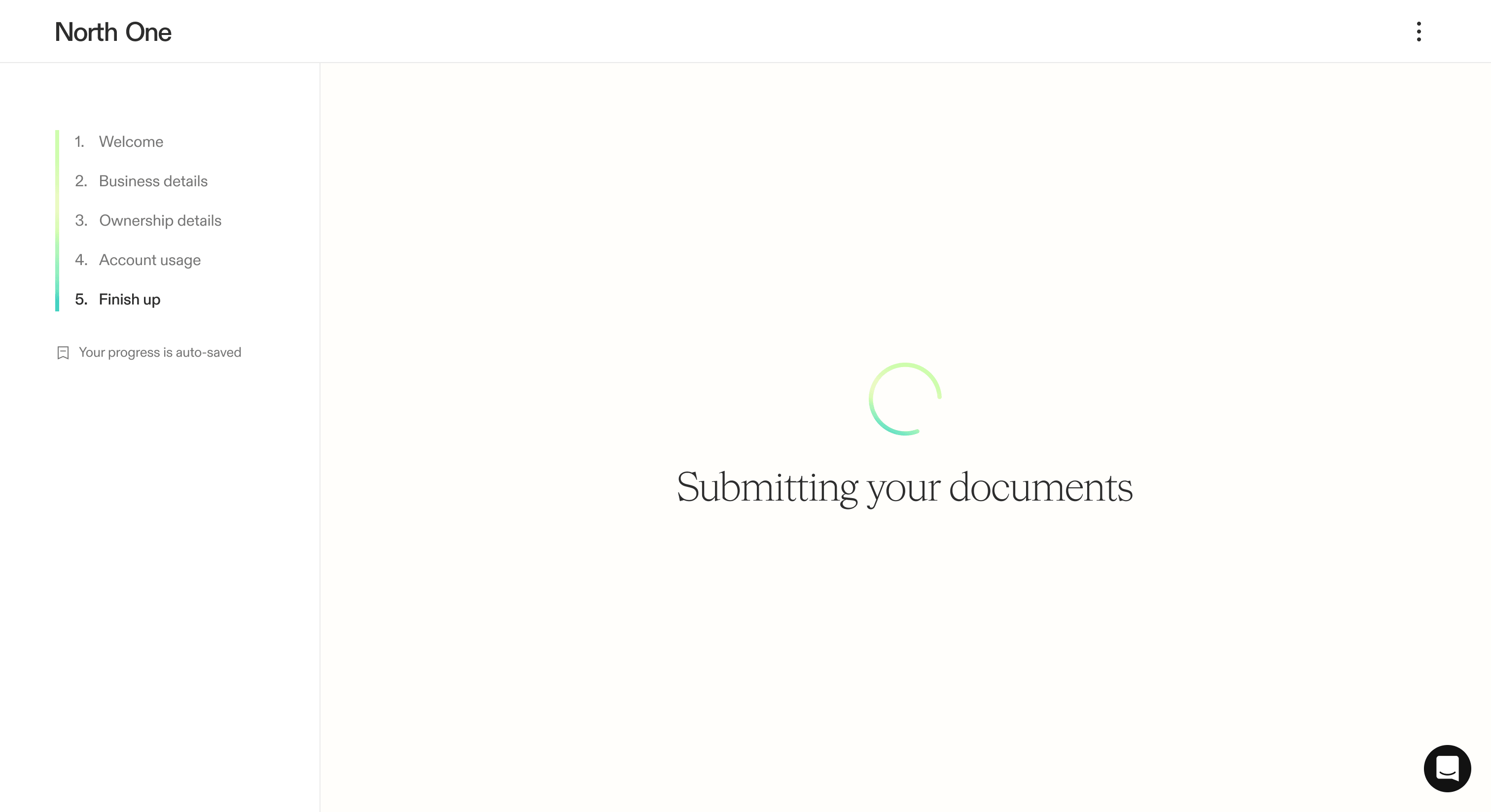
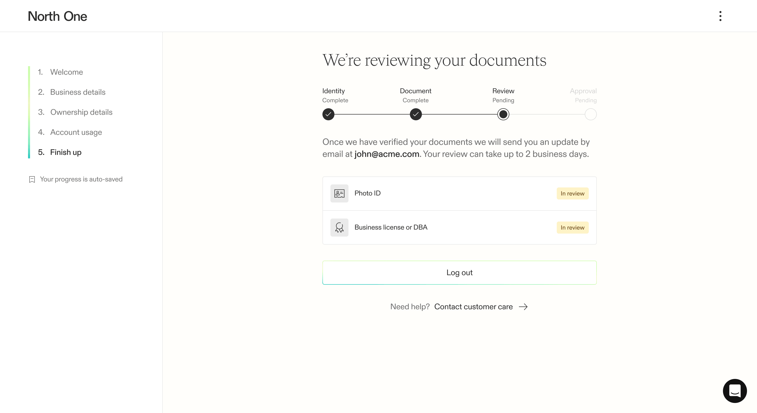
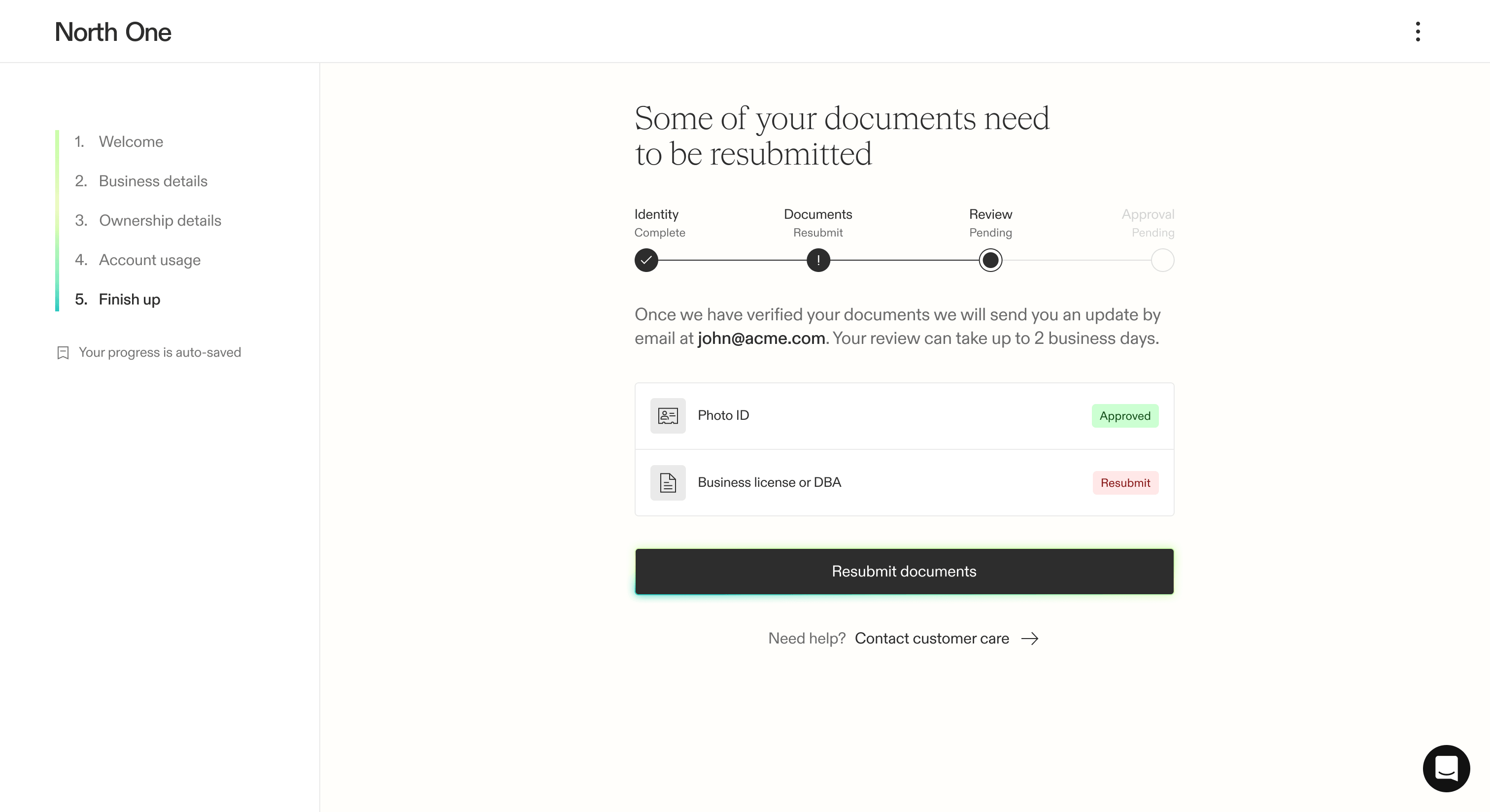
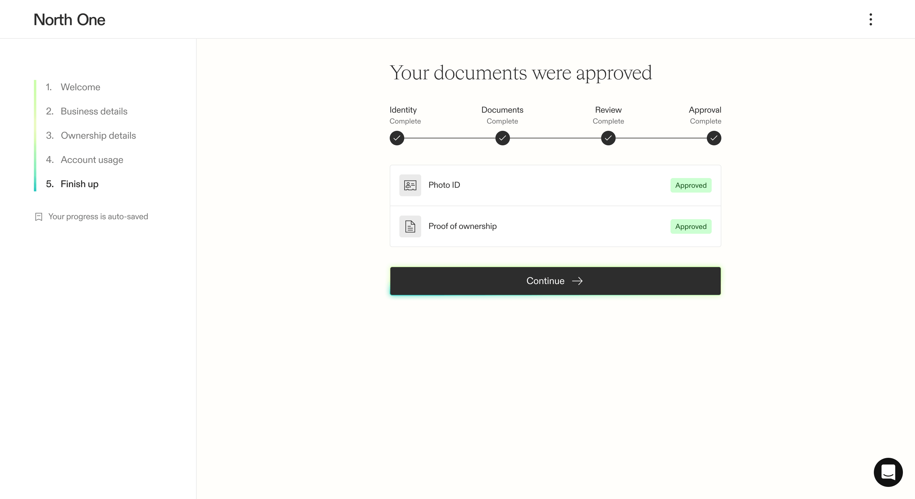
Through multiple rounds of iteration, we took a process that once confused most users and turned it into a cohesive, dynamic step-by-step experience. Whether users needed to verify their identity, business documents, or both, each stage clearly explained what they needed to upload, resubmit, or wait for.
Legitimate customers could now move through the process confidently — with automation sometimes getting them through in seconds. Our review team’s queue also shrank, allowing them to focus on the situations that actually required human intervention.
Iteration
While I also worked on banking features at North One, the sign up flow was the project I started on my first day and continued iterating on until my last. From reworking entire steps to refining small pieces of content, A/B testing played a major role in how the flow evolved.
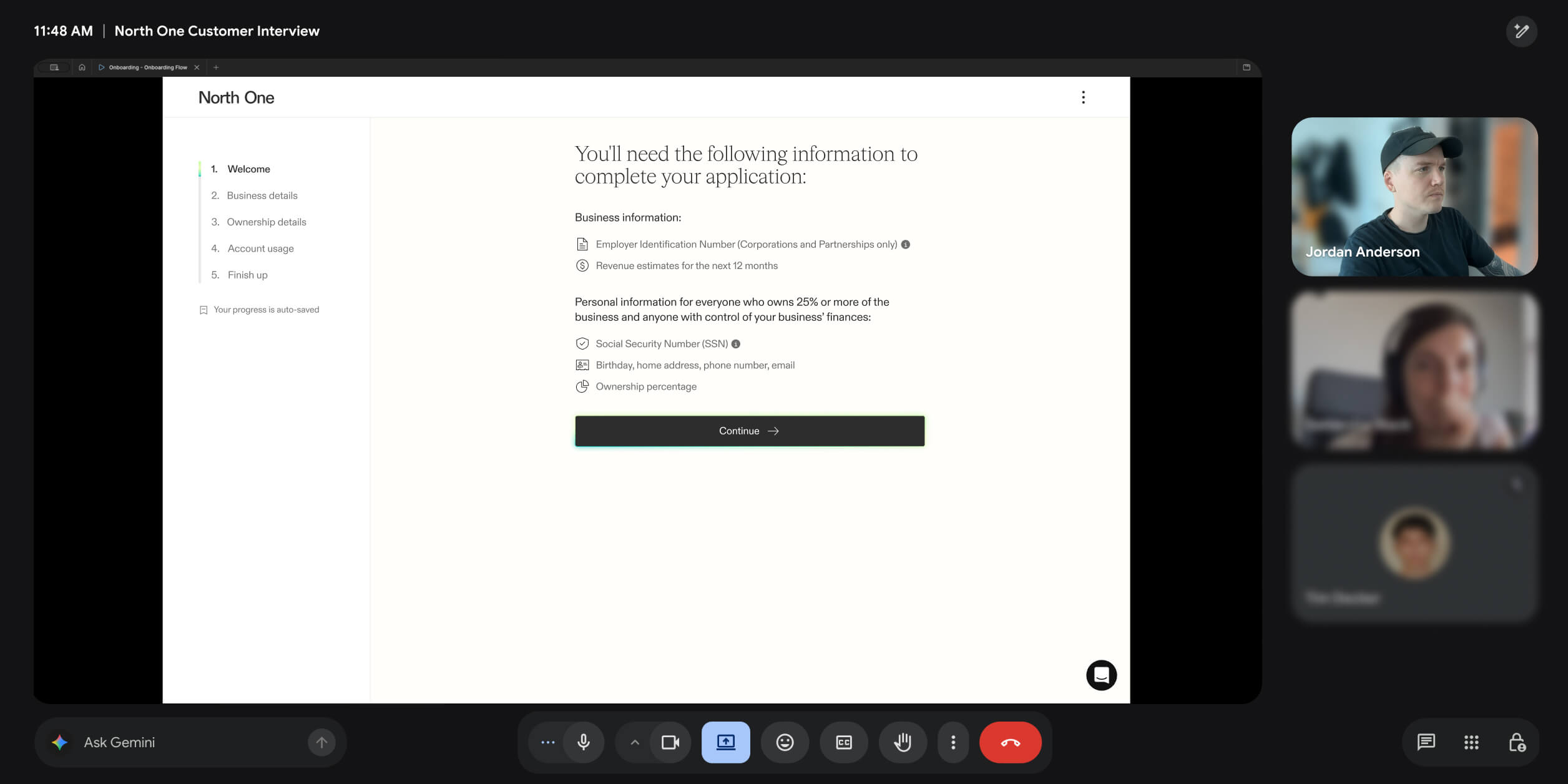
We also continued meeting with customers to review prototypes, test theories, and gather honest feedback along the way.
Impact
The new flow gave North One a proper foundation to iterate on. Removing the funding gate had the greatest immediate impact, but it also reset the scoreboard. The definition of a converted user had changed — a larger pool of sign ups was now getting through the door, challenging us to activate them further downstream.
Working from that new baseline, through a combination of other iterations, we drove the conversion rate up by an additional 18%.