Overview
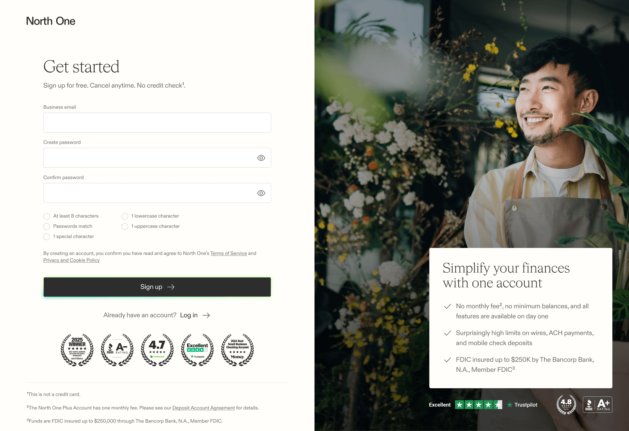
As covered in the sign up flow — once we removed the funding requirement, we needed to find a way to activate users further downstream. At that point, we had a passive sequence of in-app notifications, but users were left with little guidance once those were dismissed.
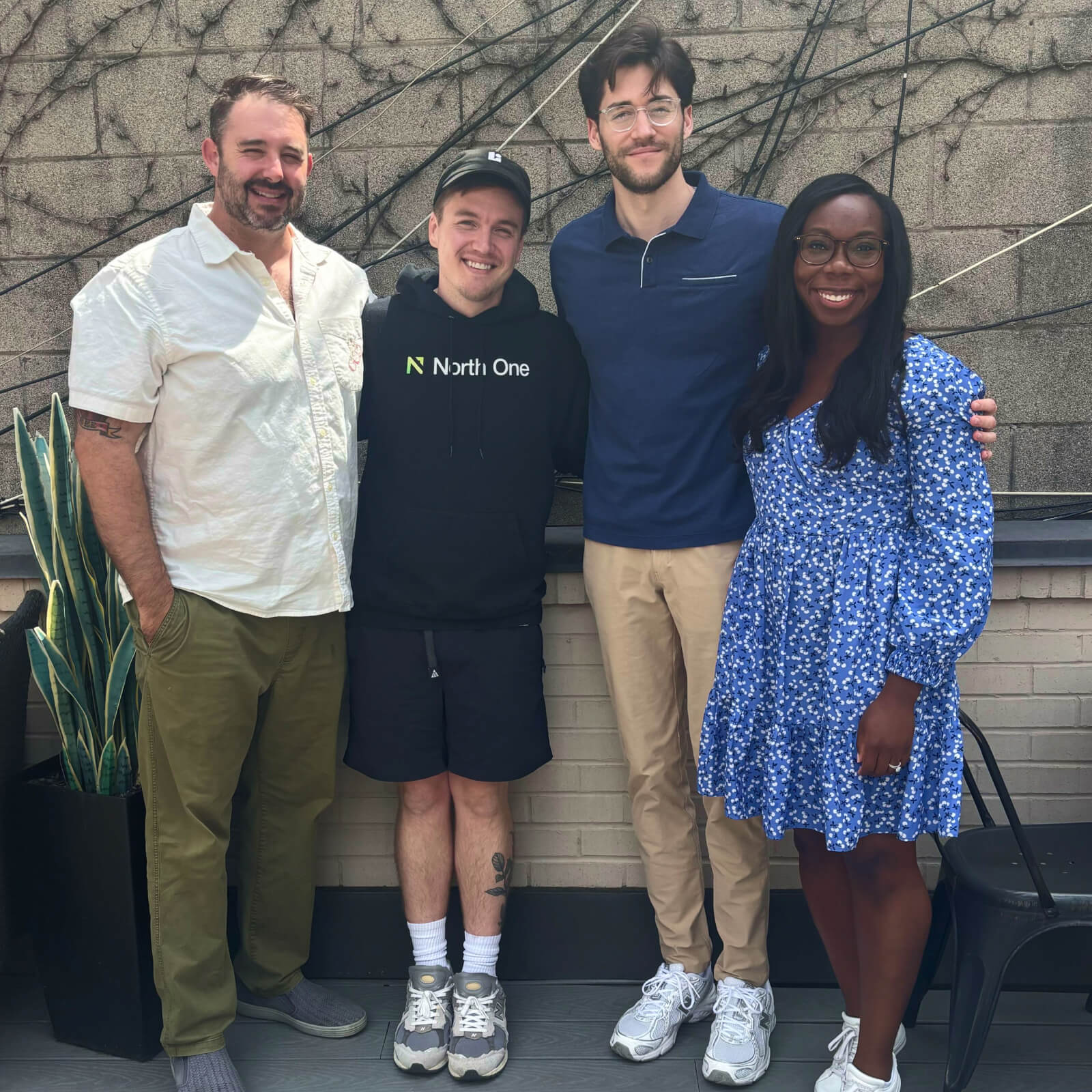
Our data showed that activating users early reduced the risk of churn. So with that in mind, a small team and I spent a week together in Toronto ideating, designing, and releasing a solution aimed at improving activation rates.
North One
Senior Product Designer — Research, Ideation, Prototyping, User Testing, UI Design, Interaction Design
Q3 2025 — Q4 2025
Research
Competitive analysis
We started by looking at competitors and comparable fintech products facing the same activation challenge. A clear pattern emerged — the best examples used monetary incentives, guided onboarding, persistent checklists, or a combination of the three. Most importantly, they made the next action obvious every time a user opened the app.
Data analysis
By mapping the transaction patterns of users who became active versus those who churned early, we found that users who reached six transactions were far more likely to become reliable active customers. Those transactions weren't random either, they clustered around three tangible milestones we could design for — funding the account, making a card transaction, and connecting third-party integrations.

Ideation
Based on our research, we agreed to move forward with a guided experience and a persistent checklist. The guided experience would surface the highest-priority activation actions first, while the checklist would track progress over time. Given our tight timeline, ideation needed to move fast — we each started by sketching our own concepts, then came together to present them and vote on the ideas that worked best.
Prioritization
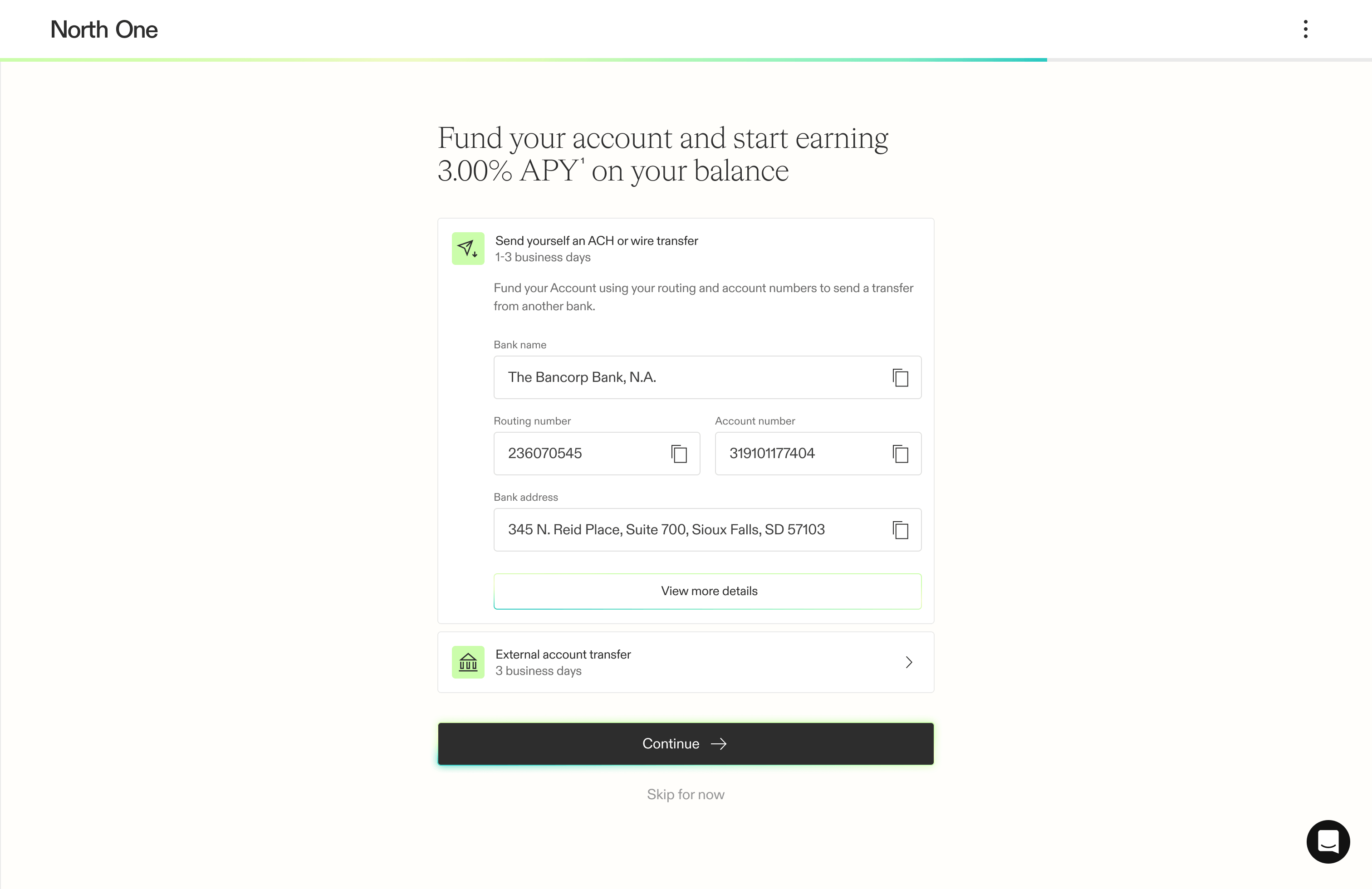
Our first iteration focused only on the three tangible milestones uncovered in our research, while everything else went to the backlog. With those priorities in place, we began mapping the user flows to define exactly how users would move through the experience.
Motivation
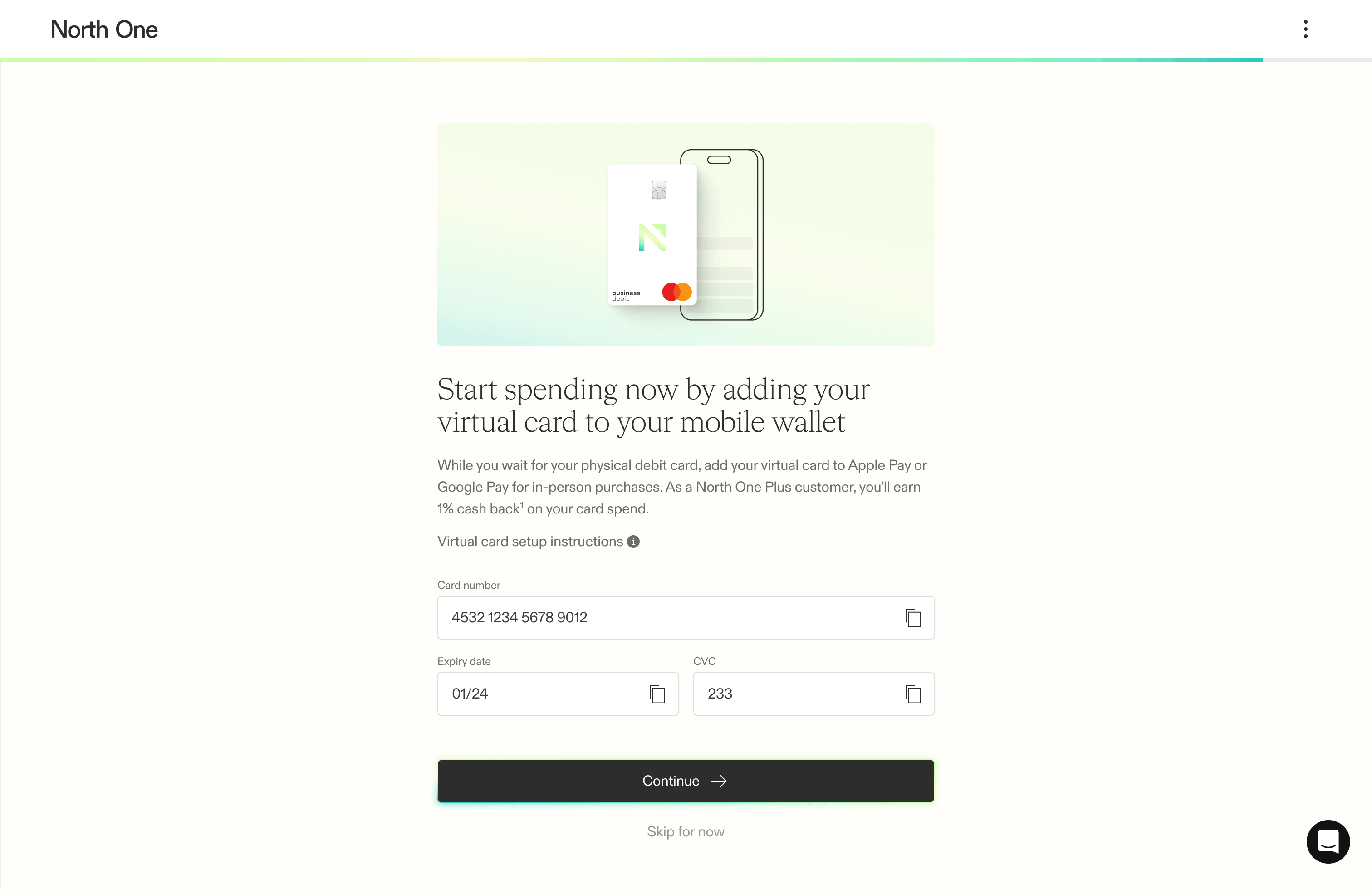
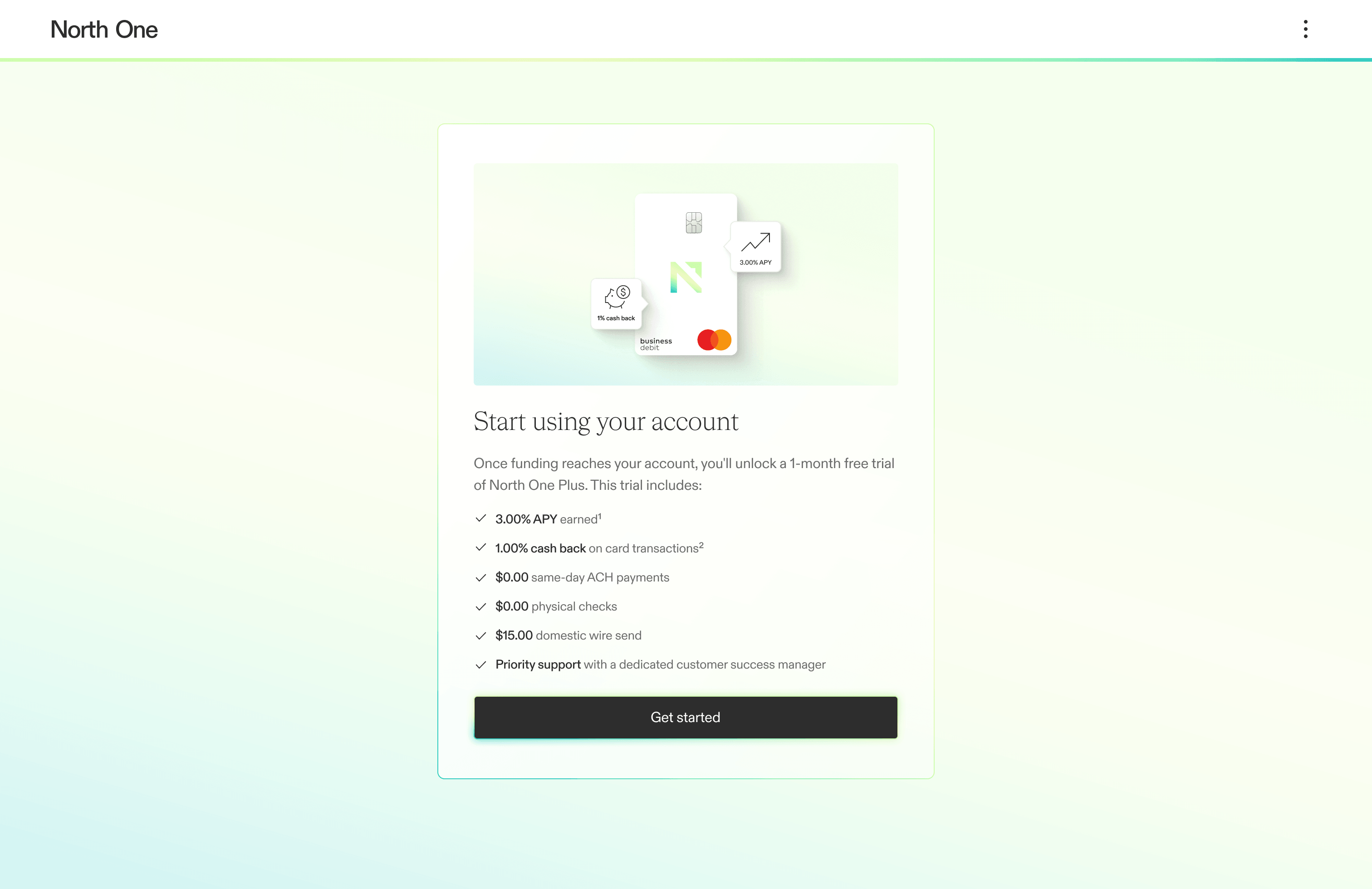
Offering a monetary bonus like our competitors would have required a compliance process we didn’t have time for. So instead, we offered a free trial of North One Plus — putting more responsibility on our content to communicate the benefits of the upgraded plan.

Design
With only two days to finish the design, we used AI to help us prototype the flow — creating something functional first allowed us to quickly experiment and solidify a path forward.
Guided experience
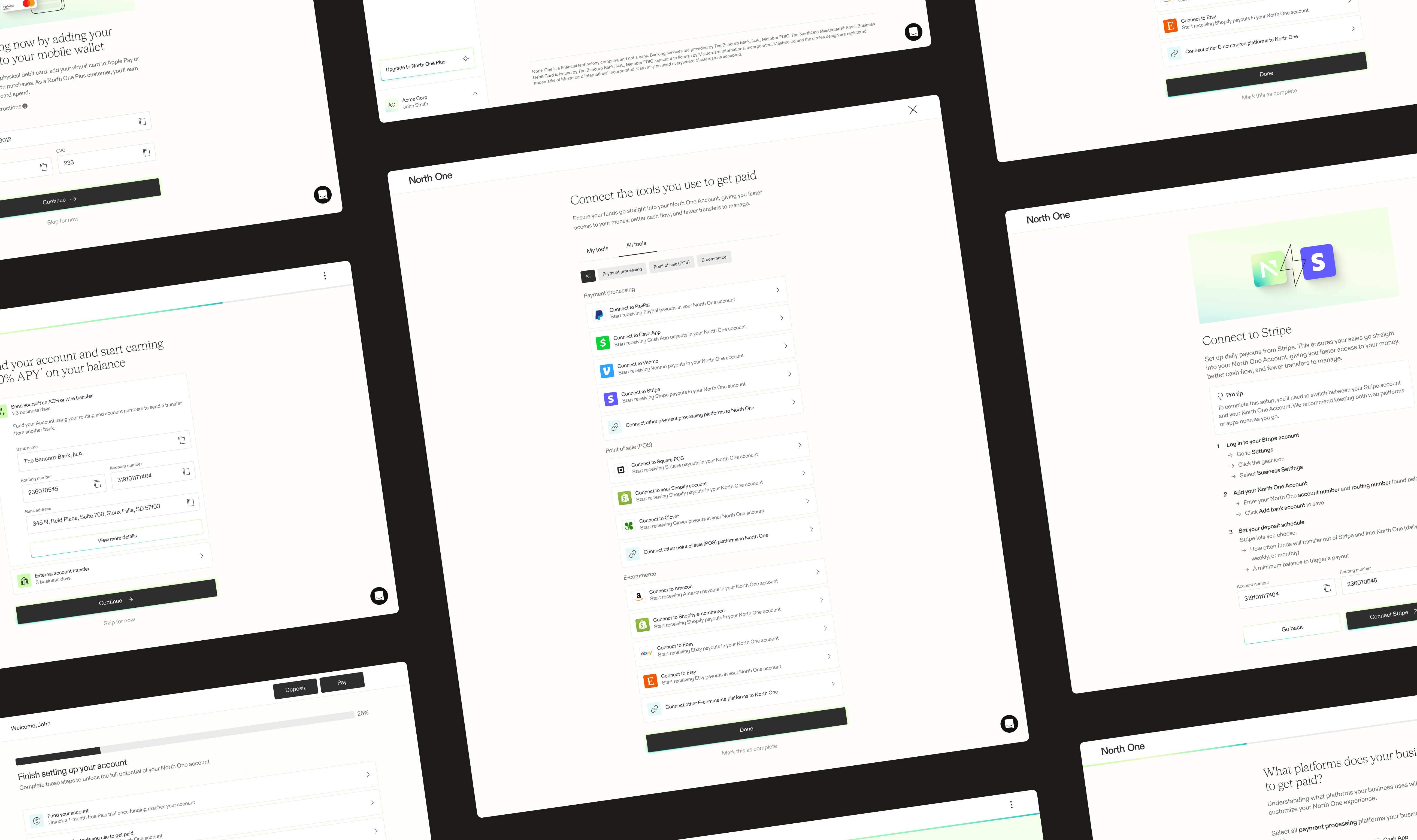
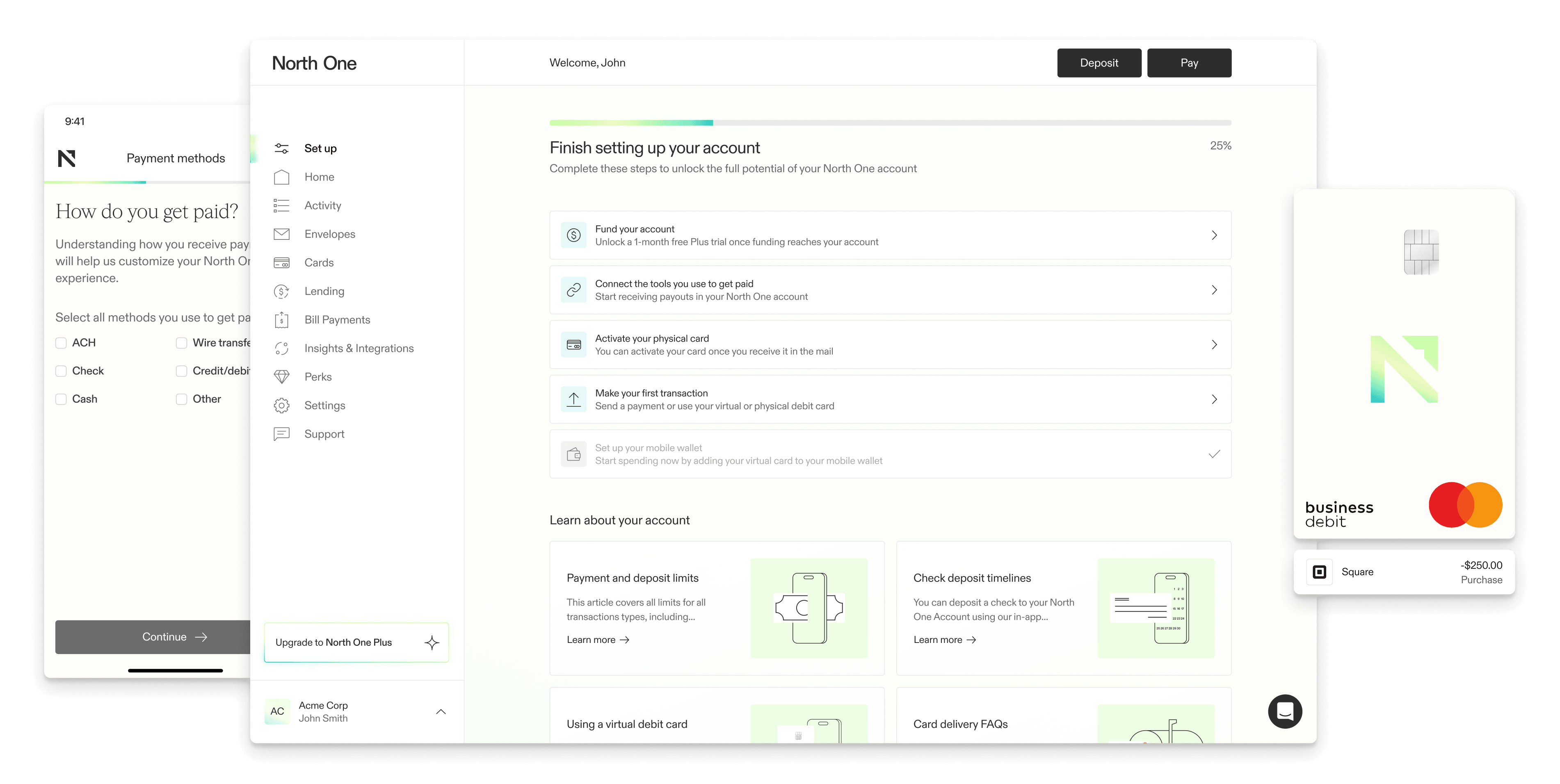
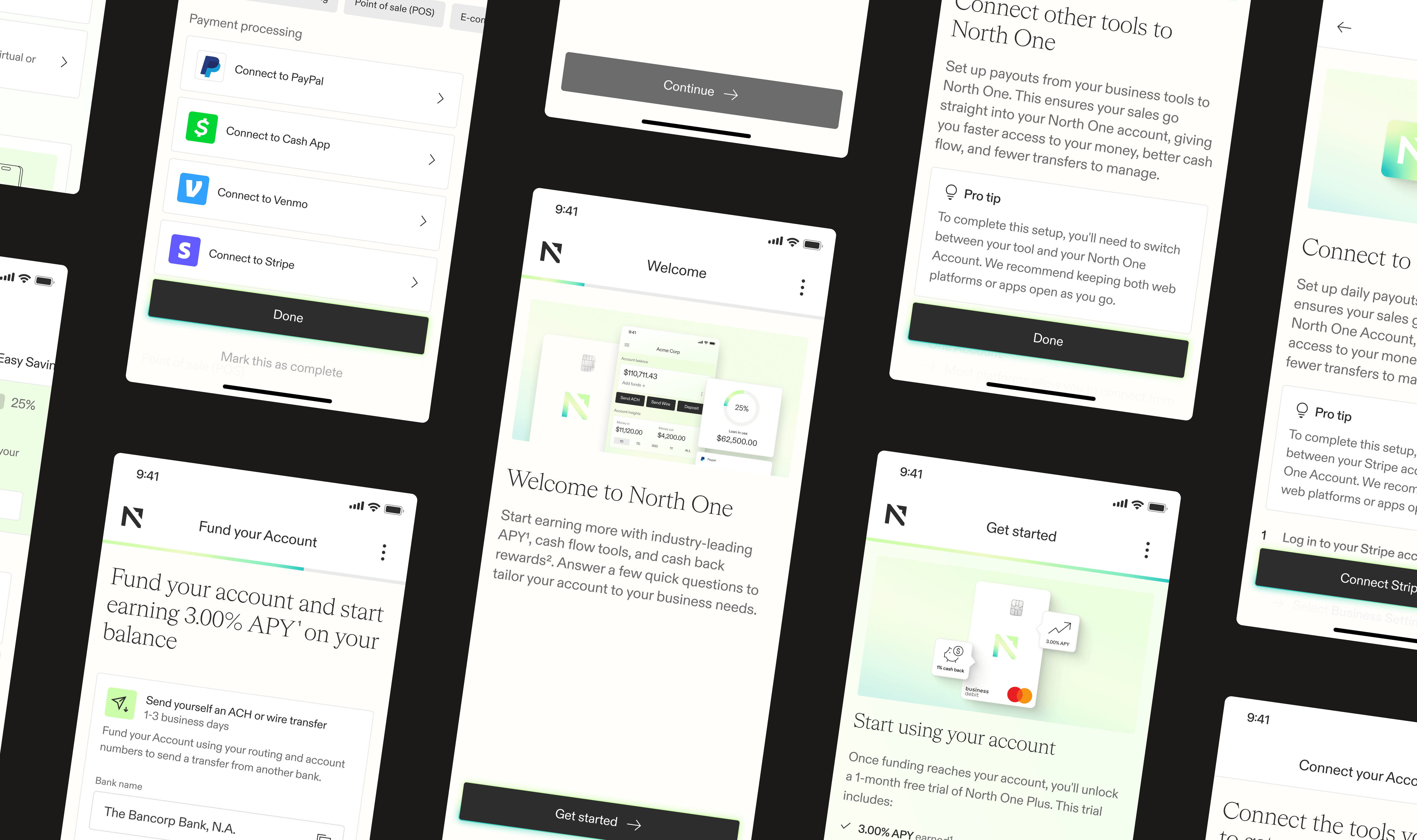
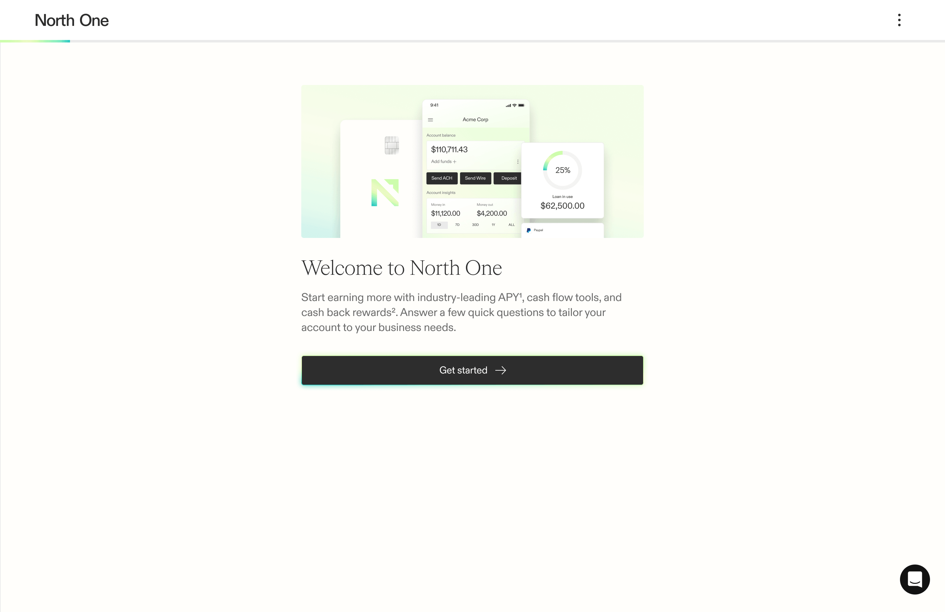
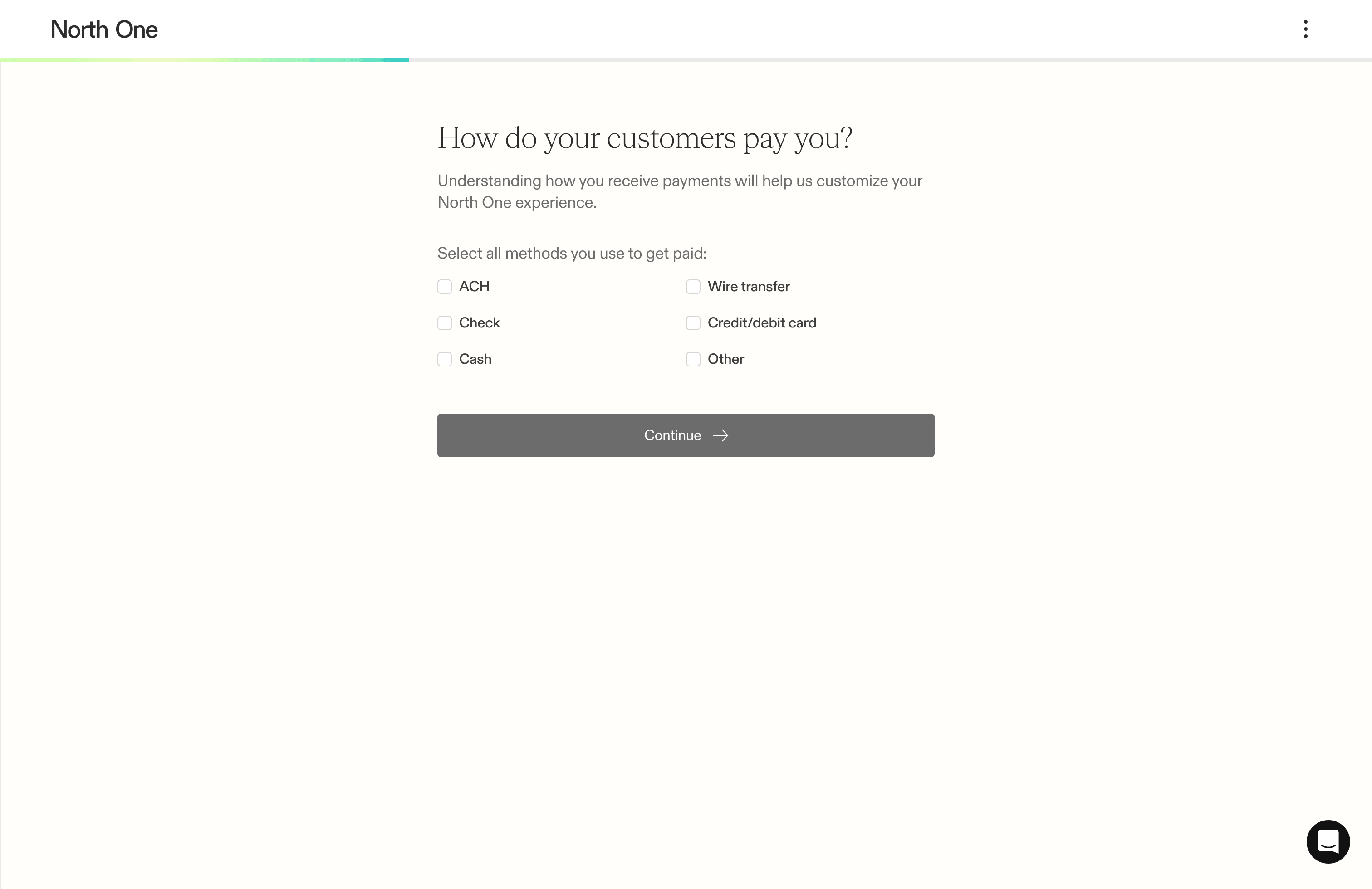
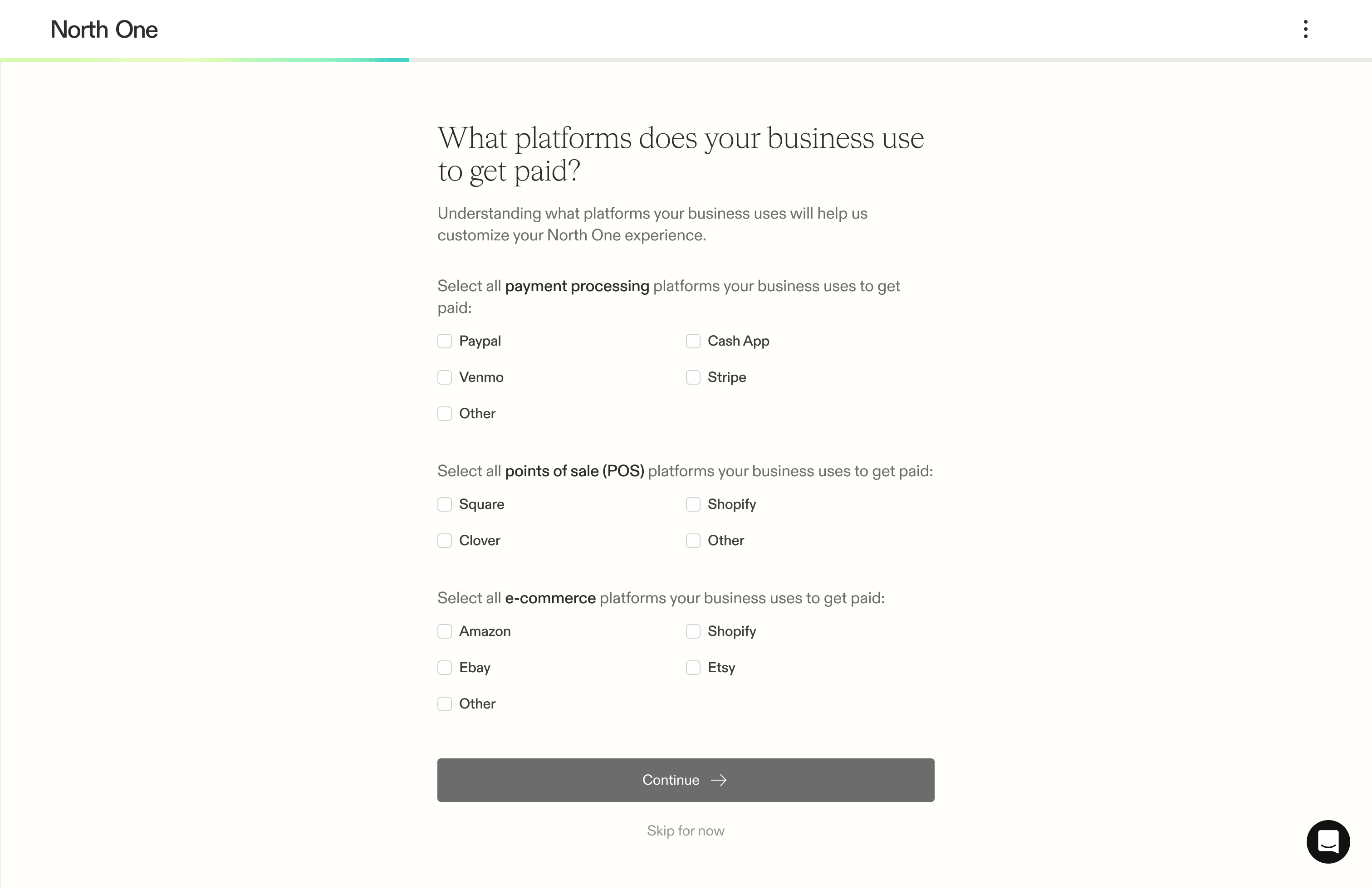
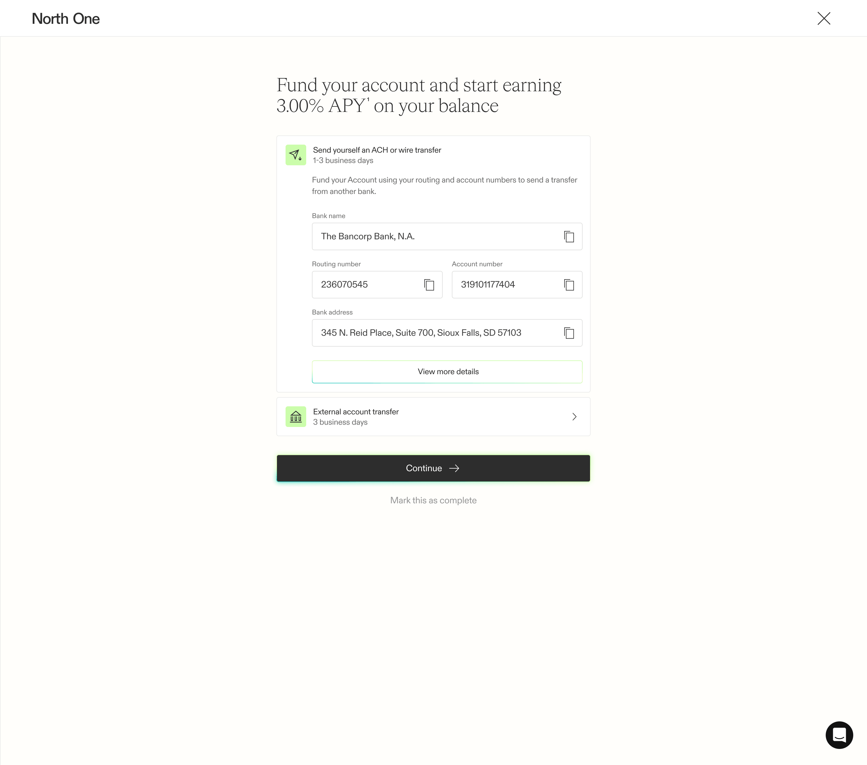
Starting with the guided experience, we designed a focused step-by-step flow aimed at activating new users. Each step had a single focus, clear framing, and a direct path to completion. Since this was the first thing users saw after opening their account, we prioritized forward momentum by giving them the option to skip steps while reassuring them that they could complete them later.
Set up screen
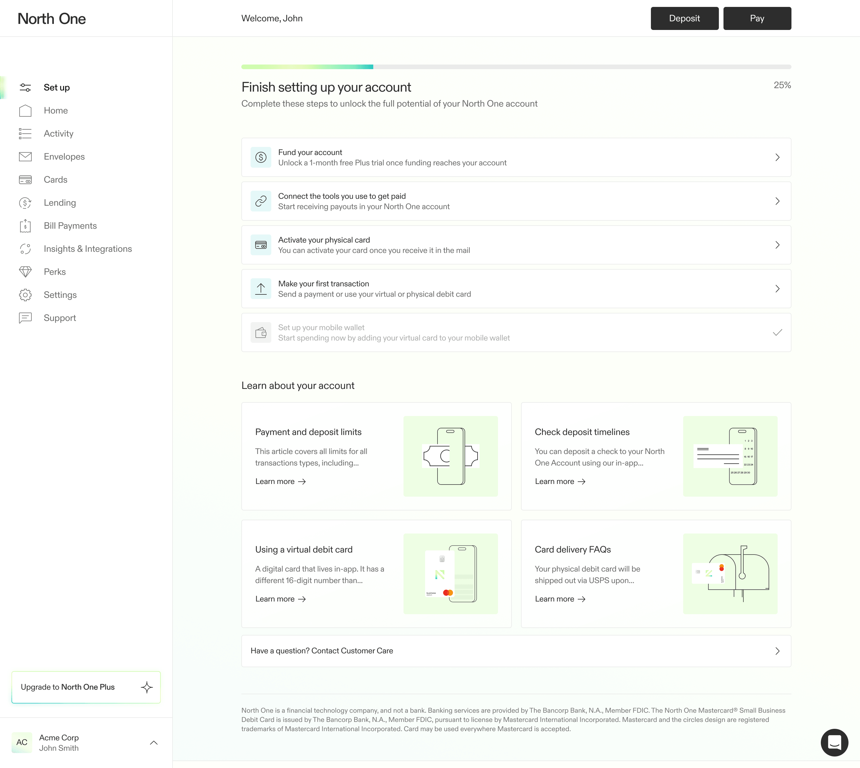
Once users completed the guided experience, they landed on a dynamic set up screen reflecting the progress they had just made. While we considered building this directly into the dashboard, we realized some users would still need the checklist after moving money through their account. Rather than fighting for priority on the dashboard, we created a new place where users could return and pick up where they left off.
Integrations
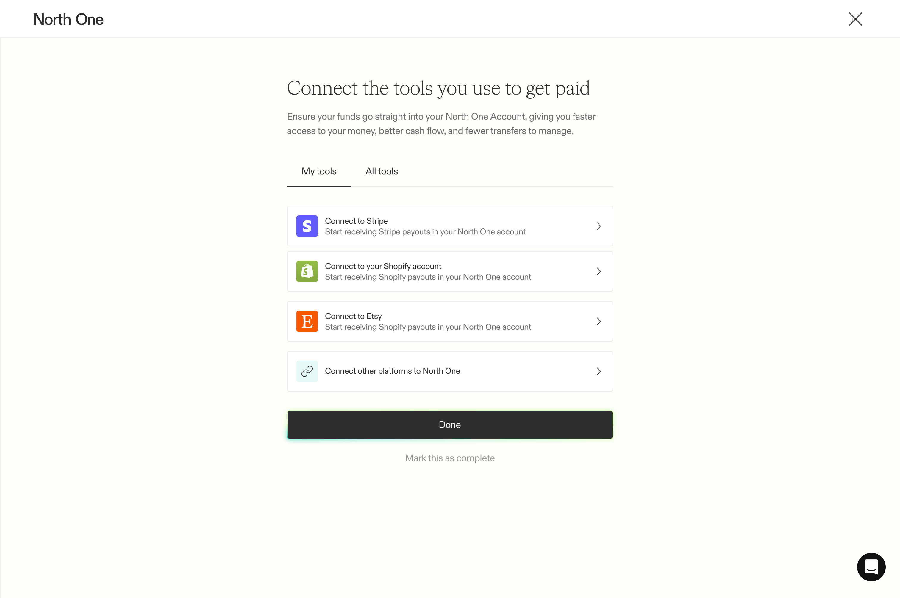
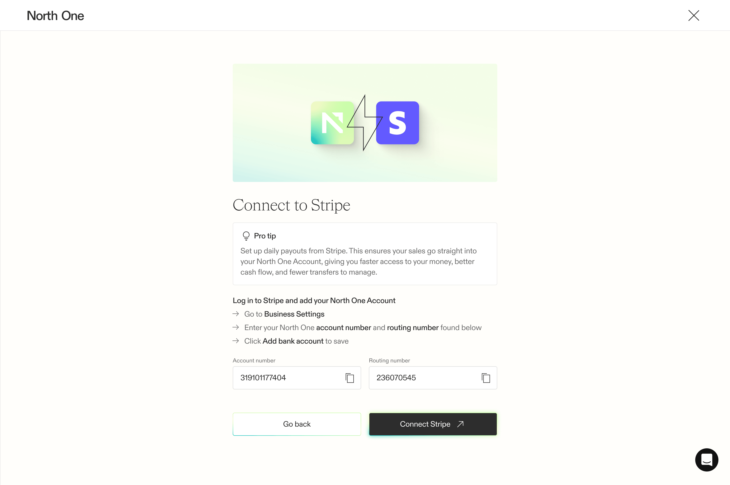
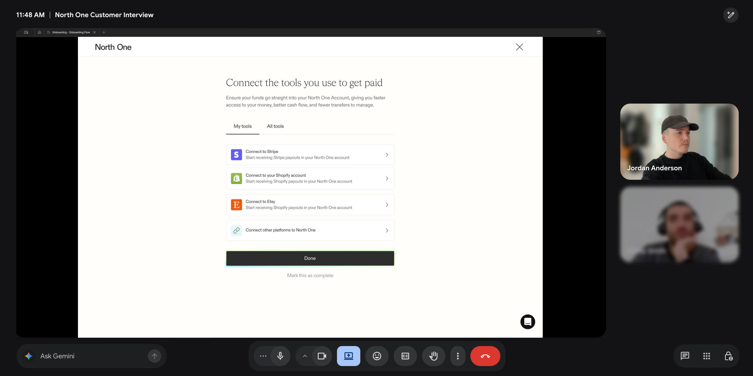
While brainstorming the best ways to move customers’ money into North One, payment processors, e-commerce platforms, and POS systems rose to the top of our list. Not only were customers already using these platforms, but many had recurring cash flow we could tap into. In the guided experience, we captured how customers were getting paid, which meant we could now lead them directly toward connecting the platforms they already use.
User Testing
Once the developers had what they needed, our focus shifted toward user testing. Overall, the testing validated our direction, but more importantly, it highlighted where customers hesitated or showed signs of confusion.
While the timeline didn’t leave room for major changes in the first iteration, we made what improvements we could and began building out our backlog.
Impact
The flow not only provided us with a more reliable method for activating customers, but it also gave us an experience that could evolve as we learned more about which behaviours drove long-term engagement.
In the first two months, we saw activation rates increase by 16% — new accounts funded faster and began generating more transactions.